Amendments to line drawing of seated figure
My tutor had suggested that this piece would benefit from varied thickness in the lines. I questioned whether this changed the authenticity of the drawing as it was completed as a continuous line, but she explained that the integrity of the drawing remains intact, that I would be responding to the original drawing.
I therefore first looked at the drawing in comparison to the photograph I had taken and decided that the areas of greater shade were where the amendments were required. I thought about whether to use a different medium for example ink with a thick brush, but decided to stay with the original black sharpie pen. I went with the intention of building up the lines in the particular areas I had chosen, but as I approached the paper I immediately began to draw additional lines and to instinctively build up the lines in those areas, I continued with this process and it felt quite fluid, therefore giving me confidence as I proceeded. I also began to add lines where there were none before, but felt this gave more substance to the image.
I continued until I felt happy with what I had done.
Image 1 below shows the comparison between the original on the right and the amended version on the left.

Image 1
Amendments to tonal drawing of lying figure
This exercise was particularly difficult for a number of reasons; to be honest I was feeling fed up and disillusioned with the course and really struggling to gather together any motivation or to harness any creativity, I also felt the clock ever ticking away on my final part of the course which I hadn’t yet started on and was in turn feeling a lack of motivation for. I had also invested a lot of time and energy in the initial piece so the thought of having to go through that again was also daunting, especially with Christmas around the corner.
I therefore decided to approach this piece from the very beginning again, rethinking my style and approach. I kept a diary of my thought processes throughout as well and found this a good way of aiding reflection as I progressed.
I first reflected on my initial piece and what I liked about it. There were elements of the background and of the figure that I liked but the two were different which added to the awkwardness. Whilst I liked the pose and the perspective, it felt quite staged. Additionally the assignment called for A1 and I was pleased I had achieved this, but I did not feel that I had been able to command that space with the drawing and I did not feel that anything was gained from it either.
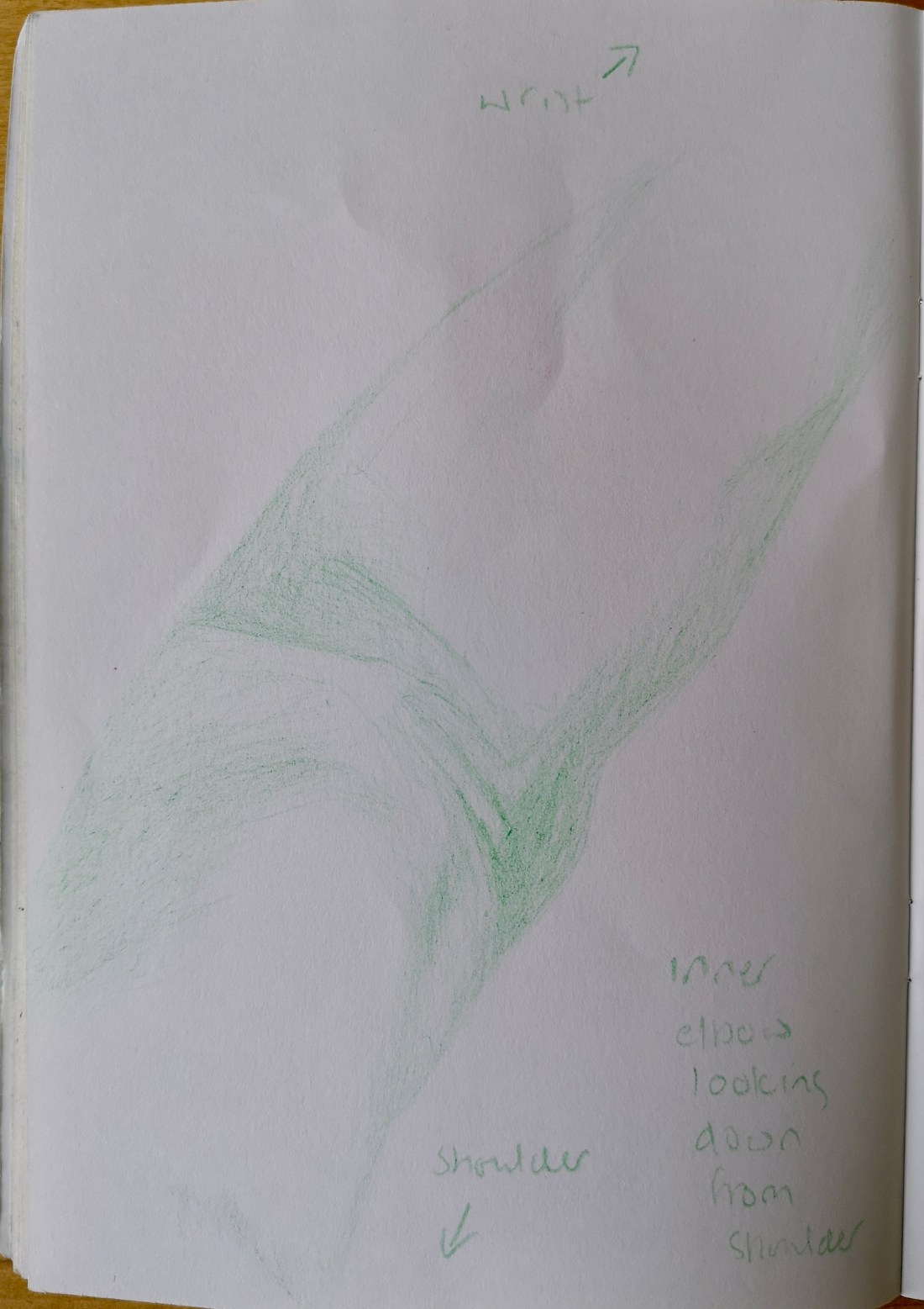
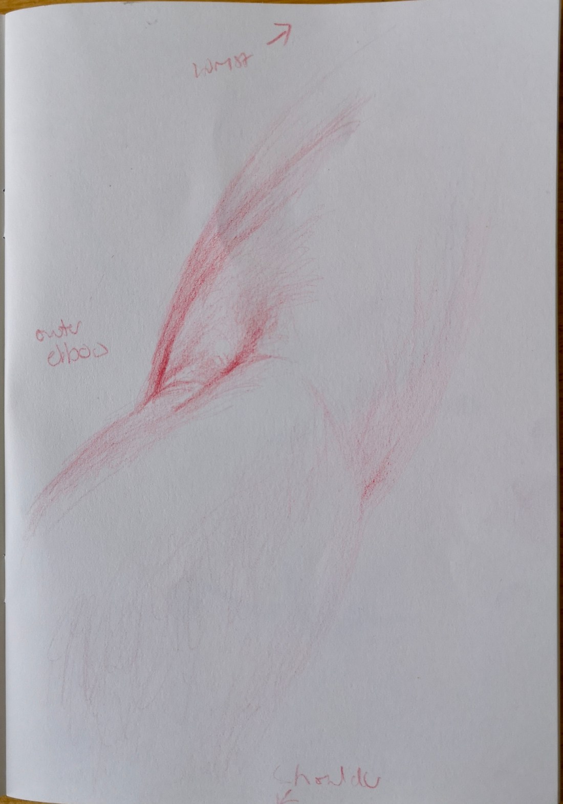
I therefore began by looking at some art online to find styles that I liked, I also searched for tonal drawings to help guide my search, which directed me to monotone drawings using mediums such as pencils, charcoals and ink. I decided early on to use a smaller ground size to keep it manageable. I also decided that I would use a different pose for the drawing. I did not want something that was staged again, and I was unable to capture a spontaneous pose so I went through my digital photos hoping for a better picture and found one of my husband lying on deckchairs when we were in Paris just over a year ago. I was immediately drawn to it because it was portrait orientation, and had great tone because of bright sunlight. It was also the spontaneous and natural image I was looking for. From my research I had also decided that monotone may be more effective for a tonal drawing, I also thought this may help me to build more effectively on my use of tone. I liked the idea of conte sanguine colours, so I did a little sketch and it was ok (see image 2), but started to worry that I wouldn’t be able to get enough detail. I then saw a fellow students ink drawings and got inquisitive, and after a follow up google image search, got inspired – well enough to have a practice (see image 2). As with the conte drawing I tried to keep a loose style as I had been working on this due to weakness in this area. The practice with ink was ok, although I felt I tended to use the ink as a painting tool rather than for drawing, but I was also more drawn to developing this further. After much reflection I decided I just needed to let go and see what happened on a larger scale.

Image 2
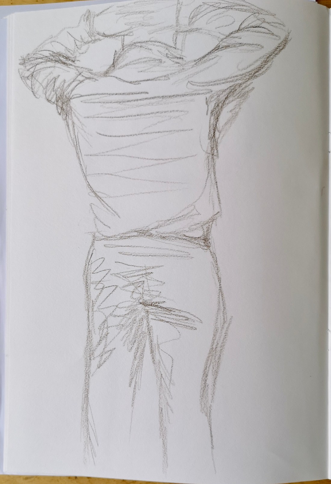
I used white A2 paper, and a small paint brush with black ink. My drawing started well, but the brush didn’t work well for larger areas. It was much better when I swapped to a larger brush but then began to look really messy so I stopped to reflect and it was only at this stage that I realised one leg was out of proportion (see image 3). I thought I may be able to salvage the image but was more tempted to give up on it. I thought a lot about other pieces I had had problems with in the past and subsequent discussions about them with my tutor. I thought in particular about what I may be able to remove or take away from the image and considered drawing over the left leg to correct it and of using gesso to add highlight at a late stage where I had gone too dark. I also thought that it would be good to do a few more small studies again with different mediums as well as ink to practice more. I spent a few days just looking at the image and thinking it over.
I again began to feel the pressure of time and felt that if I did not finish the image within a few days that I would move on to something else with the hope that a bit of distance may help and I needed to get on with other things.
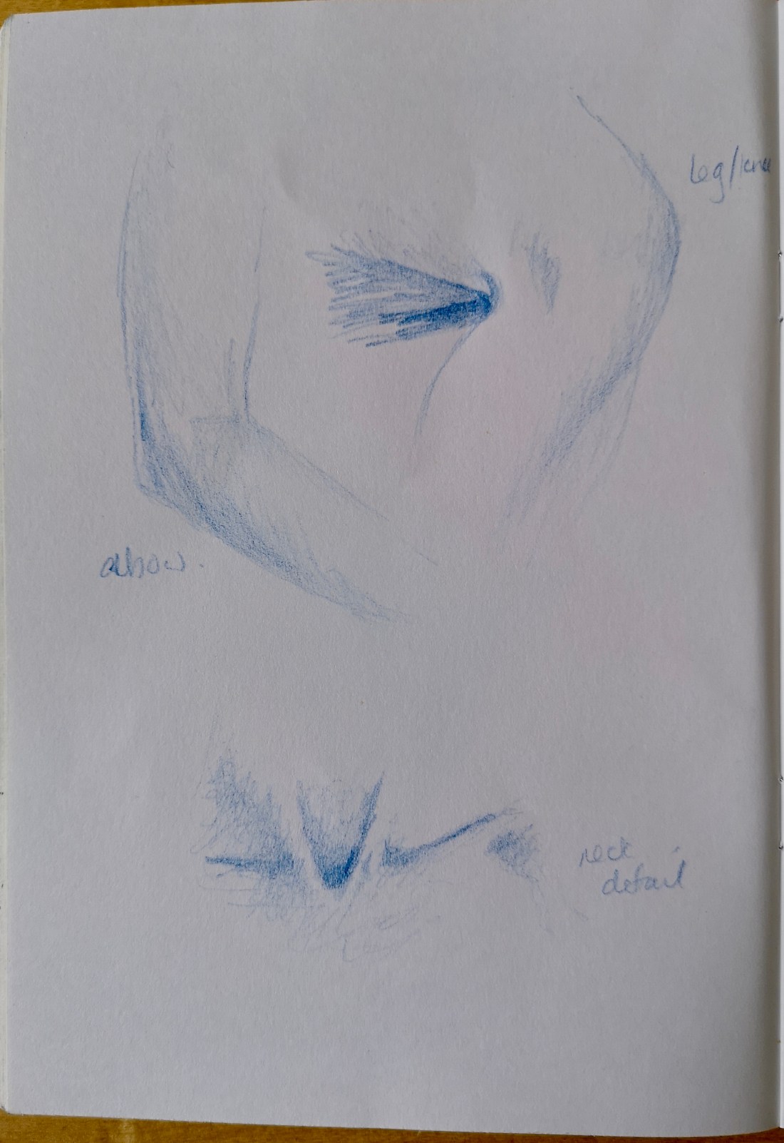
I therefore tried another version with conte sticks on coloured paper, building on my initial practice sketch (see image 3). I remained insistent on using a very loose approach but again got the proportions wrong although otherwise, I was quite happy with the tonal effect. At this point I became really fed up. I wanted to walk away from the whole thing, but couldn’t even stop thinking about it. It was as if it had become my nemesis.

Image 3
At last I had an epiphany – I began to re-evaluate my whole approach; why was I so insistent on rushing through with such a loose style? Why was I so against using pencil? When I did this I knew that graphite pencil as a basis for the image was the way forward. I used grey textured paper of close to A3 size, and thought that I would also use conte sticks along with the pencil for shadows and highlights. i started first with a 2H pencil to loosely draw the broad shapes and dimensions then zoned in with the 2H along with 4b and 8b for detail. I moved between the 2 approaches – to ensure I kept my mind on the whole image. This really worked. Although I did feel a bit annoyed with myself at returning to a very detailed image, I realised I’d actually gained much more of a balance this time, using the different styles in a better way to the best effect.
Once the figure was complete I then decided to use a green pen for the chair. I felt it would really complement the image. I really didn’t want to add background other than the shadow, so by making the chair stand out I felt this helped ground the image without the need for further background detail. I am really pleased with the final outcome (see image 4), I feel it’s the best piece I’ve done in the whole course. The whole final process went well and didn’t feel like it was just incidental as had felt before, rather it was a methodical approach which built through trial and error and drawing on prior research.

Image 4
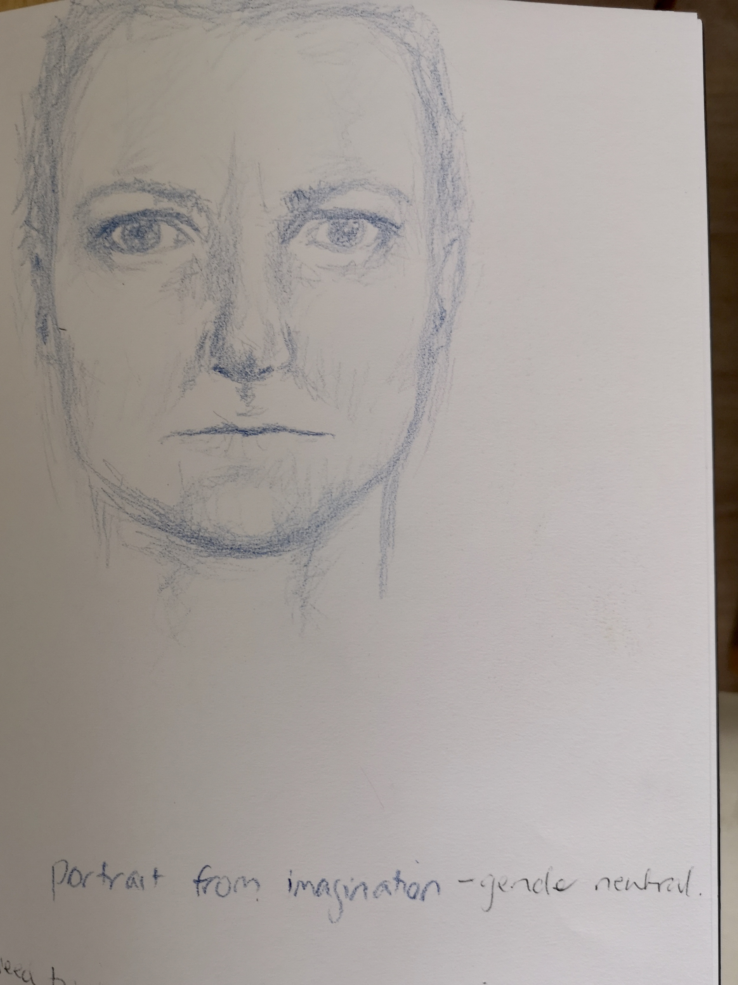
Additional portrait
This exercise caused me the most angst as I really did not know what exactly to do and I really struggle to work beyond specific instruction.
I really didn’t know where to start with this but had lots of thought. I considered whether using different media for the same image would produce different results – i.e would it change the intensity or intimacy, would it have an impact on the interpretation of the piece. I also wondered about doing additional portraits using the same media (as the original) but of different poses, perhaps something different to reflect another element of the model’s personality.
Although I liked the idea of a different pose with the same media, I tended to steer away from this instinctively. I found myself coming back to the iidea as to whether different media and different styles would give another dimension to the initial portrait.
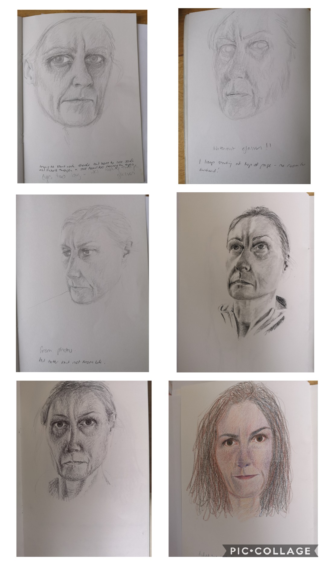
To start, I used black conte stick on a tinted paper. I used the same photo to work from but it was not zoomed in as far – this was by mistake. I really struggled to get the dimensions. I’m not sure if this was just more evident because it was easier to see with the contrast of the medium against the paper. I worked quicker than I had with pencil, but it was much easier to make a mark using such a dark medium. I also found that although I was working in a similar way to the coloured pencil it produced a much harder image with more severe features. It was also very unforgiving as it was harder to cover mistakes. I felt the way the image progressed led me to concentrate on different features such as lines on the forehead. When I compared the 2 portraits side by side, I was interested that the colour one appeared even softer than before (see image 5 below).
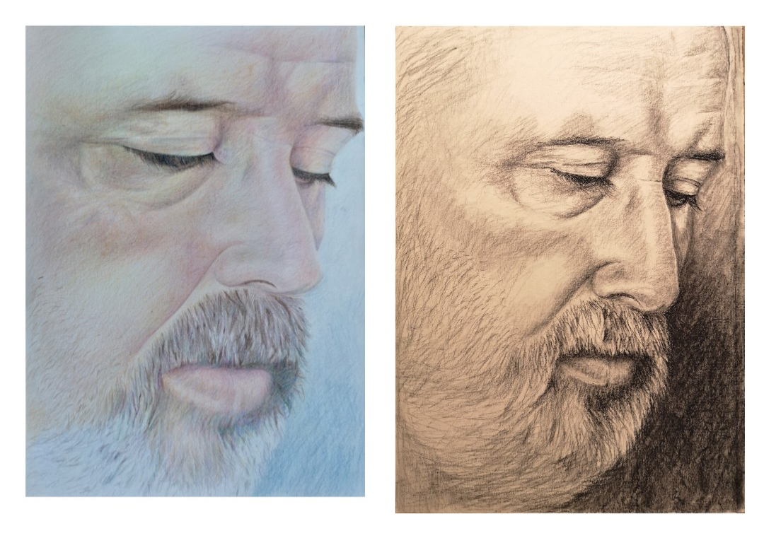
Image 5
Although I felt the above was successful I felt this was not what was called for and felt it necessary to continue exploring. I was particularly interested in using biro with ink washes. I was not sure how I’d manage this as the washes would need to be very subtle and may have required some mixing. I was thinking it may be better to apply the wash first and then draw over with biro.
I had a go at this. I kept the ink wash really simple but was very pleased with the effect, so much that I was tempted to leave it there as it kind of had a reminiscence to my models face. After a few days, however I felt I had to do more so began drawing the portrait over the wash with a biro. I resorted to my usual style, laborious measuring and estimating before committing, being wary of making any errors and becoming very focused with how it should look – what had been in my mind as the finished piece. After an hour or so, I stepped back and realised the proportions I had laboured over were completely wrong so I destroyed the image in complete frustration. See image 6 below for stages of the drawing as described.

Image 6
I decided after this failure that I had to do some more practice before attempting again. In the meantime I had begun to reflect over my earlier coursework in preparation for assignment 5 and was reminded of my need to loosen my approach to drawing, I therefore concentrated on doing quick sketches with the aim of loosening my drawing style, this was quite successful on a smaller scale (see image 7).

Image 7
I remained quite anxious about trying again, going over and over in my head what outcome I was aiming for. Eventually I just bit the bullet, I decided against using biro for the final version and chose instead my old adversary charcoal (albeit the pencil form) and just tried to deploy the same loose approach to the same portrait. I couldnt believe the results, after just a few quick scribbles I more or less had the portrait complete! It wasnt complete in the same sense as the previous one, but had all the necessary elements to be recognisable and the proportions were fine too. I left the drawing over night as I was unsure whether I needed to do anymore – in part I felt guilty that I hadn’t put more effort in. The next day, I added a bit more shade to suggest form but not much. I was really quite nervous about leaving it or doing any more, when I realised that everything I had done really showed how well I knew my model (my husband), how intimate I am with Him, and with that I was satisfied that I did not need to do anymore – this was a very personal image and for me perfectly complements the original portrait. Image 8 shows the charcoal portrait next to the original pencil portrait.

Image 8
In all the amendments actually took longer than the original assignments but through the process I felt I learned more and progressed further than I had the first time around.