This exercise asked me to collect a range of objects with different surface textures and experiment with depicting these in my sketchbook, and to experiment with frottage.
Frottage
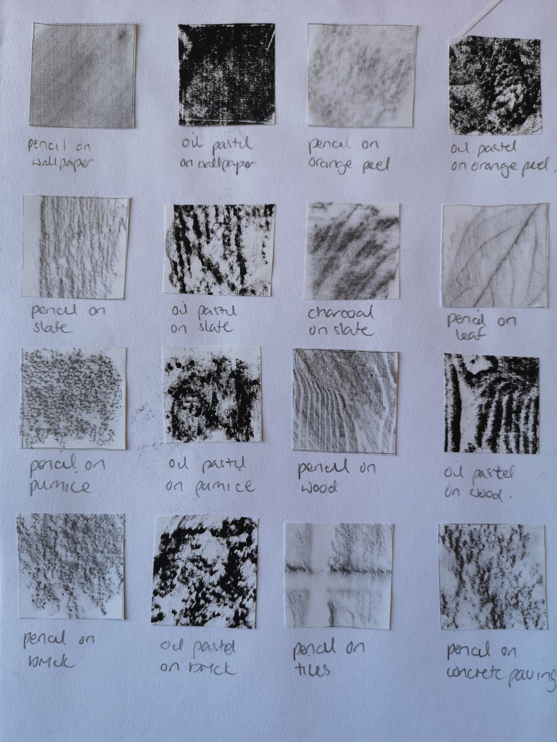
I first used some very thin and smooth paper to do the frottage, initially using pencil and getting a good impression on hard surfaces but noticed this was much more difficult on softer surfaces especially materials. On those surfaces it was more apparent that a kind of negative image was produced – for instance with the hessian the gaps between the weave are captured by the pencil, but when looking at the actual material you are drawn to the weave. On the denim I also noticed that where as the fabric appeared to my eye to have a horizontal – vertical weave, using frottage revealed that the weave is in fact diagonal. I also tried frottage with an oil pastel and with a charcoal stick with limited success, I could not apply either in the same way as they were too soft and the media would therefore not provide a relief of the texture, however simply applying the side of the stick and drawing it over the surface once or twice was successful but only on hard surfaces. I also found that because of the lack of variation in tone with these media, this only appeared visually effective in very strong hard textures such as wood and slate.
Below are images of the frottage experiments, each with a description of the surface/material and medium used.

Drawn textures
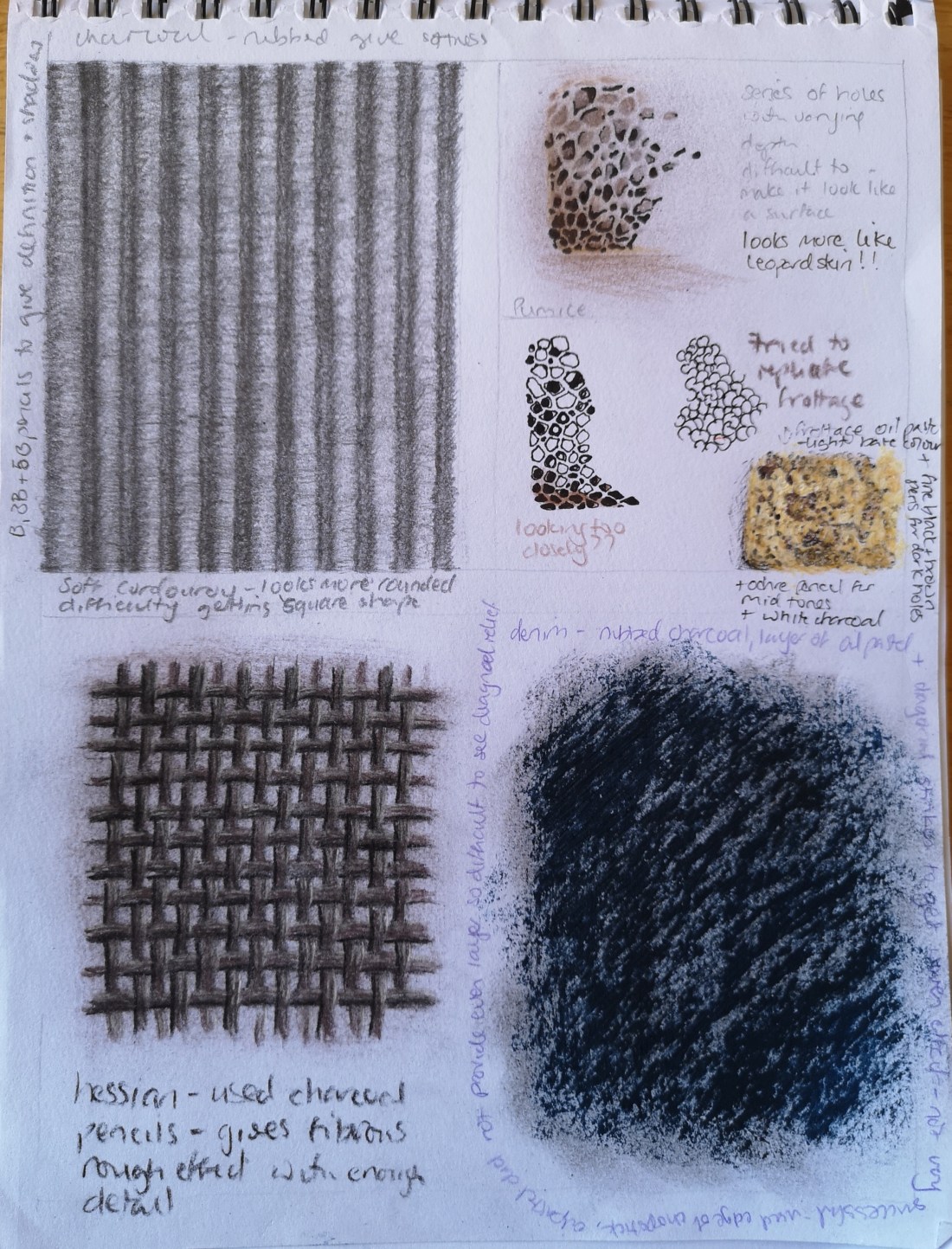
I next tried to reproduce and depict the textures using different media in my sketchbook. I started with the soft corduroy. I made this image larger than life and used charcoal rubbed across the surface to capture the softness with different b pencils to capture the detail and depth of the textile. I worked on this for a long time and whilst I liked the result as I felt it did capture depth and softness, I did not feel it was representative of the construction or pattern of the material, but I struggled to think of any other way to try and better this, so moved onto the next object I had chosen – pumice.
As I examined the pumice, I could see it was constructed of a series of holes of different sizes and depth. At first sight they all appeared to be round, but on closer examination they are of different shapes and some appear quite hexagonal. Again I made my image much larger than reality and I focused first on drawing different shapes with the intention of shading these. I used black fine liner as I felt this would represent the definite shapes. However, each time I tried this I seemed to get more of a leopard skin or animal print effect. I then turned back to the frottage images and saw that these had produced the outline of the holes and thought that by doing this again using a lighter colour I could then use this as a template to add to and creat the desired effect. I felt the result was quite effective. However, when I later turned over the page I found that the images produced by the bleeding through of the pen on my earlier attempts had actually produced quite an unintended likeness to the texture of the pumice
I then chose the hessian to reproduce. I knew exactly what medium to use, how to apply it, was confident in the result I would get and was not disappointed. I chose to use 3 shades of charcoal pencil because they would give the roughness of the material as well as help to define the texture of the weave. I used the mid tone to provide the basic structure with the dark and light tones to help define the weave and give a sense of 3 dimension. The charcoal also helped to show that the material is not fine and gave a sense of a dense, thick thread. On reflection I think that applying this to the frottage image may also be effective in enhancing the sense of texture.
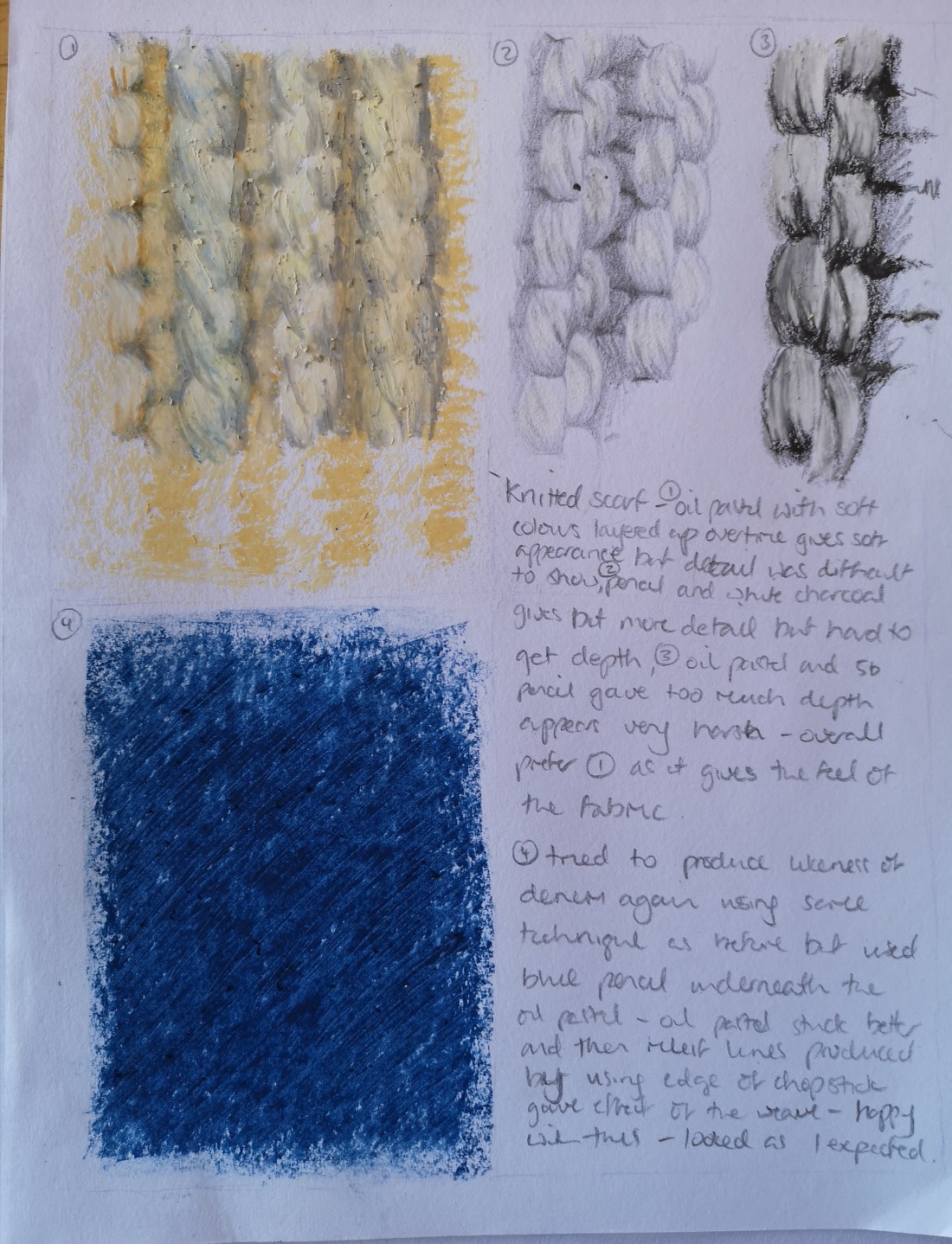
Next I tried to replicate the denim texture. From the experiment with frottage, I was aware of the dual element of the texture i.e. appearance of horizontal and vertical weave with the texture of diagonal weave and wanted to replicate this. I therefore experimented in using oil pastel applied in a horizontal and vertical motion, first on top of rubbed charcoal and then over blue coloured pencil and then using the edge of a chopstick to scratch out a diagonal relief to represent the weave. I found this was particularly effective in the second attempt i.e. oil pastel over blue pencil, and that it gave a 3 dimensional effect which I was pleased with.
Lastly I tried to replicate a knitted texture. I experimented first with different colours of oil pastel heavily applied and built up in layers, second with pencil and charcoal and then with oil pastel with pencil again but used in a more sketchy application. I really did not feel that any of the experiments were very effective in producing a likeness, but the oil pastel heavily applied and built up, seemed to produce a very soft feel which resonated most with the texture.
Below are images of the drawn texture experiments described above. Image one, first drawing clockwise from left hand corner is: soft corduroy, pumice, denim (first attempt oil pastel over charcoal) and hessian.
Second image shows the unintended effect of the black pen bleeding through the page producing a likeness of the pumice.
Third image shows drawn texture experiments also described above. First drawing clockwise from left hand corner is: knitted fabric (using heavily applied oil pastels, pencils and white charcoal, and then oil pastels with pencil) and denim (second attempt oil pastel over blue coloured pencil).