1. Figure study using line – Seated model in an upright chair
I first asked my model to make different poses in an upright chair and I took photographs of each to explore further.
I had an initial idea at this time as to which pose I thought I would use for this study but decided first to make a small line drawing of each to see how they translated. It was only then that my view changed as to which was best to carry forward. I liked the image as it filled a lot of space and actually was quite bold for a simple drawing.
To explore how I would use line for this image I drew 2 further versions, one with continuous line and one with more purposeful, varied lines. I immediately preferred the continuous line although I knew this would be quite tricky on a large scale. In particular I was concerned about the boldness of the line as I felt ball point pen would almost disappear on an A1 size portrait. I therefore made marks using different mediums. I mostly liked the ink and pen/brush but neither of these work continuously. My next preference was therefore a sharpie pen which seemed to glide well and had a controllable output.
I also explored the use of colour; I wanted to add some colour so that the image stood out and did not disappear into the paper, but I did not want to use tone as this was against the brief and I did not want to divert attention from the line drawing. I tried different approaches, first adjacent lines denoting the colour of the clothing and the chair, then block colours overplayed on the image, then block colours in the background and chair. I liked the last approach best and felt the use of primary colours really helped the figure to stand out. It was only once I had completed the final line drawing that I decided on ink for the colour and I feel this was a good choice as it produced very vivid colours which were also in keeping with the bold line.
In terms of process I initially sketched out a rough outline of the figure to help with scale as I found this the most difficult thing to get right even in the smaller images. From this I was then able to work round in one continuous line with the pen, retracing lines at certain points where needed to move across the page. When I finished I found the raised foot was very out of proportion so did cheat a bit and try to rectify this, but otherwise it was just one line starting from top to bottom.
The following images are my preparatory sketches and experiments.

The images below show the stages of my final piece.
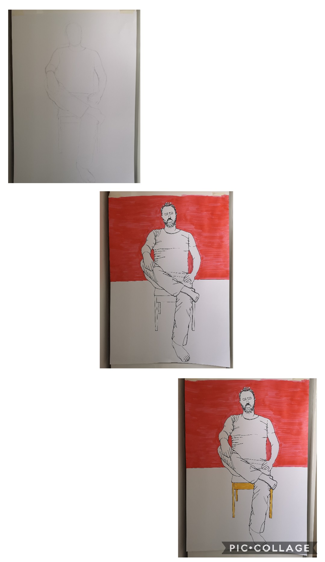
Below is the final study

Sharpie pen and ink on paper.
I am happy with the end result although did wonder if it was too simple and basic, as it seemed to evolve very quickly whereas usually my assignments take days. On reflection I also think that using ball point pen would have been ok and I perhaps would have been much more loose and forgiving with this, whereas with the bolder pen I seemed more concerned at getting the proportions right at the outset.
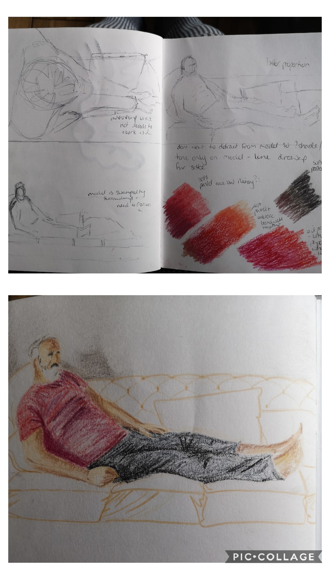
2. Figure study using tone – Reclining model
I used a similar process to the line drawing for determining the pose I wanted to use. I had initially thought that a very different pose (i.e. looking from the head of the model downwards would create an interesting pose, but when I made a rough sketch it actually showed that a lot of the figure was obscured by the head.
I therefore decided on a side on view and focused this in to ensure the model took up most of the image.
I then made experiments with medium, I new that I wanted to use very bold colours, but they needed to blend well to help with the tonal requirements. I therefore worked with inktense blocks and soft pastels in different ways and found that by using the inktense as an initial underlay it also provided a key for working over with the soft pastels which I really liked.
I then did a small and rough study of the composition that I was thinking of and felt this worked well – I knew that the background was necessary to place the model but did not want to detract from the subject, I therefore drew it in line only and was quite pleased with the outcome. I decided to therefore take this plan forward on the A1 sheet.
Below are the initial experiments and composition studies.
I worked on the final piece as planned, using inktense blocks as foundation colours and then building tone with soft pastels. I started by drawing an outline of the whole image in light coloured pencil, then built up the tone working on each component of the figure in turn.
Below are images of the stages of drawing.


When I came to the background I found myself feeling very differently about my plan, I felt that because the figure stood out so much, I was at risk of making him look as though he were in mid air with just a line background, I also felt that it would appear more like an illustration and did not want this to happen. I therefore decided that I would draw the lines in a dark colour and add block colour to the outlines.
When I did this, I felt it did not complement the figure and that it was at odds. So I decided then to add some more tone, still with a mind to keep the background distinct from the figure. I used the inktense blocks for this but added water with a brush to give a softer impression.
Final stages of the drawing are below.
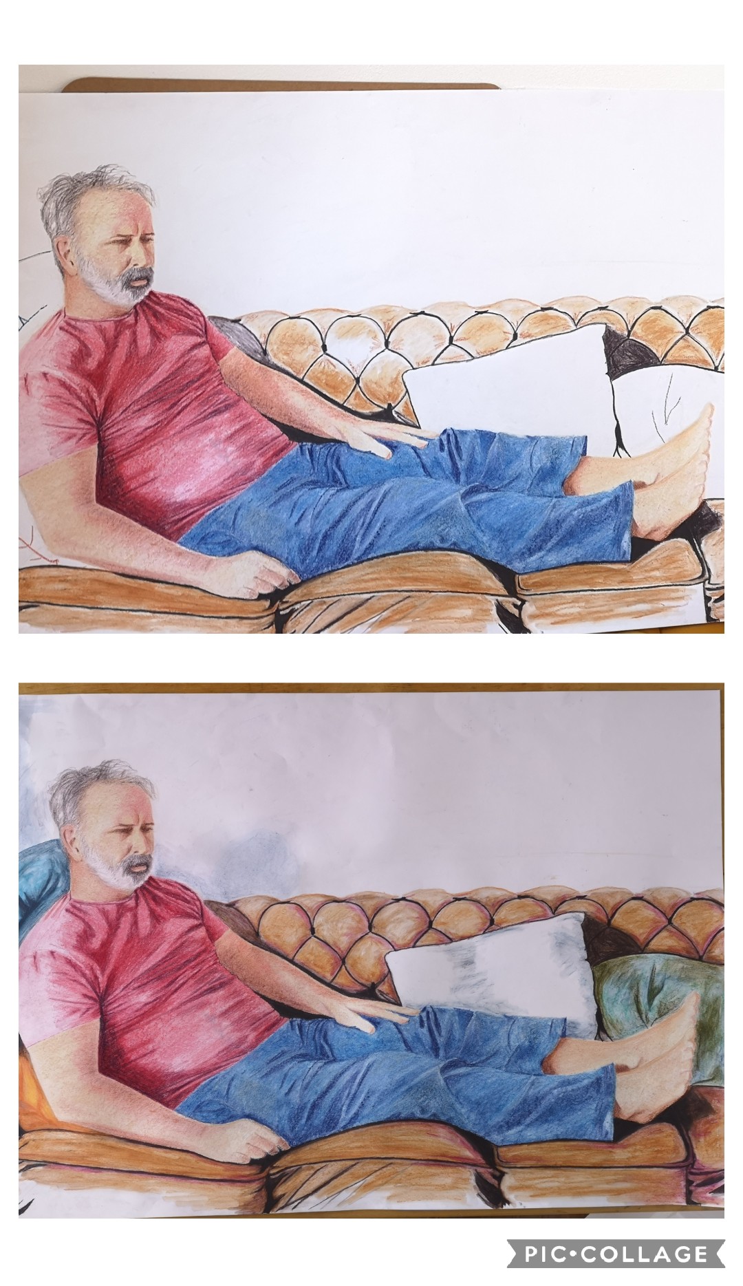
I hoped to leave the background in a less finished state, but felt that it still did not work and therefore continued to work on it in terms of tone and depth.
Ultimately I finished when the background was consistent with the figure which I think works best. As I used the same medium in a different way I feel it still provides a sense of background which sets off the figure so I am happy that I persevered.
The final image is below.

Inktense blocks and soft pastels on A1 paper.
Whilst I’m happy with how the final piece looks like the model and is well proportioned etc, I am disappointed that it looks too much like the image I took it from, I did intend for something a bit more different looking, I suppose I should perhaps have considered a few more options rather than going straight into the one I felt worked first time.
3. Portrait combining line and tone
When I approached this final piece, I had already decided on drawing my husband rather than a self portrait. I was influenced in particular by my research into other artists who had drawn or painted family members and friends and liked the familiarity and intimacy of those and wanted to see if I could capture this. I also liked the idea of a un-posed portrait, similar to that caught on camera.
I therefore began to draw my husband as he sat across from me without his knowledge whilst he was engaged in concentration, I also took a quick photograph to capture his pose for reference. He eventually realised I was drawing him, and was ok with this but when I looked at my drawing and the photo I felt that it gave something more, that the expression was not just about concentration and may offer a wider spectrum of interpretations.
In exploring how I would develop the portrait, I just really went with instinct. Firstly I took a ball point pen and re drew the portrait as a simple line drawing, then as I looked at this, I decided to add colour. I used pencils and added this in shaded blocks, picking out broad shapes on the face and applying the colours in overlay as I could pick them out. As I worked, I felt an influence coming from the Elizabeth Peyton portraits I liked in the reading material. I quite liked this but wanted to translate this to a larger scale (the image was around A6 size at this stage)
I felt that the ball point pen would not work for a larger piece so decided to use a fine liner and drew an outline image again. This time I focused in on the image, my intention was to avoid drawing the whole head, but as I did this I realised focusing in gave a further dimension to the portrait and increased the intimacy which I really liked. I then drew the outline of this new view with the pen. I quite liked this, it was a very simple drawing but had all the information to recognise it as a portrait. I thought about what medium to use for colour and settled on inktense sticks. I felt I could blend this well with an element of control, However on application they gave a very intense and bold colour which completely changed the essence of the portrait and I felt conflicted with the image. I also felt the use of a definite outline had not worked once scaled up so decided I would not pursue this.
I therefore experimented with different colour pencils – soft, blended and watercolour in an effort to find ways of achieving a balance in soft skin contours with defined lines of creases and facial hair. I found that using blendable pencils gradually overplayed worked best for skin tones with the use of watercolour pencils (without water) for fine detail.
Preparatory work below.

I used an A4 sheet of cartridge paper for the final piece. I needed a size that I could work on as a whole to retain the level of intimacy I wanted to convey. I used an ochre colour pencil to make the outline of the drawing and then used one colour at a time to gradually build up the skin tones – ochre, yellow, orange, light green, red, purple, magenta and then darker green and blue. I made sure that I stepped away from the image each time I applied a colour as not doing this previously has often resulted in my producing disproportionate work. I also worked on a small easel so the image was easy to view from a distance and therefore review when I was not working on it. I feel this was particularly beneficial.
When the skin was initially complete I had quite a surreal image with blank areas for eyes and around the mouth. I did contemplate leaving the image this way, but on reflection felt this was mostly because I was a bit scared to continue to the next stage in fear of spoiling the whole thing.
I therefore progressed to add the detail of the beard and moustache. I had already experimented with using a mix of red, green and blue for this purpose with some success, I felt this reflected some of the hues that could be seen in the photograph.
Stages of drawing the final piece below.


Final image below
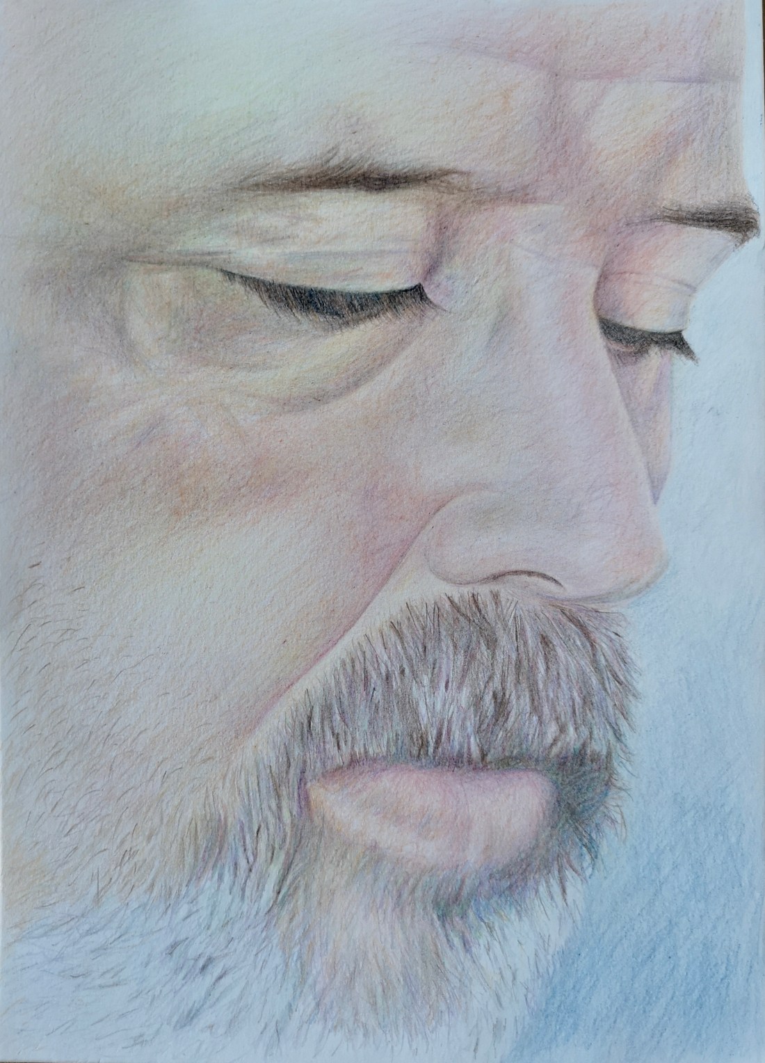
Coloured and watercolour pencils on A4 paper.
I am happy with the outcome of this portrait, I feel in particular that it reflects some of the research I completed during this part of the course, although at the same time is in keeping with an approach I am perhaps more comfortable with and easily steered towards. I do however wonder whether I have a tendency to look towards what I like and avoid or dismiss what I don’t.
I do have a tendency to resort to pencil and so wonder whether I have been experimental enough. However I am pleased with the fact that I allowed this piece to evolve in a way that I don’t usually. I feel that it has met the brief for use of line and tone, however, in removing the outline that I had initially started with it has become more of a tonal drawing so I feel that I should have perhaps explored other ways of doing this before starting the final piece.
