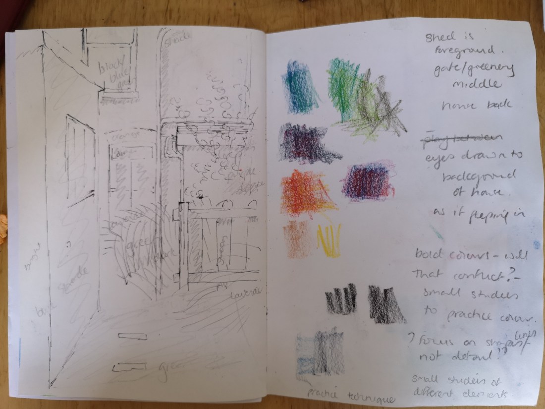
I had already done some groundwork for this assignment and selected my reference and composition (see Pt 3, Project 3 Composition – Ex 1 Developing your studies). What I wanted to do was to mainly capture the different tones caused by the light. I was particularly influenced by my earlier research into George shaw and Christoph Nieuman. I have some thoughts on how I may do this but needed to prep and experiment further.
I started with a line drawing, from real life, to get the proportions and make notes of light and colours. I then took a photograph of the view and used this with my line drawing and notes for the rest of my prep and final piece.
I made some initial thumbnail sketches using different media to get a sense of the effect with each of them. I then did a version with inktense added to line drawing. With this version I liked smooth edges, but felt the lines made it too cartoony. Overall I preferred the inktense to ink, I felt I had less control of the ink when applied with a brush and that it was therefore only good for short lines and marks.
I also looked at different elements of the garden in more detail, I realised there was a contrast between the man made and natural elements that I also wanted to capture.
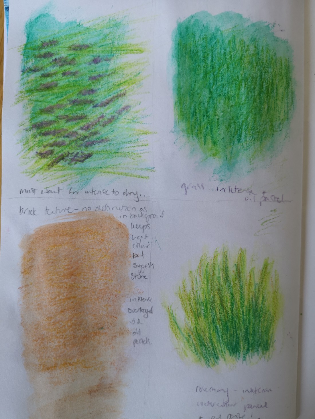
I added watercolour pencils to my prep, I found these were good for small areas with more detail and lines, and that they gave a lighter effect that could be built on using a very soft dapping technique with the brush and minimal amount of water. I also felt this helped with the contrast of other elements in the composition.
I also added some small amounts of oil pastel this was good for adding texture – particularly on the brick walls without bringing them forward. They helped to just give more suggestion of stone without the detail. They were also useful when applied to the lavender and grass in bringing them both to the foreground.

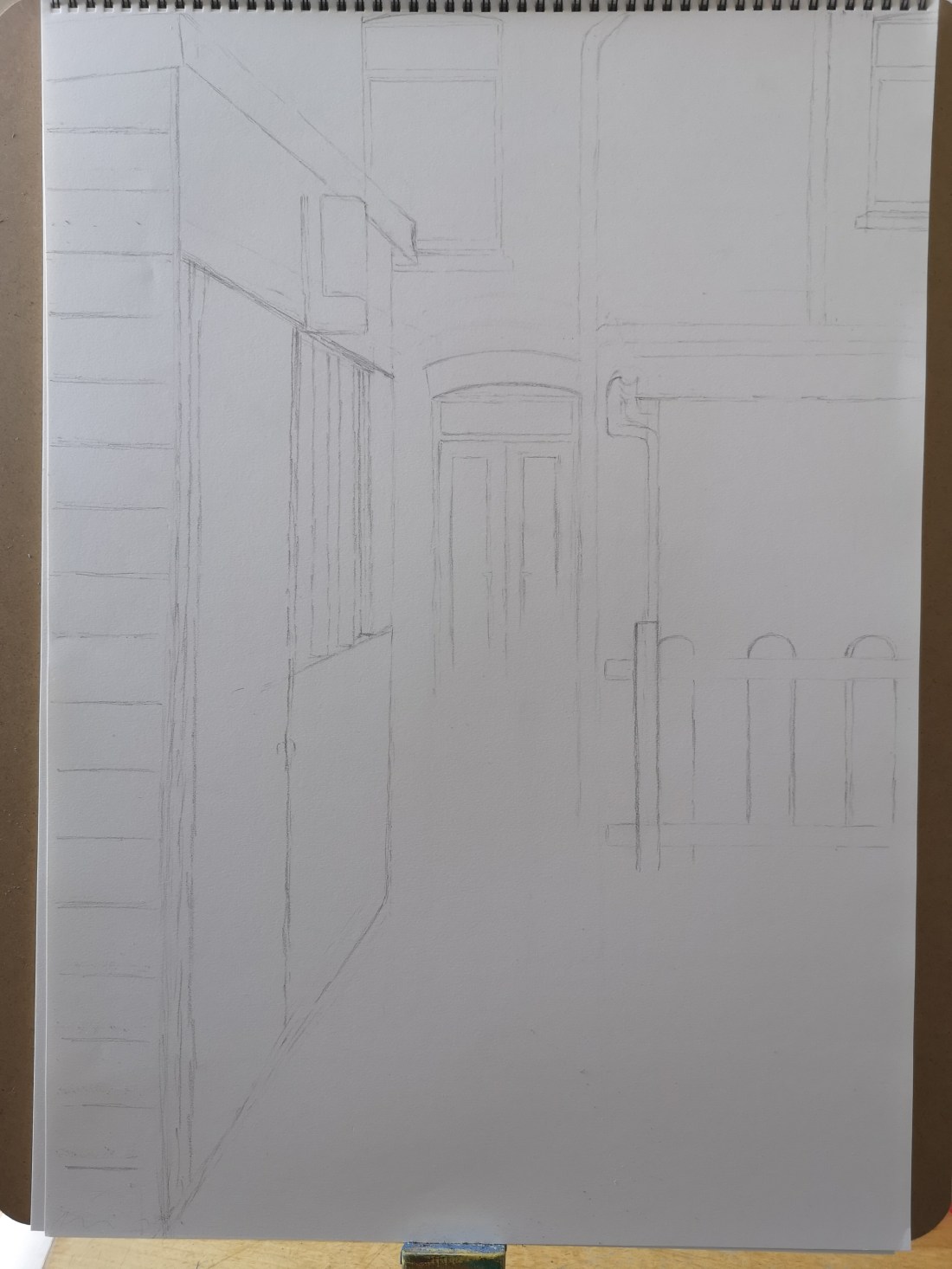
I next started on my final piece. I used A2 medium weight cartridge paper. I began by drawing an outline in pencil.
I found problems with perspective when using the photo – there seemed to be lots of vanishing points. I therefore instead related each of the features by their proximity to each other – e.g. the outer edge of teh shed light was in line with the outer edge of teh window above; the outer edge of the door was in line with the middle of window above; the bottom of the shed window (far side) was in line with the top of the gate post. I felt this also helped with the flow of the image.
I took me what seemed like ages to complete this initial outline and was frustrating at times but I persevered and think it was worth it. This initial outline focused only on the straight edges – I just left space where the foliage would be.
I then started applying colour from background to foreground. I decided not to use black (focusing only on colour to capture the effect of light), so for dark spaces I took a keener look and tried to capture the colours within which I felt added depth. I got some problems with warping of paper, but this tended to reduce with drying.
As I was working I liked how the light was being captured, felt what I had envisaged was coming to fruition. I felt some of the edges were rough and thought about this as I worked. I decided I could use pencils to finish these off. This allowed me to focus on the initial stage without getting to wrapped up in the outcome.

Although the greenery of the middle ground was not complete, I moved onto the foreground, I wanted to complete all the large straight edged shapes first. I was a bit more apprehensive because it was foreground and very prominent in the piece, so was keen to get more even coverage. However, I realised that the effect of the inktense when it is wet (at least when I do it) leaves a grainy look which lent itself to the surfaces so I became less hung up about it.

Once I had completed the block areas on the shed, I began to look at different tones created by the light reflecting on the front as well as the detail of the tongue and groove. I used watercolour pencils to assist at this point as they provided a more translucent colour over the inktense.

Next I broadly coloured most of the green areas with a light shade of green inktense, this I hoped would give a good base to allow me to draw over with a variety of different tones and colours to create the detail of the foliage with a variety of mediums.
I then added base colour to the tree and added some darker tone to the foliage, and then coloured the drainage pipes all with inktense. At this point I felt there was no further need for inktense and the remainder of the drawing was completed using a variety of watercolour pencil, coloured pencil and oil pastels.


I really just used my gut feeling to decide what medium to use where from this point on. I found the pencils very good for the details and particularly for creating depth in amongst the foliage.

I kept on working on the detail of the foliage until I reached a point where I felt I could go no further
Final image is below.

I feel my final piece does give a sense of depth in relation to foreground to background and I feel I have been able to capture a sense of it being a sunny day, and the direction of the light. There is a contrast between the hard lines of the built structures compared to the natural foliage and I feel the colours work well. I also feel like I have used a good range of tone. However I don’t like the middle green section of the picture, I don’t feel I was fully able to capture the depth of the foliage at this point. I am unsure as to whether this is due to tone or my drawing skills, I did work on the area for some time but felt I was in danger of getting too bogged down with it. On the plus side I think I have worked well on the tree and I think it is mainly this which helps to define this area.
In terms of technical skills I think I have used perspective well and my mark making is good in relations to the drawn parts, however I don’t think I have applied the inktense well (when adding the water) and my straight lines are really poor as I find I seem to shake, but I tried to just go with this and use the other medium to work round any issues.
In terms of meeting the assignment brief, I feel I have achieved all that was required, and I experimented before hand before committing myself. I think one draw back is that my initial sketches are always much smaller than the final piece and in this case I don’t think my use of the inktense scaled up well. This is something I will bear in mind in future.
Overall I don’t think landscape drawing is my strong point, I think that only practice can help me improve. I think I mainly need to build on form, texture, shapes etc in nature and would therefore benefit from repeating the tree and cloud exercises from the beginning of part 3 as much as I am able.
