Drawing Skills 1: Pt 3; Project 5 Townscapes – Ex 2 – Study of a townscape using line

I really did not enjoy this exercise, it didnt feel right when I was drawing and I really struggled to get any sense of perspective or depth. I therefore repeated the exercise on a smaller scale with a different view but don’t think it made any difference.

Both my sketches are below, I dont know how this could be improved when using only line – perhaps I’m being to rigid with regards to the brief. I did try to add a brief hint of sky and to use cross hatching and different thickness of lines to indicate shape and form, but I still think the results are very flat.

Drawing Skills 1: Pt 3; Project 5 Townscapes – Ex 1 – Sketchbook of townscape drawings

I completed this task in my local area. It took me a while to get into it, but I was pleasantly surprised that the more I looked the more I saw and the more I became interested in. I found myself tending to find lots of detail which I wouldn’t usually notice, in particular wires and cables from telegraph poles and aerials on roof tops. I realised that I have become so familiar with my surroundings that I don’t even notice these things most of the time, only really seeing the main structures of houses and their features.

I decided to develop the last sketch further, I chose to use my preferred medium of pen and pencil. I didnt really have a plan in mind but decided to just draw and see what happened. I took a photo for reference. I ended up drawing quite a detailed image which I felt was simplified at the same time: with pencil the colours are gentler and so give the scene a serene quality (see final image below).

I’m not sure about the result. I feel I have got the fore, middle and background right but I’m not sure I like the overall effect as it seems a bit child like, but at the same time I’m not sure what I’d do differently. In the past I have felt that a more bold use of pencils has been called for but I dont think it would benefit the picture this time.

Drawing Skills 1: Pt 3; Project 5 Townscapes – Research point – Urban environment

For this exercise, I am asked to research John Virtue and his London series of paintings and to look for other examples to use for inspiration for my own ideas.

John Virtue created a series of London paintings whilst artist in residence at the National gallery during 2003 to 2005. Over the 2 years he drew the view of London he saw daily from different points on each side of the river Thames. His daily drawings were then used as reference to create 11 larger scale paintings on canvas.

All of the paintings were completed in black and white with acrylic and ink as is Virtue’s usual medium. His method involved first carefully drawing the features of the landscape, then overlaying with paint in various ways to create the atmospheric elements and sky. Virtue says that he does not use colour as it serves as a distraction he is also noted to have left more modern features such as the London Eye out of his landscapes, focusing on the more historic and classical skyline.

The absence of colour, very physical mark making and size of the canvases (all over a metre square) contribute to a very dramatic effect, which critics noted along with his process to be reminiscent of Turner.

Three of the paintings are shown below:

John Virtue, Landscape 662, 2003 (white acrylic, black ink, shellac and emulsion on canvas)

John Virtue, Landscape 664, 2003 (white acrylic, black ink, shellac and emulsion on canvas)

John Virtue, Landscape 739, 2004 (acrylic and shellac on canvas)

When I look at the paintings the skyline is barely seen, and without any colour the focus is mostly drawn to the way the medium has been applied to the canvas. This ranges from a softer stippling effect to great big sweeping brushstrokes across the canvas. These provide different senses of movement which could be related to weather and atmospheric conditions but to me seem more connected to emotion. I have not seen the paintings in person and so I know that there is a limit to what I can see when I look at the paintings online, however, when I look I keep wanting to see them in colour as I wonder what is missing. I feel, therefore, that these paintings perhaps challenge my reliance on colour to tell me what is happening in a painting. This also brings me back to earlier research in this course on Odilon Redon who used monotone in his charcoal drawings to evoke a sense of drama and mystery. I think in the same way Virtue creates great areas of blackness within the familiar London landscape which contribute to the dramatic effects but also evoke a sense of mystery and encourage the viewer to look deeper at what they see and feel.

Christoph Nieuman is an artist who primarily works in the field of illustration. He has created a series of ink drawings whilst travelling in different parts of America and the rest of the world. I first heard of his work through a documentary I saw on Netflix. I was interested in the way he simplified objects for visual communication and illustration.

I became aware of his ink drawings after following him on instagram and was instantly drawn to them as they use minimal colours and marks to effectively portray what are often very familiar scenes.

A few examples of his works are provided below.

Christoph Nieuman, Avenida Paulista, (Ink on paper)

Christoph Nieuman, Hora do rush, (Ink on paper)

Christoph Nieuman, LAX, (Ink on paper)

I like most that even though the brushstrokes are very flat and simple, there is no attention to sky, ground or atmosphere, each of the drawings is very effective at giving a sense of scale and perspective. I really like the way they are so minimalist, as if he is trying to use as little ink as possible. I also like the fact that the colours are not necessarily true – for instance the first image is in purple monochrome which does not appear realistic but equally does not seem to matter and is still effective.

I am keen to draw on Nieuman’s approach to drawing in my final assignment for this part of the course, in particular the simplistic approach and use of colour. I will experiment and develop this further in my preparatory work.

Drawing Skills 1: Pt 3; Project 4 Perspective – Ex 3 – Aerial or atmospheric perspective

I completed 2 sketches for this exercise using photographs I had taken whilst travelling, for reference.

The first drawing used coloured pencil. I started with the background and sky, lightly shading with green pencil, and then gradually building in first blue and then yellow for areas of light and red for subtle tonal changes created by features within the landscape such as groups of trees. I then used mainly green, blue and red to draw the trees in the foreground but using the points of the pencils to try and get greater definition and sense of distance from the background.

For the second image I used tinted charcoal pencils, again going from light to dark from background/sky to foreground. I again picked out variation in the landscape by using different mark making methods and subtly varying the tone so that the land did not simply appear flat.

Both pieces are provided below.

Drawing Skills 1: Pt 3; Project 4 Perspective – Ex 2 – Angular perspective

I did a line drawing of the shed in my back garden using black ball point pen, from an exterior corner view.

I found this easier than the previous exercise in terms of the general shape, but had some difficulty in working out the spacing between the features such as doors, windows and wooden slats, but perspective theory cant help so much with that so its really about trial and error I suppose.

When I finished I drew my eye level line on the page in blue ball point pen and found (as suggested in the course material) that none of the structural lines met the line as the angle was too wide and vanishing points were therefore off the page. I’m not sure then how the theory helps for these kind of drawings, as I am left relying on my eyes to judge.

Below is my drawing.

Drawing Skills 1: Pt 3; Project 4 Perspective – Ex 1 – Parallel perspective – an interior view

I drew an interior doorway within my home just using my eyes to judge perspective initially. This was done using a black ball point pen – line drawing only. Once I was happy with the drawing, I drew in where I thought my eye level was, on the actual drawing. I used this to draw a horizontal line across the page (drawn in blue ballpoint pen) from which I then checked the perspective using a ruler and pencil.

I checked the perspective of the door, the interior corners of the door frame and the vertical lines of the floor boards. I found that the upper part of the drawing was more accurate than the lower (apart from the floorboards which were totally off!), which is interesting, I wonder if this is partly because to look at the bottom half required adjustment of my eye line?

I re-drew the parallel lines in red ballpoint where appropriate and comparing this with my original indicates that I wasn’t too far off. It also showed that because of the angle of the door there were 2 vanishing points (one where the interior door frame angles and horizontal floor board lines meet and the other where the door angles meet) which threw me a bit for a while, but worth bearing in mind for future reference.

Below is the drawing with all amendments.

Drawing Skills 1: Pt 3; Project 3 Composition – Ex 2 – Foreground, middle ground, background

I was keen to continue with developing the sketches from my back garden, in particular the one I have developed in the composition exercise. However, in the course guide it is suggested that only wide open landscape can be used for this exercise, stating also that it is essential to include sky in the image. I have therefore looked back to previous photos taken whilst holidaying and chose the photograph below.

I decided to start with pastel pencils for this exercise, I felt this would help to create the soft muted background more easily.

I started by drawing the sky and then built the image from background to fore. I found it harder than I expected to do this exercise. I had assumed that because it was easy to identify the differences just by looking at the landscape which had also been captured clearly in the photograph, that this would therefore be easy to translate to the drawing. I had an idea that it would simply be a matter of overlaying blue grey layers, with the background being lightest and that I could simply use other medium such as pencil and coloured pen to increase detail in the foreground.

It was not so easy to do this, but what I also found was that it was most difficult to maintain some sense of form whilst holding back on detail for the middle and foreground. What I did eventually was to just keep working in layers; first creating tone and then smudging and and then repeating until I was happy. I also used fixative a few times so that I was then able to gently colour over with a blue pastel. Whilst working tonaly I also tried to shade according to the shape of the landscape, so in curves and upward movements which I do think was effective in giving form to the hills.

I used coloured pencils and pens to make the detail more fine in the foreground, but also found that intensifying the colour helped to bring the foreground forward and therefore create more depth.

When I thought I had finished I realised that the sky was lacking depth and perspective so I worked on this some more to try and add more of a sense of distance in a similar way to the landscape. I found this the hardest aspect of the drawing. It is very difficult to prevent the sky looking as if it is like a wall going upwards rather than being above and beyond towards the horizon.

I’m happy with the outcome of the ground, but feel the sky is my weak point and this is something I can only get better at with practice. There is always room for improvement and development. If I were to do the whole thing again I think I would experiment first with different medium for ways to get the distinctions in tone between the different areas. I’m also keen to practice this exercise with the image I worked on in the previous exercise, I am considering using that for my assignment 3 and I think this exercise would help in the development stages.

Below is the final outcome.

Drawing Skills 1: Pt 3; Project 3 Composition – Ex 1 – Developing your studies

Following my research on landscape artists – past and present, I was keen to develop the studies of my back garden further. I see it as a familiar place and am particularly interested in looking out for things I don’t usually see, looking at how the light effects it at different times.

Looking at the earlier studies I had made and photographs I had taken, I decided to look at different ways to frame the views to make an interesting study. As it was a sunny day, I also decided to take new photos of each of the views to consider any new interest which may be added.

The original and secondary images are provided below:

Original photos, taken early afternoon, in summer time on an overcast day. These were the photos I took just after each of my sketches (see earlier blog post). Initially I most liked the image in the top left hand corner, I was particularly drawn to the different lines created by the wall, ladder, trellis and other items. However I also felt the view was quite busy for developing further, and I struggled to crop it whilst retaining interesting lines and natural foliage.

Second set of photos taken in summertime, early evening, sunny day with light clouds.

After taking the second set of pictures, I was drawn more to the image on the bottom right, because of the shadows cast, however I was concerned that this did not contain enough foliage and was not interesting enough to carry forward, I also though the actual space was too small to really qualify as a landscape.

I decided instead to work on the view from the end of the garden towards my house (bottom right on original set and bottom left on second set of photos). I liked this view as usually I would view my garden from the opposite direction. I also felt it contained different elements of landscape that were interesting and I had purposefully used a vertical view which I felt added a different dimension to the idea of landscape. I decided to explore this view further at different times of the day.

All the above were taken over a few days after the first sets of photos, at different times of day with slightly varying weather conditions. Clockwise from top left, late evening, sunny, visible sky with light cloud; morning, sunny with light cloud; morning cloudy; late morning, sunny with light cloud.

I liked the bottom right image best as I felt the view had the best combination of light and shade. I also liked how I was still able to see the differences in tone caused by falling shadow – in the sunnier views these contrasts were much more difficult to determine. I decided then to play with the framing of the composition I wanted to draw. Thinking back again to my research, I was interested in Peter Doig’s concrete cabin series, and decided to focus in further and to remove the sky. I thought that this would have the effect of drawing the viewer in. I also thought it may help focus on the fall and effects of light without distractions.

The above image is the composition I decided to take forward as a drawing.

Drawing Skills 1: Pt 3; Project 3 Composition – Research point – contemporary artists working with landscape compared with earlier artists

For this piece of research I decided to make comparisons between John Constable and Russel Crotty.

John Constable is a notable English landscape active in the early 19th Century, and an influence for the impressionist movement. He moved away from the taught methods of painting landscape at the time which encouraged painting from imagination and insisted instead on working direct from the landscape, painting studies outside from which he created his larger pieces. In particular he painted with oils outside which was unheard of at this time.

Constable is particularly renowned for his scientific observation of atmospheric conditions. He studied clouds in their various form, identifying the particular classification in his paintings. He was therefore quite meticulous in depicting realism within his paintings and this is also achieved through his attention to the effect of light on the landscape. His technique was to use very free and vigorous brushstrokes, he also used techniques such as stumbling over lighter areas of paint to allow the lighter paint to show through.
John Constable, Wivenhoe Park, 1816, Oil on Canvas

John Constable Cloud Study, 1822, Oil on canvas

Russell Crotty is an American contemporary artist, born in 1956. His primary medium is ballpoint pen and his work includes astronomical drawings of the night sky and landscapes. He draws from observational studies, adding text which reflects his experiences and thoughts, or from written material. His astronomical works are noted for their accuracy; Crotty is an amateur astronomer and has contributed his observations to the likes of NASA.
Crotty’s technique is to use very small cross hatching marks with ballpoint pen, usually over a very large scale and on paper coated suspended globes. He describes his work as investigating and expanding the notion of works on paper.

Russell Crotty, M11 Galactic Cluster in Scutum, 2002

Russell Crotty, Point Saint George, 2009,

Both artists are concerned with depicting realism in particular elements of their art, and have a certain scientific basis to this. Both also contribute to the development of artistic process beyond (pre) existing boundaries. They’re work also stems from direct observation and engagement in the landscape.

A significant difference is in their methods and medium – Constable, a painter, noted for very vigorous and free marks, using oils, whilst Crotty is noted for very small purposeful marks using pen on paper, he also adds text to his drawings which Constable did not although he did make notes on the back of his studies recording direction of light and weather conditions.

Drawing Skills 1: Pt 3; Project 2 Landscape – Research point – artists who work in series with the landscape

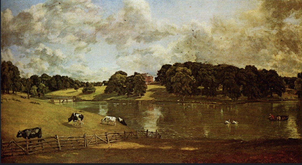
I looked at the following historical artists – Claude Monet (active 19th-20th Century; Paul Cezanne ( active second 19th-20th Century) and the contemporary artists Peter Doig, and Nicholas Herbert.

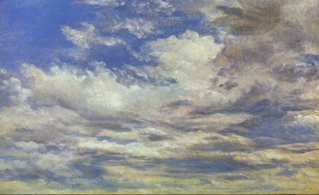
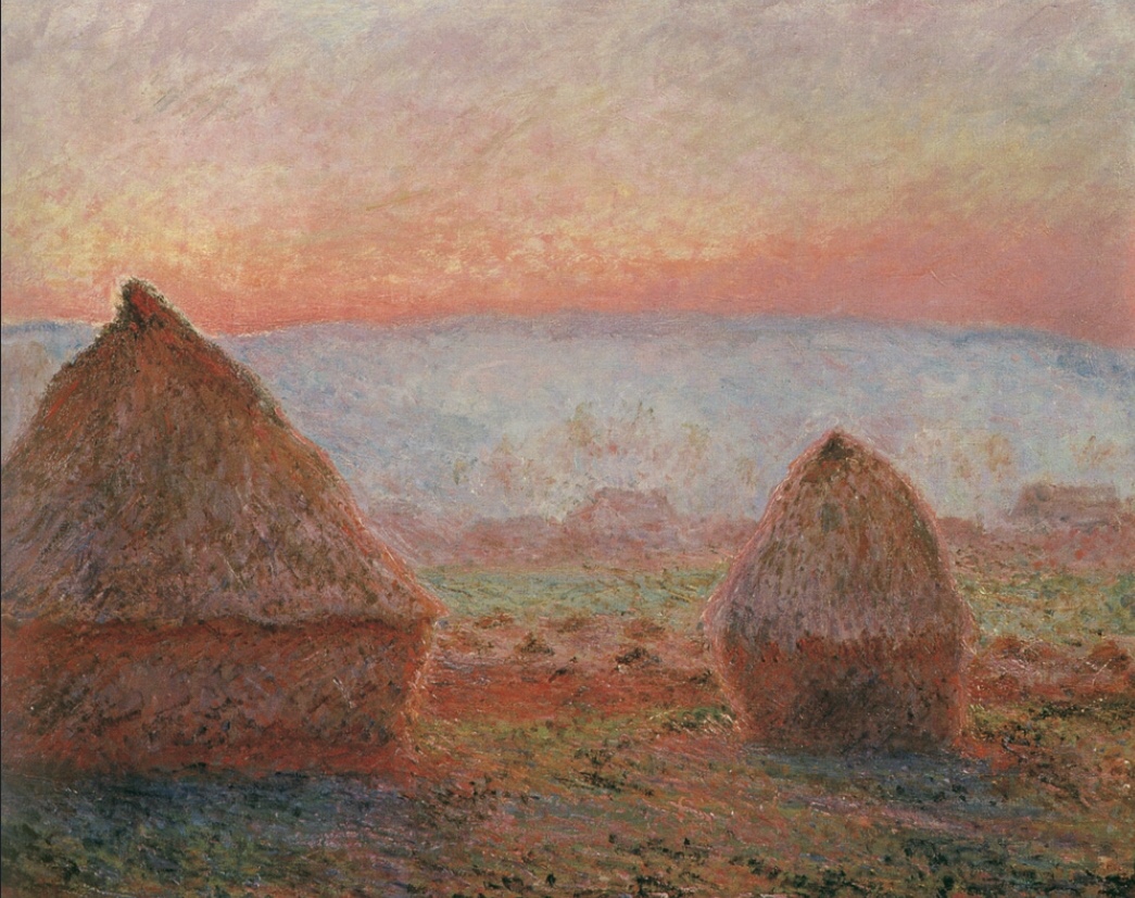
Monet is renowned for being a founder member of the impressionist painting movement in art and for completing several series of paintings. Many of these were completed in the area within and around where he lived and one was a series of paintings of hay and grain stacks which he painted from direct study. They were painted across different seasons and times of day with the purpose of capturing the different light effects which was a primary aim of his artistic career. It is noted that Monet would often work on different paintings at one time in any one season with each relating to a different time of day, thereby working on several paintings throughout the day. Each of the paintings uses different combinations of colour to capture the effects of shadow and light hitting the stacks and surrounding landscape, and each is titled accordingly. The brush strokes are very evident, small marks and when you look closely they comprise of different colours which on viewing the painting as a whole become blended, which is the essence of impressionism. The technique along with the mostly pastel colours used gives a very soft yet dynamic appearance, whilst also looking real – it is easy to recognise the scenes he portrays as true to life.

Some examples of these paintings are shown below.

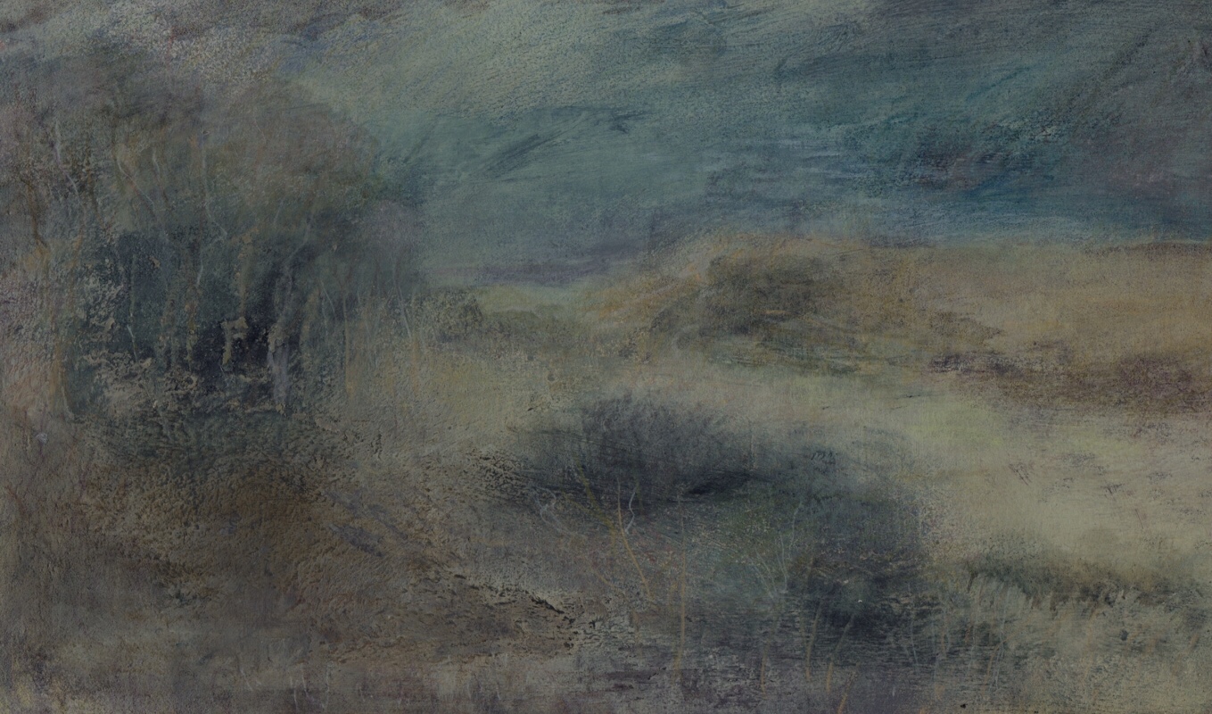
Claude Monet, Haystacks at Giverny, the evening sun, 1888 (oil on canvas)

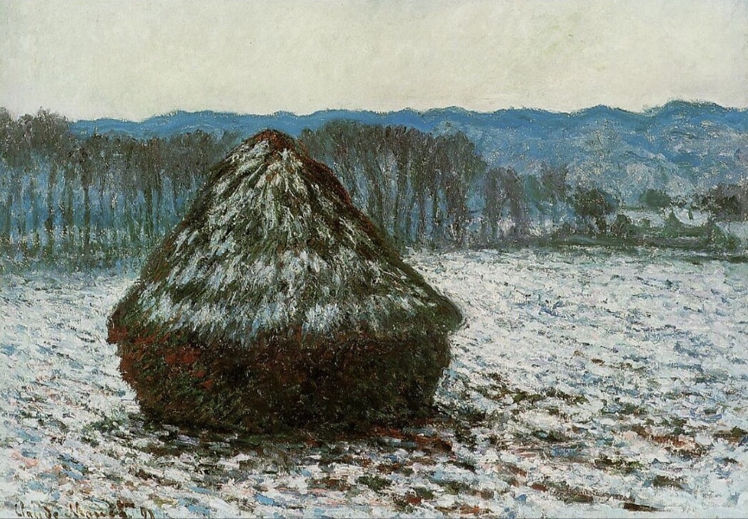
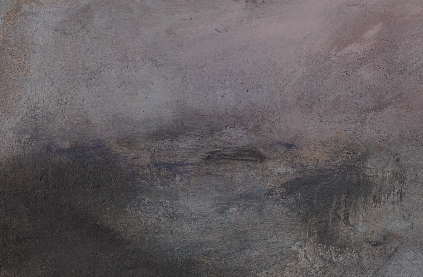
Claude Monet, Grainstack 2, 1891,

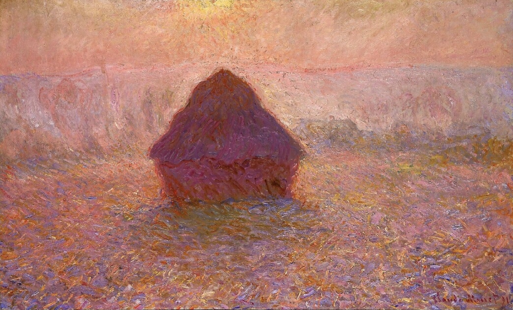
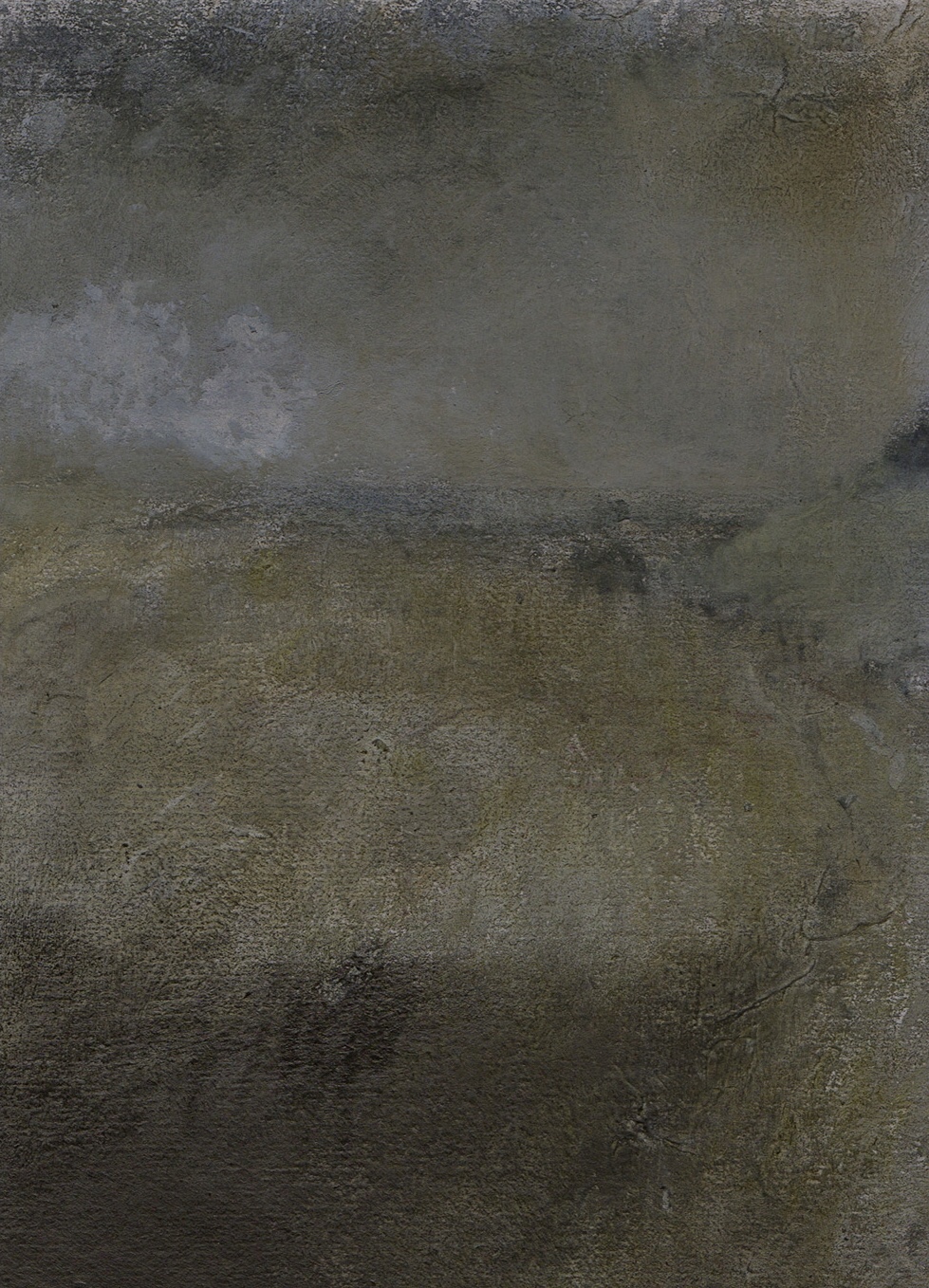
Claude Monet, Haystacks in the mist, 1891

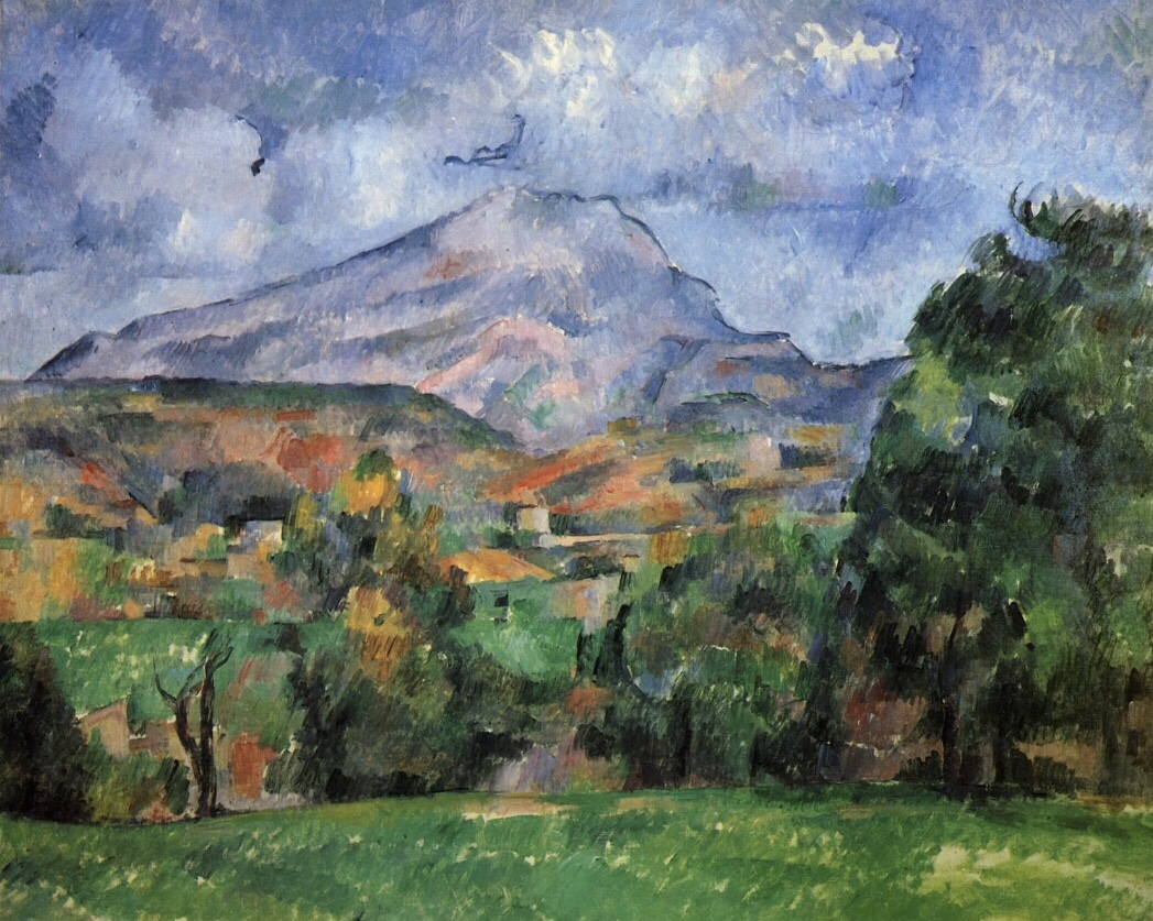
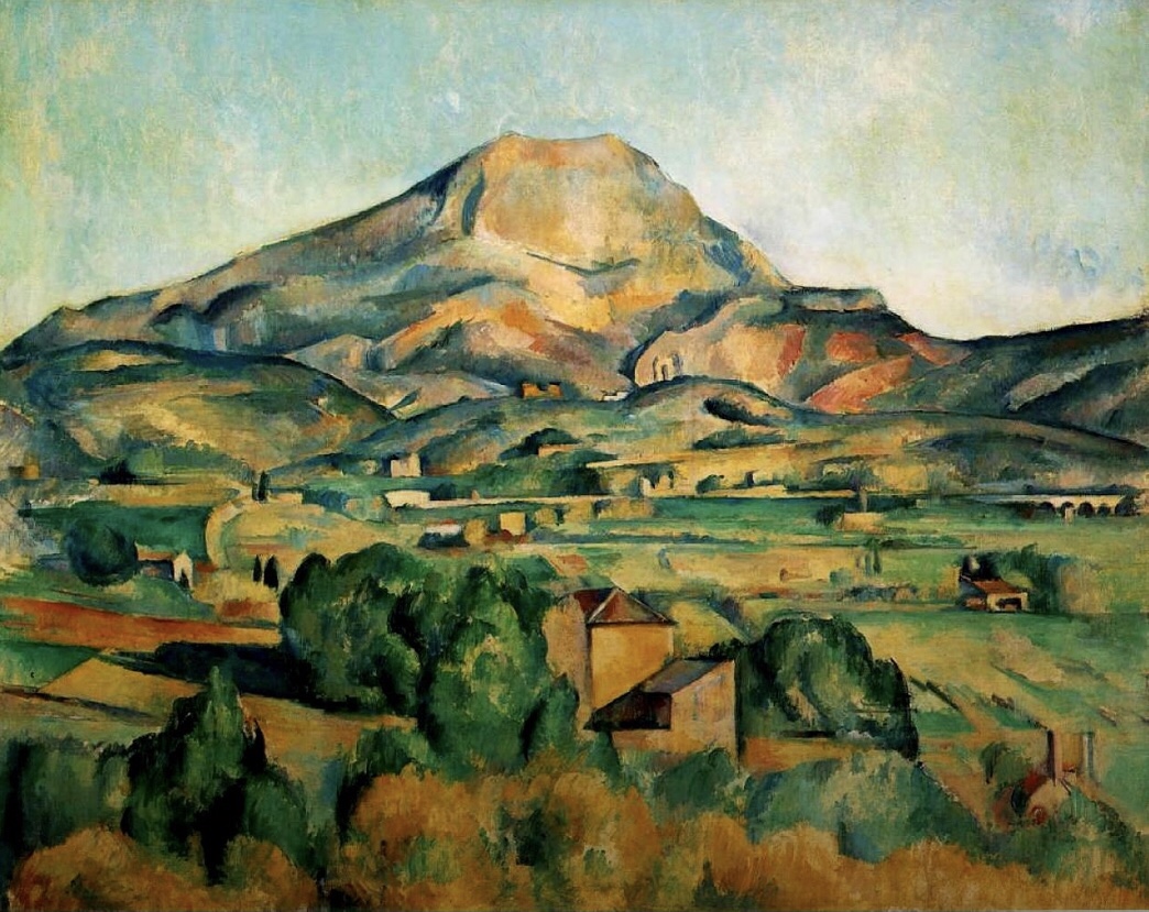
Cezanne was a post impressionist and is noted for his intense studies of his subjects. He was interested in reducing natural form to essential 3 dimensional shapes e.g. tree trunks as cylinders. In particular, he is known for a series of paintings he made whilst living in the south of France. They each depict a mountain which could be viewed from his home – Mont Saint-Victoire. He completed several paintings over a few years; many with different perspectives and including different features of the surrounding landscape

Each of his paintings appear quite different although all in the same style which characterises Cezanne’s paintings. Each painting seems to use a slightly different palette of colours to depict the features of the mountain, surrounding scenery, and weather conditions. The brush strokes appear very short and frequent, as if applied in a very quick and sketchy manner. His use of colour is very bright and harmonious, but by not being physically blended on the canvas they are all visible and seem to stand out as features of the landscape which they depict, also helping to shape and define the view. Each of the paintings has a variant characteristic either in the tone and colour or the surrounding landscape and therefore appears as if he has seen it differently each time. In contrast to Monet he does not appear to be aiming to capture different elements such as light or to be trying to perfect a final image, rather he simply seems to really enjoy and admire what he sees and to be drawn to paint it again and again.

Some examples are provided below.

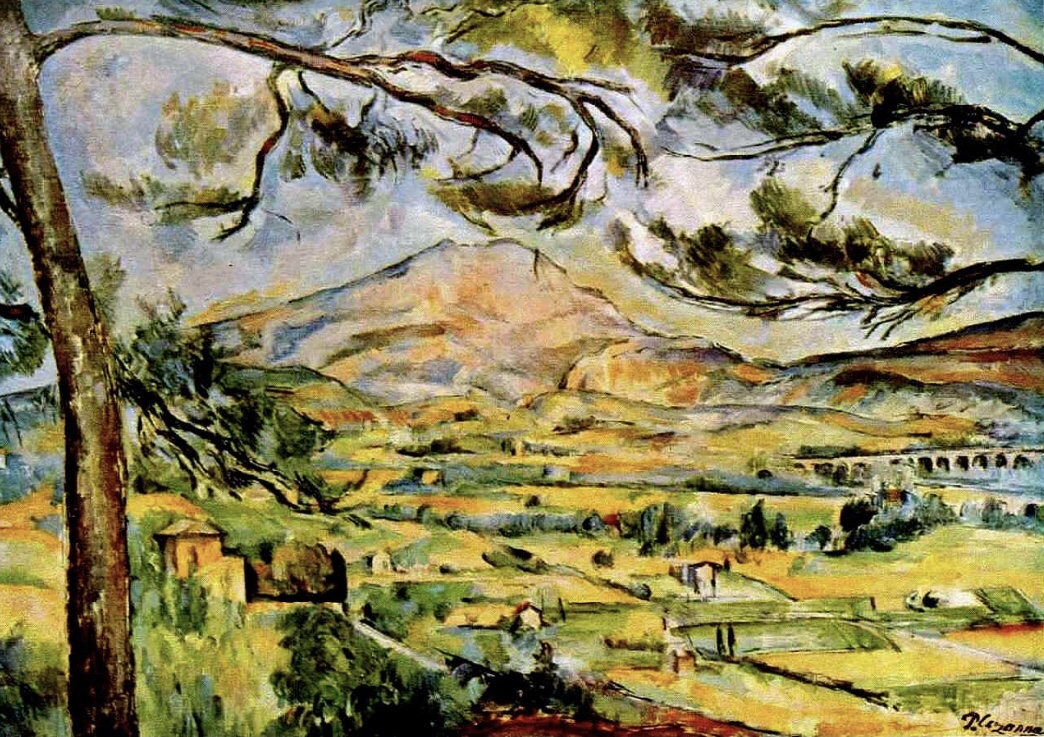
Mont Saint-Victoire 1887

Mont Saint-Victoire 1890

Mont Saint-Victoire 1895

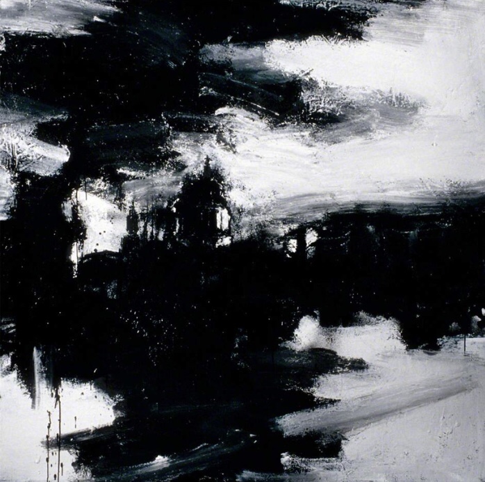
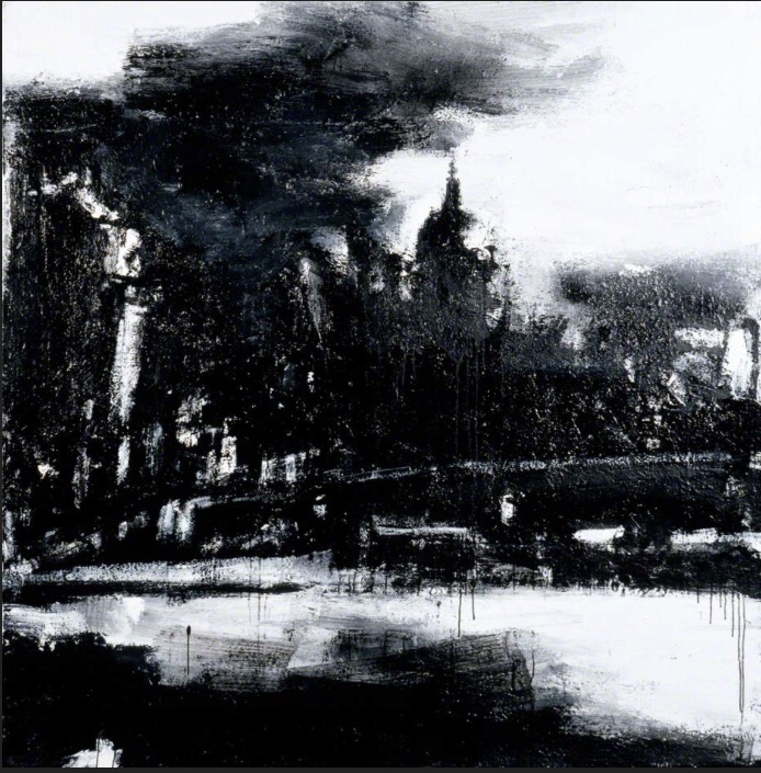
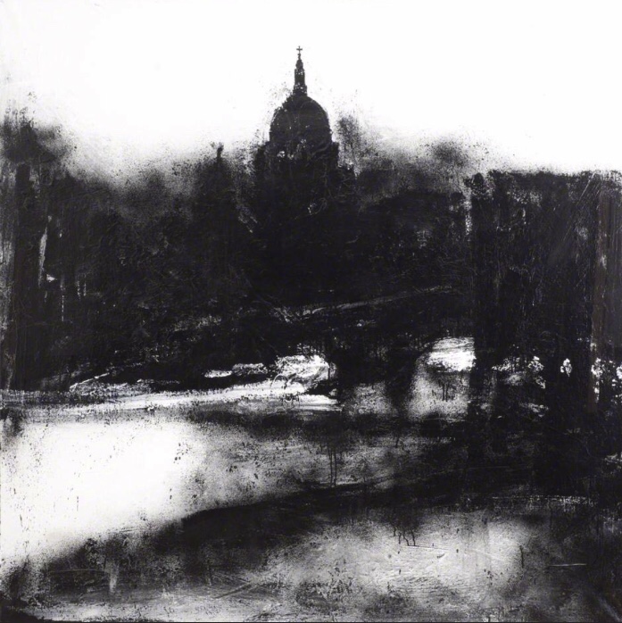
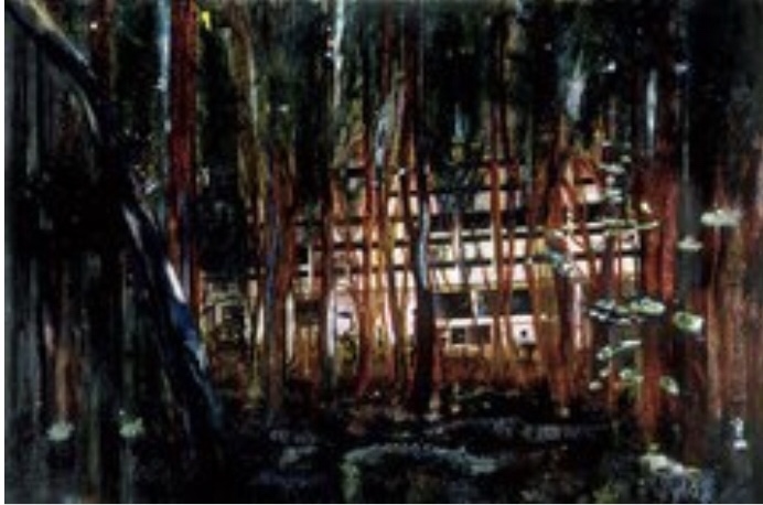
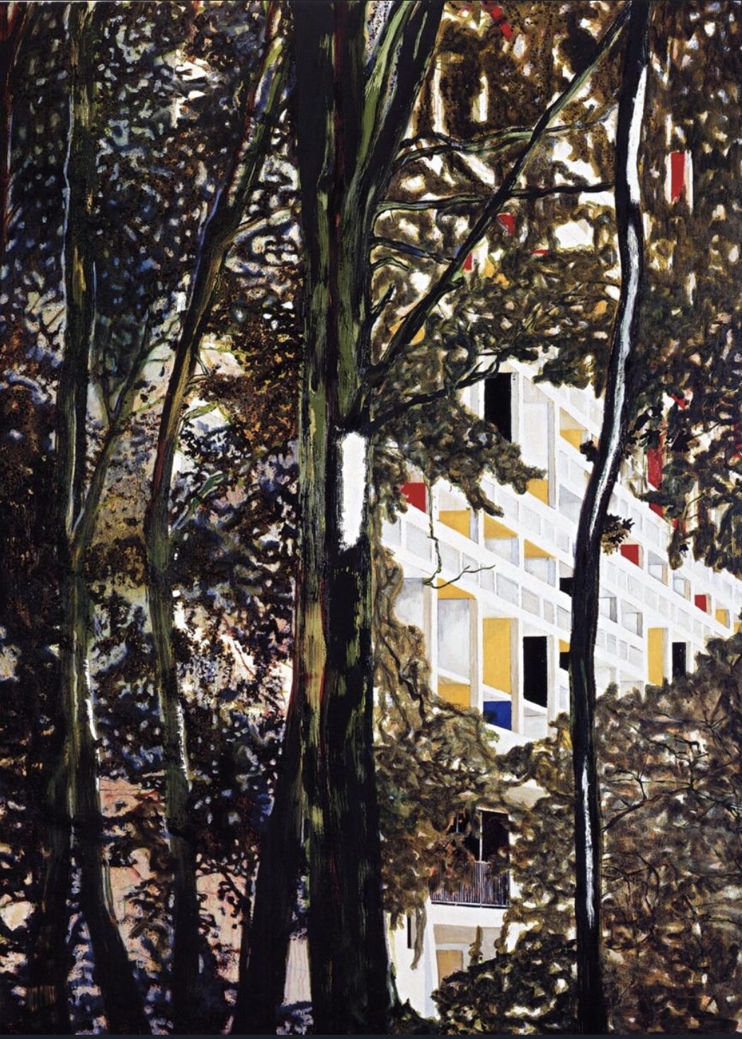
Peter Doig created his ‘concrete cabin’ paintings from his visit to the unite d’habitation apartments over a period of 8 years. The apartment block was designed and built as an ideal living space in 1961 but was derelict by 1973. I was surprised to learn that the paintings he created were taken from stills of video footage he took whilst there. Each of the paintings seems to focus on the atmosphere and gives a sense of being within the space depicted. The buildings are surrounded by wooded areas and in some paintings they are difficult to make out, which gives a sense of looking through the trees almost searching for the buildings. There is no sky evident in the images I viewed which I think adds to this effect.

The colours used for the woods are quite deep but vibrant enough to identify the trees, they are also in contrast to the much lighter almost all white buildings which are therefore made more visible between the trees. Doig’s brush strokes appear to be applied in a much more meticulous way, he is noted to build up his paintings in layers which is perhaps what gives the apparent depth to these images. His painting style is termed ‘magical realism’, and looking at them I take that to mean some kind of dream like quality based in reality. There is a sense of otherworldly, I can imagine them as an alternative fantasy world, which in a sense is what the buildings were intended for originally.

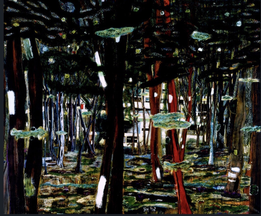
Concrete cabin 1991-2 oil on canvas

Cabin essence 1993-4 oil on canvas

Briey (concrete cabin) 1996

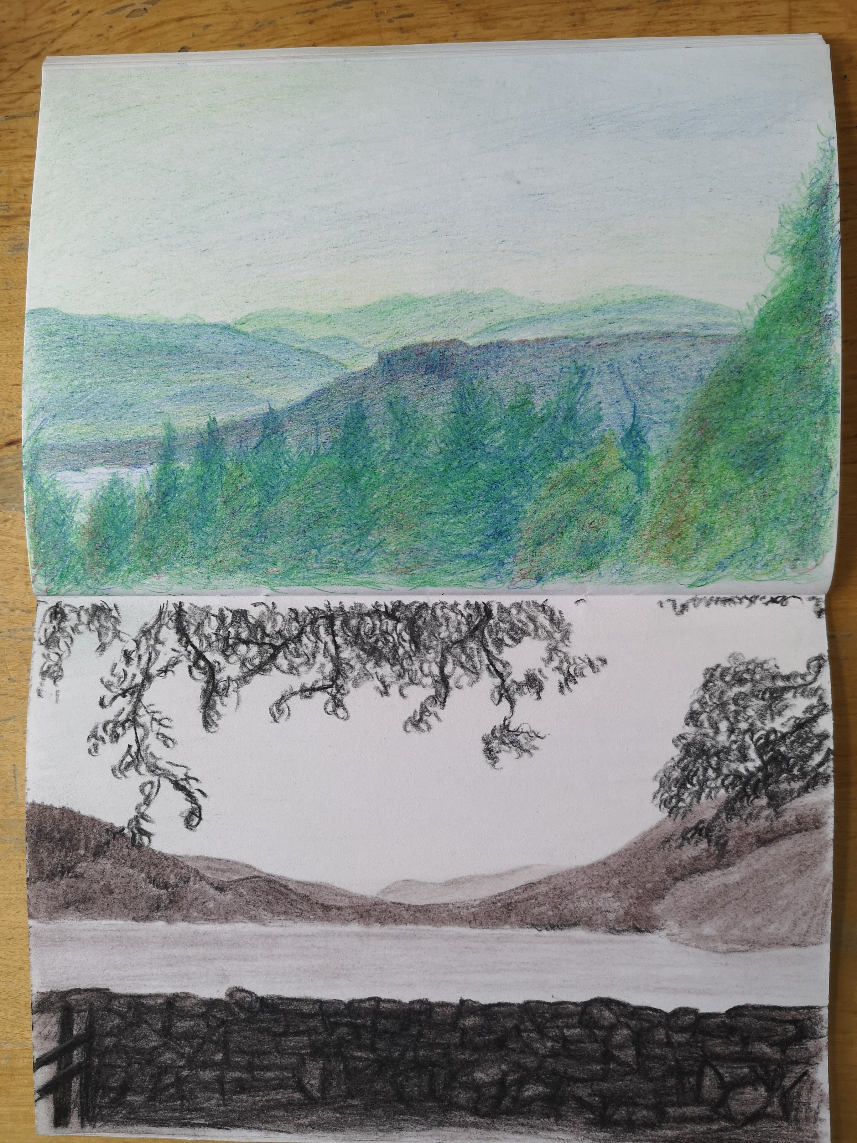
Nicholas Herbert has produced a series of artworks inspired by the Children hills. He described the works as capturing the sense of the primitive space through memory and experience rather than as an intended copy of the view. Each of the landscapes is created with a modest range of mixed media and with a more earthly palette, which he says removes the romanticism. He also describes a process of mark making in which he allows the process of application to help influence the outcome, for instance often the paper may degrade or scuff which he feels adds texture and rawness to the work.

It is easy to see what Herbert describes when you see his works. The marks are very varied and through the textures created do give a sense of drama and earthliness. I sense very forbidding, unsympathetic and wild landscapes so feel he is effective in his outcome. It is only the titles which give a hint to the inspiration for each scene, however I feel that whilst none of his works may be recognisable places, I do recognise them as landscapes.

Below are a few examples of his work.

Nicholas Herbert, Landscape L921 Sharpenhoe series, looking out from Markham Hill, the Chiltern Hills, 2016 (Mixed media: Graphite, coloured pencil, soluble crayon, acrylic and pastel on white paper)

Nicholas Herbert, Landscape L1056 View north to a low hill, the Chiltern Hills, 2017 (Mixed media: Graphite, soluble crayon, acrylic, conte crayon and pastel on white paper)

Nicholas Herbert, Landscape L1164 View towards Pitstone Hill, the Chiltern Hills, 2019 (Mixed media: Graphite, soluble crayon, acrylic, conte crayon and pastel on white paper)

Across each of the artists I researched, whilst they had different outcomes or intentions in mind, there is a consistency in their approach which is to do with familiarity of the places they depict whether from continuous observation, admiration, or exploration.

I was quite surprised to learn that not all artists paint or draw from direct observation or on site, in particular Peter Doig only uses reference material such as photographs and postcards, although for his series he was drawing from his own direct experience which he captured on film.

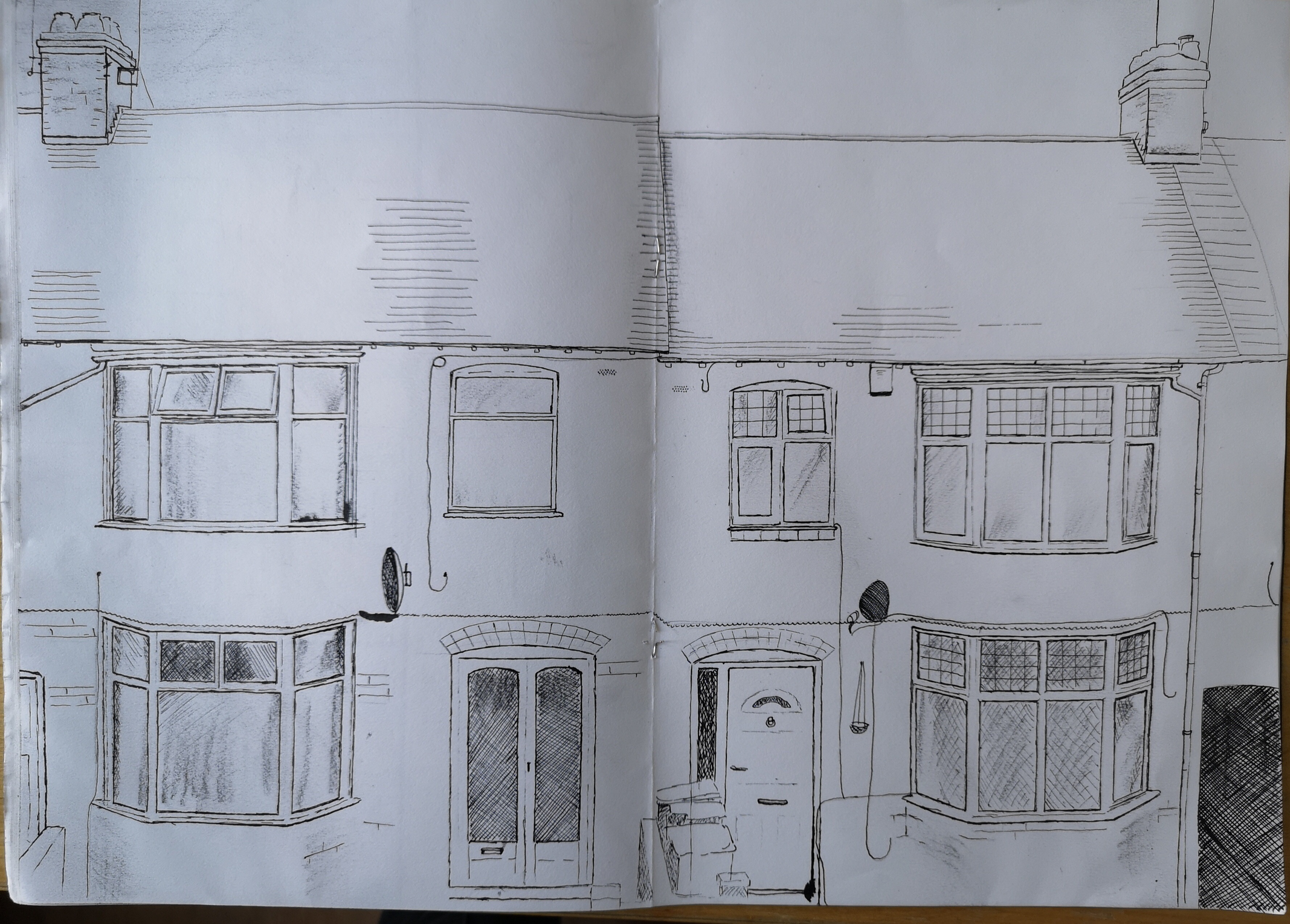
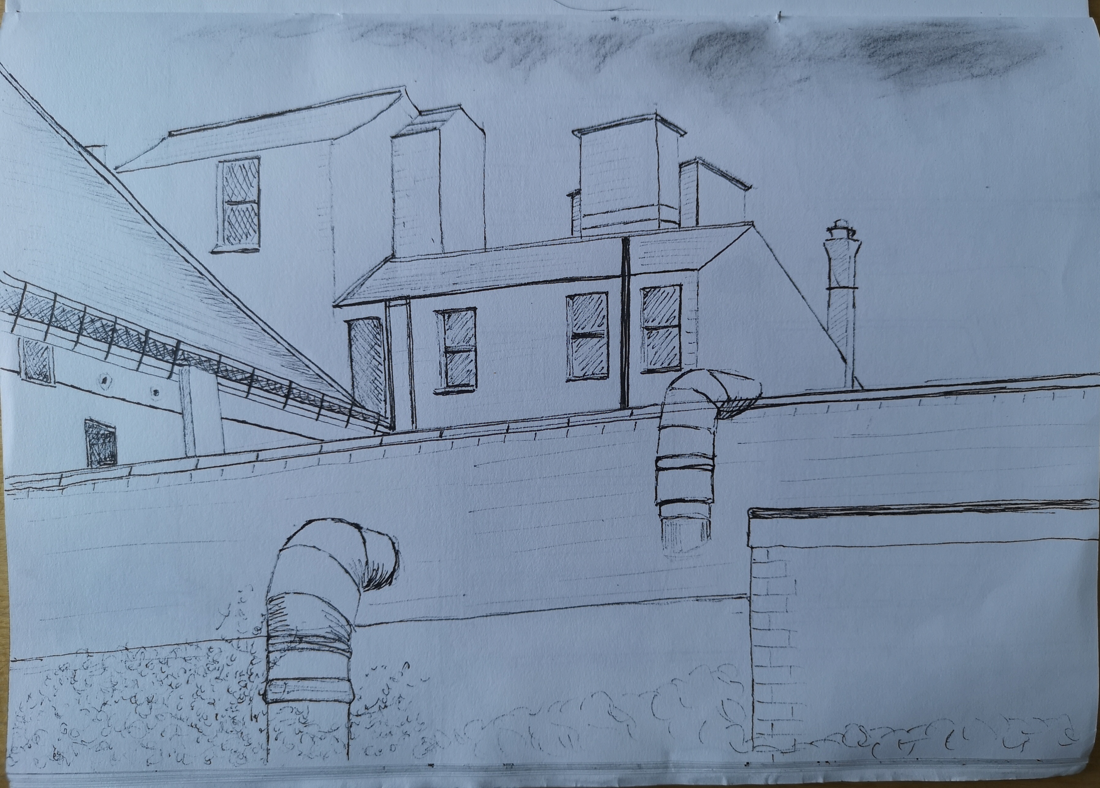
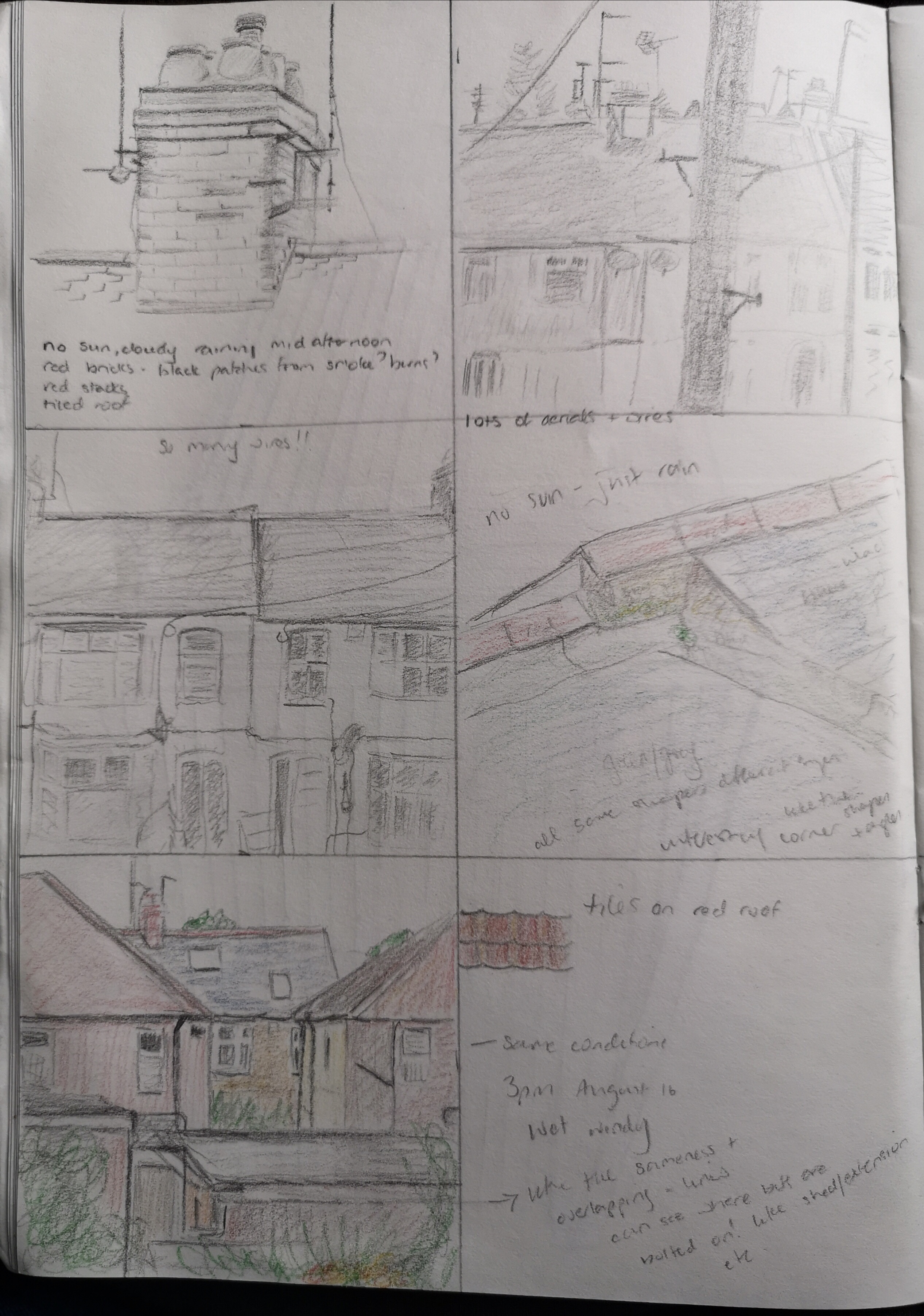
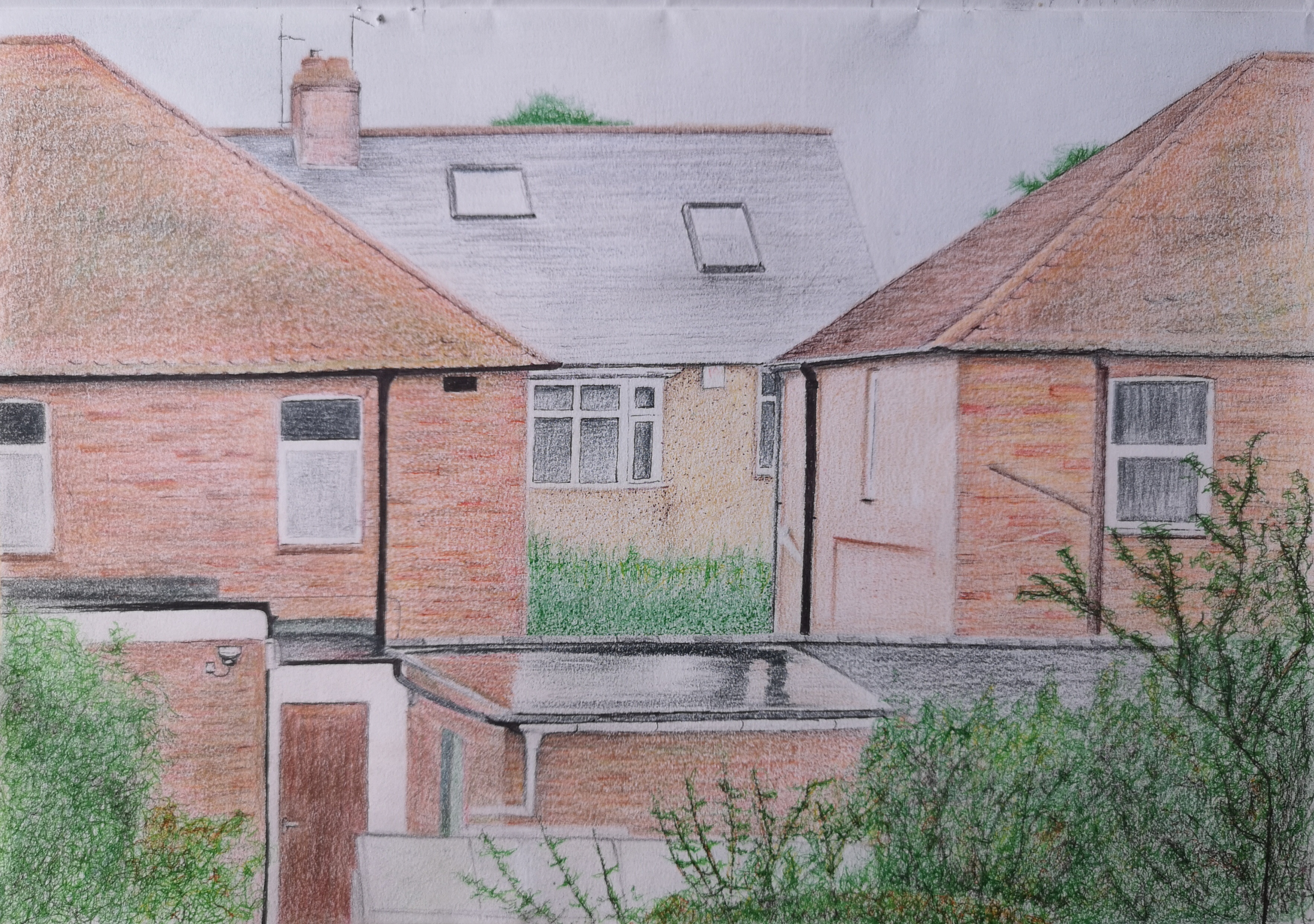
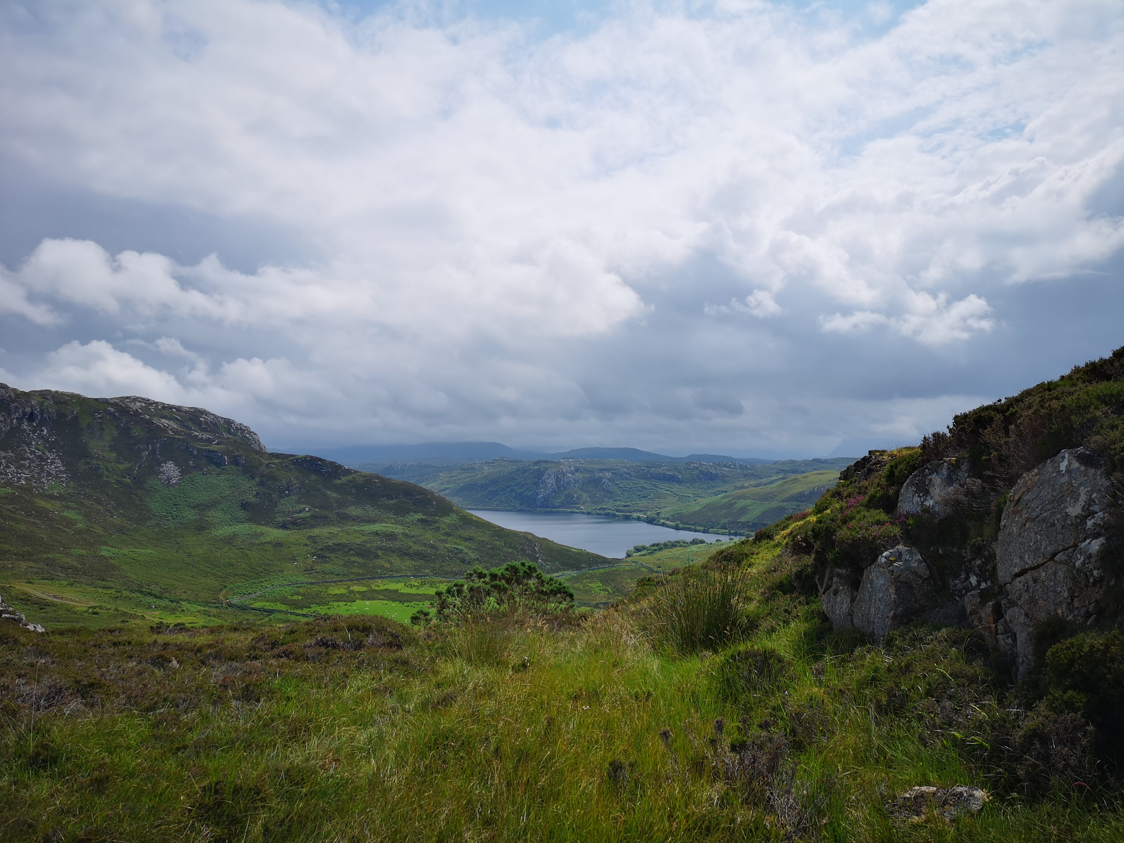
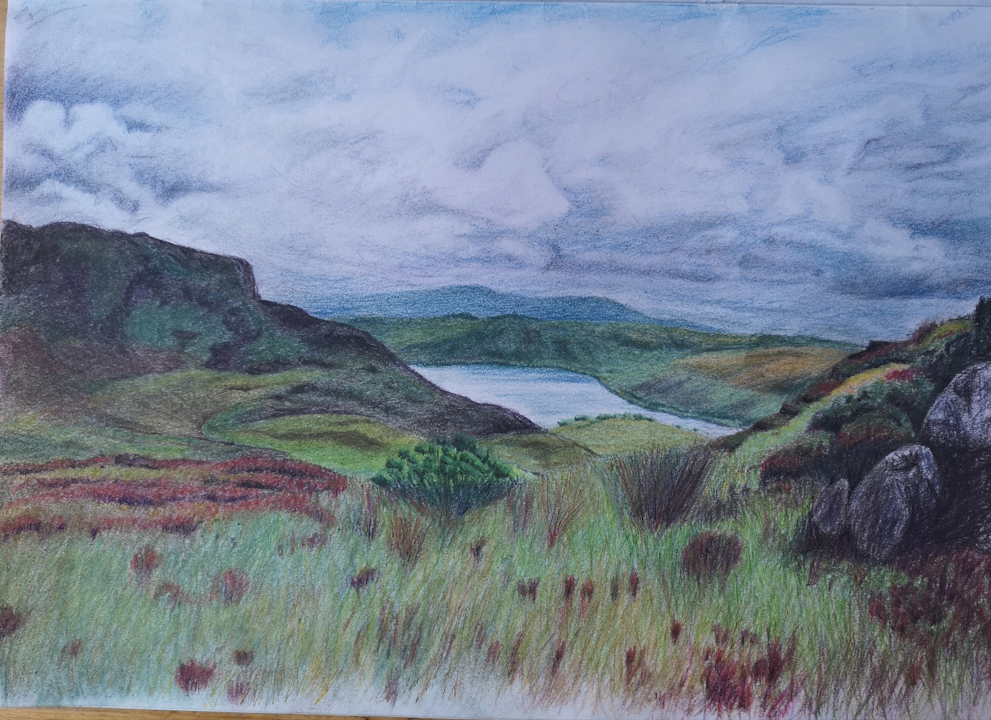
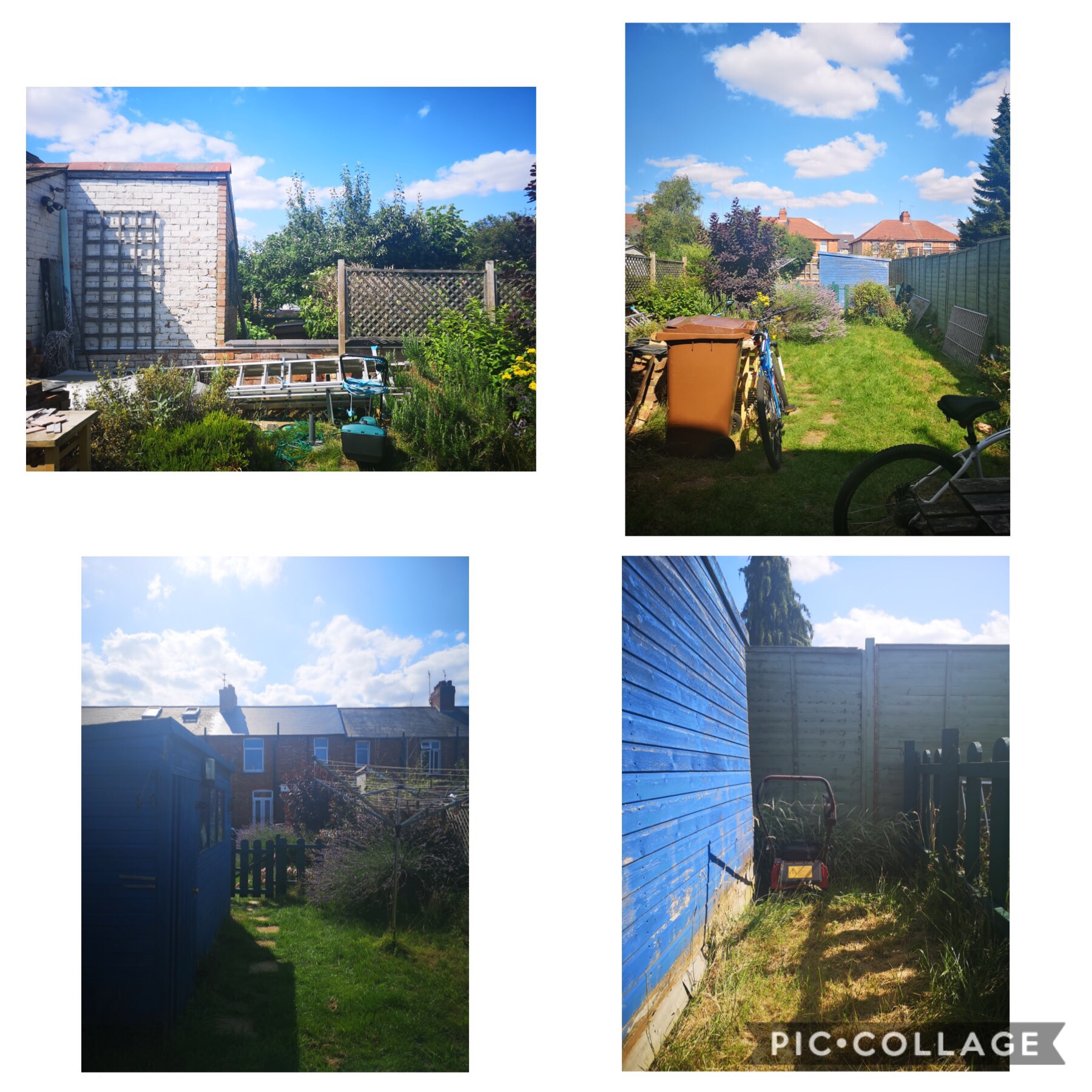
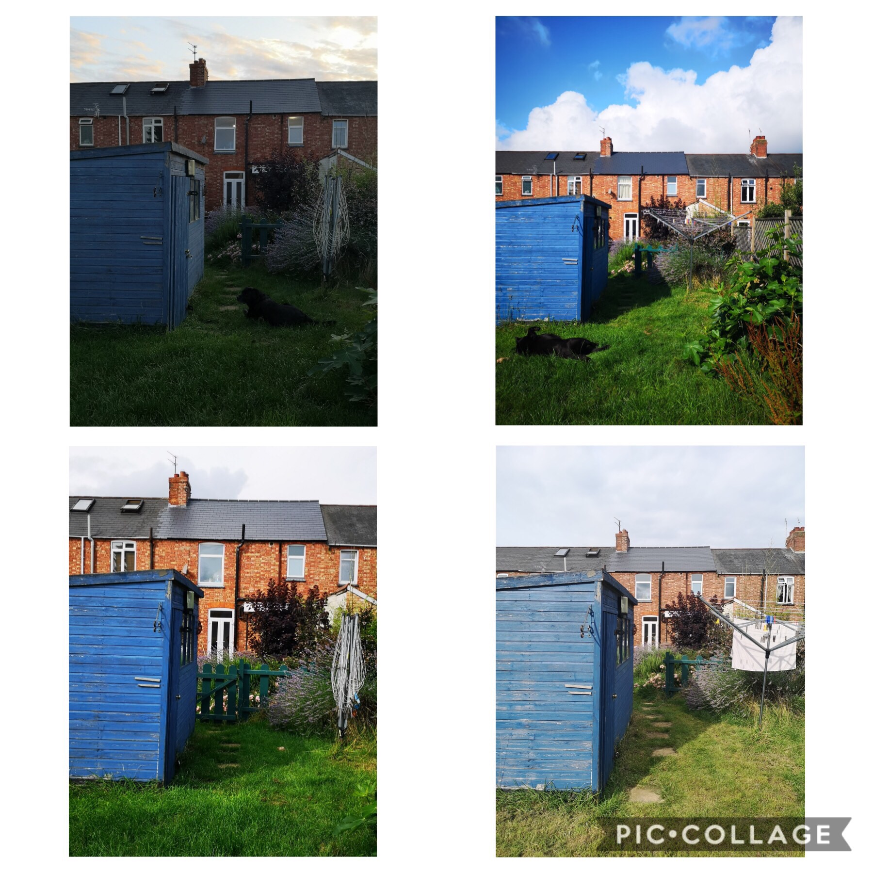
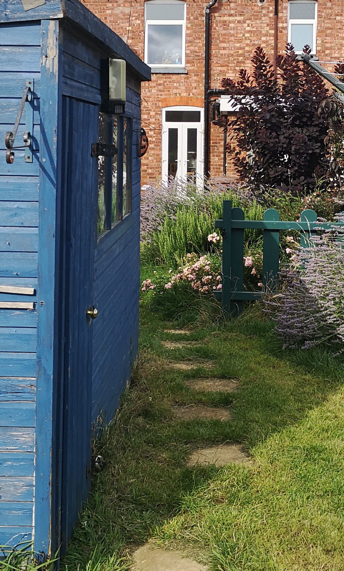
This research has prompted me to look again around me. I’ve always had a strong affection for the natural landscape and often use social media to share this. I realised that there are particular places that I too have regularly observed and returned to – capturing different views and images of the same place, whether it be changes in the season or perspective. It is the subtle changes in colour and light influenced by the weather and time of day which draws me to the places and to record the images.

I also think that studying a place in different conditions is a worthwhile exercise to inform my practice. Rather than finding a view I like and using it as inspiration, I think it would be worth studying a familiar place at different times, to see how it changes. I intend to use this to inform my assignment for this part of the course.