Drawing Skills 1: Pt 2; Project 3 At home – Ex 1 – Quick sketches around the house and Ex 2 – Composition – an interior

I started this exercise whilst still away on a camper-vanning holiday so my ‘house’ was a very small space and everywhere I looked I really was not inspired by the view and it was quite difficult to get a range of perspectives because of the limited space and headroom, however I completed a few sketches all the same.

I made notes on my sketches as I went along. I did not find it enjoyable and actually considered that I was not in the right mood to do the drawings at the time, so stopped after 3. On a technical side I also found it really challenging to draw the perspective accurately as the space I was looking at often incorporated a wall and ceiling. At the same time I did find interesting lines that drew my attention, particularly in the first sketch and wondered if this was something I may build on in future.

I continued the sketches a few days later when I got home after a bit of procrastinating; I was apprehensive after my first attempt and thought that I would really struggle to find views that weren’t cluttered but interesting (and easy) to draw at the same time, however after a hesitant start I actually found that I enjoyed looking around and started to find lots of interesting views – although one of these was actually more interesting because of the fact the wall had been stripped but actually had nothing of interest to draw!

I enjoyed finding interesting lines in the architecture but also how this interplayed with the softer and more fluid lines of soft furnishings. In addition how the views gave a sense of habitation, people living in the space. At this time my home is very cluttered due to some home improvements and as our oldest child is moving back home, but rather than this making the sketches more difficult I found it gave more interest and in particular I found myself drawn to one view in the lounge which I started to explore further and to then focus in my attention. Each time I drew the scene I kept the lampshade as my main focus and either took in the scene from the left or the right and then focused in more detail to the immediate surroundings. I found that every time I drew I found more details which I had not seen before.

As you can see I also experimented with landscape and portrait views but it was the last composition that I decided to focus on so then explored the perspective in a bit more detail, I mapped out some of the key areas of tone which I would then develop further as a final piece for my next exercise.

In this last experiment, I liked the first view – which was my initial automatic seated view. I did not like the second view – for this I sat on the floor and looked up towards the scene, apart from it being uncomfortable to work in I felt the whole dynamic changed and the mantelpiece was more dominant which I did not like; the image felt warped. I liked the last view and after further consideration felt this would be the one to develop – this had been taken from a standing view and I felt it gave the image more depth, drawing the viewer in to the scene. However, I have subsequently looked into other artists paintings of the interior genre and found that the face on view gives more of a feeling of intimacy as if the person viewing is in the room and I am keen to produce this effect rather than a more staged view which I find comes from an elevated position.

Drawing Skills 1: Pt 2; Project 2 Still life – Ex 4 – Monochrome

For this exercise I first thought about what colour I wanted to use. I didn’t want to use the same colour (blue) as the example in the course materials for some reason and I’d had enough of green with the last exercise. I looked around for inspiration, and a bowl of apricots caught my attention. I decided my colour would be orange. I felt for the subject and for my own personal development it would be good to use oil pastels. I have limited experience with these but am aware that they are not good for intense detail and that was something I was hoping to steer away from. I started to look for other items that I could add to the composition; initially I opted for a string bag and chopping board. I took a few digital photos to play around with the most appropriate view and felt that birds eye worked best. At the time I had the benefit of good weather with bright sunshine which gave good definition and contrast to the items.

I also had a go at drawing first the apricots and then a section of the proposed composition as I was keen to see how I would manage the string bag with the materials. The first practice went well and reinforced for me that oil pastels were the right medium. The second experiment was not so good and I realised that the string bag was going to be difficult to reproduce with this medium and may make the overall composition messy. The exercise also asked for one medium therefore using something to help with definition was not an option. I therefore decided just do away with the string bag, to add some interest I halved one of the apricots. Because of the view I was adopting I took a digital photo to work from but this time ensured that I did not zoom into the image and used the whole image for reference.

I used all orange based colours in my oil pastel set which amounted to 7 sticks. I made a quick outline sketch with coloured pencil and then started with the mid tone across the whole image, then dark tones, then highlights. I then went back and forth with the different tones until I was happy. I was careful not to rub the pastel with my fingers. This was something I had done before, I thought it was how the medium needed to be worked but have since read that it should be layered to create depth of colour. I first used the sticks softly and as the layers built and the image was developing I worked the sticks harder into the paper which gave a more blended and intense effect.

As I stuck only with the orange colours, the shadows are not as dark as in real life and the wooden chopping board is less true to its colour, but I am happy with the overall result – mostly I’m happy that I was able to create a good drawing with less focus on minute detail, whilst at the same time not disregarding this. It is a very simple composition and perhaps I could have added more items or background but I’m not sure that this would have added any value. I chose a textured paper for the ground as this seems to be recommended for pastels, however I found that I preferred working on the smoother paper which I used in my practice pieces.

I will take the opportunity to use and experiment with pastels more during the course. I need to get better quality sticks and would like to try conte pastels as I understand that these can be used with water, I most like the way that you can build up on the colours to blend them. The richness of the colours also encourages more boldness.

Drawing Skills 1: Pt 2; Project 2 Still life – Ex 3 – Eperimenting with mixed media

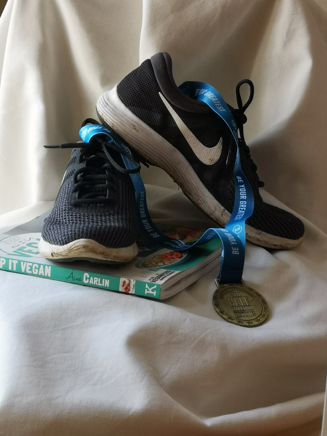
I had a love/hate relationship with this exercise; I had completed earlier projects more quickly, and towards the end was really keen to move through to the next exercise. I was thwarted by normalities of daily life and feeling a lack of creative talent or inspiration and didn’t always have time so this was completed over a period of a few minutes or hours at a time. Eventually I settled on a subject – at the time I was travelling so I felt limited for available choice but decided on a few ‘travel essentials’. I thought the metallic and plastic elements of the items as well as a few bold colours would be interesting to reproduce – in particular I didn’t want to avoid drawing subjects I felt to be more technically difficult.

I took a few digital images to decide on a good layout, and decided to have the toiletries on the towel each interacting with the other in some way tool. Additionally I decided to focus in so that the toiletries took up most of the image rather than swamping them and having too much distraction beyond the subjects.

At first glance I felt inks would be good for some of the plastic, shiny bits, and was convinced that oil pastel would be great to reproduce the colour and texture in the towel. I did a few experiments first concentrating on the towel – I was most looking forward to this part – but was disappointed that what I perceived in my mind did not come out on paper. Therefore, I experimented with a few different media combinations just trying to get a likeness for the material – this did not prove successful either until I tried also to incorporate the form and folds of the towel, and when I used ink with coloured pencil and pens overplayed for detail and shading.

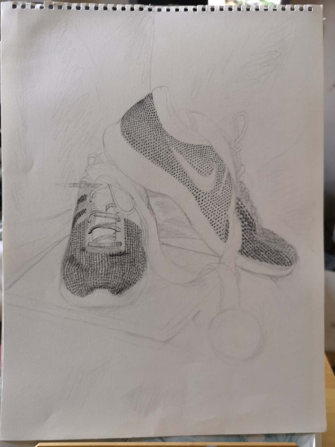
I then experimented in drawing the other items and found this much easier. My first attempts were better than I anticipated. This time ink was used to create the shaded elements – a watered down black ink using a small brush was very effective in producing the shade whilst giving the sense of man made objects, with pencil to assist. I also liked using bold coloured pens for the coloured parts as it again emphasised that these items are man made.

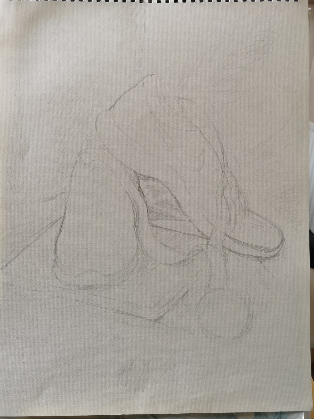
When I started the final piece I began with the ink, shading the items in the foreground and then by colouring the towel background using green ink as planned. As I was watering down the ink but didn’t stretch the paper, the paper became warped. I also found it impossible to create a consistent shade over a larger surface area. I therefore decided that I would not carry on with this attempt and started again. I didn’t want to stretch paper – I felt that was more indicative of painting and I wasn’t happy with how the ink was turning out anyway. As I searched for a new piece of paper I found a light green textured sheet from an old sketch book and decided this would be perfect; the texture and colour would form a great base for the background of the green towel. I started this time by outlining the objects in pencil and then shading them using diluted black ink, it was only at this stage that I realised the green sheet would also mean having to add white for highlights but I decided I would cross this bridge when it came.

I was very cautious with the black ink, I was scared of applying it too dark and not being able to rectify this. I find I tend to work very cautiously in general, I layer up and build on the colour or shade. Often I think I am creating something very bold and intense, and it is only when I take a digital image that I realise it can hardly be seen, the photo is then useful for me in that it shows me quickly where I need to concentrate my efforts.

I initially made my sketches and shading from the live image, but then took a digital photo which was my reference from then on. This was a bit frustrating as I realise the the photo image is never true to the reality no matter how hard you try, so a few things were a little out of place but not dramatically so and I was able to work around these. I did find though, that whilst I thought I was very careful with my scaling I managed to make the toothpaste tube a bit smaller than it should have been (although it was a travel size anyway). I don’t know how it happened but I only noticed quite late into the drawing, however, I don’t think it adversely affects the outcome.

I continued to work on the three items and complete these before moving to the background. I used coloured pencils over the the initial ink shading, particularly on the toothpaste tube and brush. I also used a mix of coloured pencils, coloured pens and black ball point pen for detail on the objects.

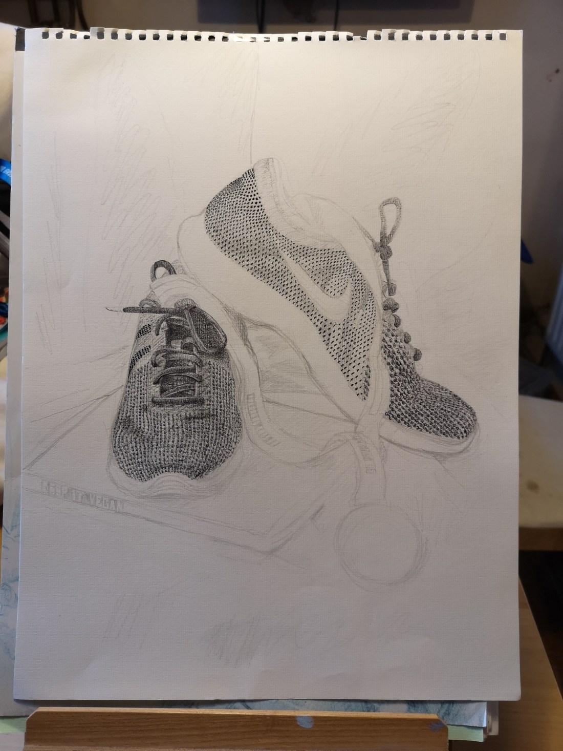
Whilst completing the other elements, I was always thinking about the background and decided along the way that I would try soft pastel with coloured pencil layered over to see what effect this would produce – I did a quick experiment which went fine and I was happy with, then I proceeded to use this on the final piece. This went ok, but I felt I did not get enough of the texture or depth of shade coming through. I therefore continued to experiment on the final piece. First I used ball point pen to emphasise some bits of the towel detail where this was particularly prominent and with the hope this would give some depth. This did not work out as I hoped, do I then used coloured pens in the same way. I was very disappointed with this and felt I had now ruined my work – why hadn’t I stopped at the pastel/pencil combo? Looking back on photos I took at that point it wasn’t so bad – why did I have to keep overworking it? Why was I so bogged down with tiny details? I think in part my problem was that I had been working from a digital photo which I was able to zoom in and out of, would I have proceeded in this way if I had only been working from life?

As I continued I was feeling more despondent and as I was about to give up, I thought of using pointillism for the shading I needed. This was quite time consuming and laborious, but as I progressed, I was eventually producing something I was much happier with and that I think captured a bit more of the texture and depth that I was searching for.

Overall, I think the image I created is recognisable to the still life and I am happy that I stuck with it, that I experimented and was able to use different techniques to produce certain effects. At times I felt that I was using too much pencil and it was not mixed media – eventually though I was happy that I did use a range (albeit limited) of different media purposefully for the effects I was seeking. An interesting observation was that in the end I did not need to highlight any of the white areas – somehow as the image developed they looked white anyway, particularly when the background was completed – it is not possible to show this in the photo but the paper is in fact green and no white media was used! The whole process has been a challenge and at times left me feeling quite resentful and just wanting the exercise to be finished – I was desperate to move on to the next piece – I also felt at times tied to this exercise and unable to do any other drawing or sketching unless it was related to this piece. It was only in the last week before completing that I told myself it was OK to draw or sketch other things just for the hell of it, and in reflection this may have been in part what helped me finish the work in the end.

What I have taken most from this exercise is the benefit of regular art practice – even when it is not related to the exercise I am doing at the time. I think I became a bit more open to experimenting and changing my approach even late in the process, which I will definitely continue. I have also become a bit more cautious about using digital images, I need to think more carefully about why and how I use these, I don’t want the photo to lead the direction of my drawing rather for it to be a tool to assist the process.

Drawing Skills 1: Pt 2; Project 2 Still life – Ex 2 – Still life in tone using colour

I used bendable pencils in 3 colours (blue, red and yellow) to complete this exercise. I’m not really sure if I did it right and found during the exercise that I had difficulty distinguishing the difference between tone and shadow, I still really don’t understand and am not sure if this exercise has helped me to reach a better understanding.

To create this piece I started by sketching an outline of the still life – these are all objects which sit on my window sill, which I thought was also a good setting because of the strength of natural light coming in and against the objects.

I used the blue pencil for the darkest tones, scrunching my eyes to help pick these out, I also took a photograph which I referred to as I find this also helps to identify the different areas of tone which are sometimes difficult to differentiate with the naked eye.

Next I used the red pencil for the mid tones but also layered this colour over the dark tones – this is where in hindsight I think I may have gone wrong in the brief, but it felt more instinctive to do this, and to be honest I’m trying not to be too rigid with my perceived rules and use my instinct more!

Lastly I used the yellow for the lightest tones and again also layered this over the other colours, this layering I felt gave an additional depth to the different tones I was creating and I am happy with the end result. I did take some time to reach the end point – several times I thought I was finished but found that the depth of colour was far heavier from left to right so I spent a lot of time correcting this. I think this had been in part because I initially started the work in the evening, but completed it over several days and at different times of day – due to my varying availability. The fact that I had a photograph helped in part but my preference was to work from the real objects because of their 3 dimension. I also found that whilst I thought I was creating a more balanced image it was only when I then photographed it that I was able to spot the flaws and correct them.

The finished piece is below.

Drawing Skills 1: Pt 2; Project 2 Still life – Ex 1 – Still life using line

This exercise was a really tough one for me. For some reason I could not loosen up in using ink, but was determined to use this medium.

I made some preparatory sketches of individual objects and compositions which went well. I also tried a range of tools but found a dipping pen worked best for me.

I initially settled on a composition of objects on my window sill, however I was not at all pleased with the results (see first image below). The smaller objects were drowned by the size of the lighthouse, and it became apparent that there was a lack of texture in the objects I had chosen. I also struggled to keep the perspective and the objects were not well represented in my drawing with size and scale being completely wrong.


As I was drawing I felt fixated on a need to draw perfect lines at first attempt, with an unwritten rule in my head that I was not allowed to sketch or re-draw a line once it had been made. In my first attempt I also chose to use a brush to create thicker lines to indicate some element of shadow and to help define the window behind as well as to give some suggestion of reflection; again this did not work and I was very disappointed with the outcome.

Afterwards I felt it was best to leave the exercise where it was and move on to the next, feeling initially that I would await the feedback from my tutor. However, I quickly realised that I needed to try again now as the purpose of the exercises are to gain the most out of the practice; to make my best effort in order to develop my skills and progress.

I therefore thought again about the objects I should use, the composition and the background. I pulled together natural objects with a range of shapes and textures but of a smaller size so that they could be grouped together more easily. I felt placing them in a dish would work best to allow them to interact in a sense. Using a dish also allowed me to practice elipses which is a personal learning need.

Again my first attempt started with the same error as before – trying to draw perfect lines at first attempt. Immediately the scale of the large shell was wrong as I began to introduce the other objects and their proximity to each other was wrong – the negative shapes were not true to the observed objects in front of me. (See below).

I decided to start again immediately and this time to make an initial light sketch of the outlines in pencil. Within seconds of starting I realised that the sketching approach was what I needed to use with the pen and ink! I therefore dropped the pencil and continued with the pen and ink. Once I loosened up and allowed myself to make shorter brief strokes and to look more often I noticed vast improvements. In particular I found I was able to get greater accuracy in the negative shapes. The final piece is below, there are some lines that are out of place but I feel this piece is much improved and that I have managed to gain some skill in the use of the medium. I am also happy that I have been able to produce a piece which focuses on shapes, textures and patterns as the brief requested. I now feel much more confident to use this medium again which is something I was always keen for.

Most of all I am really pleased that I persevered. In pursuit of this course I am managing many competing demands and challenges, but the most difficult for me are the self imposed pressure to get through the course in terms of time available and battling the internal voice which tells me to give up or to avoid something if it doesn’t go perfectly (or as near as) first time. This exercise is therefore one that I have to hold in the forefront of my mind as I face further challenges in the course.

Drawing Skills 1: Pt 2; Project 1 Detailed observation of natural objects – Ex 1 – Detail and tone

For this exercise I have used coloured, blendable pencils on A3 paper. As instructed I used cross hatching techniques to build up tones.

I had completed a few practice sketches of different objects in my sketchbook before approaching this exercise, so felt I had a grasp of what I needed to do and enjoyed the process.

I enjoyed working in colour using this approach as well and found that I looked for more colour within the subject to help build the tone which I felt gave more interest. I deliberately avoided adding in the background, I actually avoided this as I was worried about getting this wrong in terms of perspective. This is clearly a weakness for me so in my next exercise I think I will make a conscious effort to include the background as a feature of the composition.

The finished result is shown below.

At the end of Assignment 2, during my tutorial, my tutor discussed this piece with me with regards to my effective use of tone. However she also advised that the stalk appeared too prominent and that erasing it back slightly may help it look as it should. I therefore simply did this and it was very effective (image below) with very little effort or time needed. This was consistent with a theme picked up in my tutorial of my need to consider reducing back rather than adding more to my art when I face a particular problem and I really hope to retain this piece of advice for future work.

Drawing Skills 1: Assignment 1 – adjustments following tutor feedback

In response to the feedback from my tutor with regards to my assignment, I used my camera phone to help crop the composition of my final piece. I also as advised spent some time building the tone on the right hand side and lightning the left – the result is shown below. I am quite astonished at how much of a difference this makes; on the first version I had felt the trainers dominated the image, however with just a few subtle amendments the composition is much more balanced and each of the items seems to share the attention of the viewer.

During my feedback discussion we also talked about the value in using the photos I had taken of stages through my drawing, to reflect on what had added value to the overall result.

I found this difficult to do initially – I could understand what was being suggested, but I was also reminded that whilst I had been completing my assignment I was conscious of building layers, starting with the detailed elements. This had been a deliberate act on my part in wanting to get a true sense of the form and texture before adding light and shade. In some way I had felt that to not do this would be deceitful. However, in completing a subsequent exercise today (see post ‘Drawing Skills 1: Pt 2; Project 2 Detailed observation of natural objects – Ex 1 – Detail and tone’), I realised that some detail can be added later in the process without compromising the end result. In the exercise today I worked in a completely opposite way to the assignment by working on the light and shade and building tone before working on the more detailed elements. This is in part because the exercise called for this, but nevertheless has helped me to understand this possibility and consider different ways of working and I intend to practise and build on this approach in future exercises.

Drawing Skills 1: Pt 1; Reflection on Tutor feedback

I had my first feedback session today with my tutor following completion of part 1. I was apprehensive to start; unsure of what to expect.

My mind immediately took me back to the time I had attended an interview as part of my application for an art foundation course at my local collage some 30 years ago. I had my heart set on the course and I suppose a bit of an assumption that my eagerness and talent would be enough to get me through. Anyway, all I remember is that it wasn’t that straight forward and the interviewers made me leave the room so that they could consider whether I should have a place on the course which brought me to tears!! I did get a place, but I left within 2 months – on reflection I think their hesitation was well founded and I was not ready.

This time round of course it is a completely different scenario, I have been considering this for years and I am ready to commit myself, to put the effort in and to gain everything I can from the course – therefore I shouldn’t have worried about this feedback meeting!

I found my tutor very positive and constructive and her feedback consistent with my own feelings and perception of how I have performed, but with equally helpful discussion, exploration and achievable ways of moving forward.

I found it particularly useful to consider experimenting with reductive charcoal drawing as an alternative to the assignment I have done just to see where it goes rather than because of a need to re-work the assignment. This idea is appealing to me as it removes the pressure of the assignment, which hopefully will enable me to fully engage in the process and really gain from it.

We also discussed reflection and about how I need to take this further and build on what I see and what it means to me, where I can take things to.

Practical and specific things were also discussed – the need to practice elipses which also moved into a discussion about posture and how this can effect movement and drawing. This was interesting as I spend a lot of time considering my posture in other walks of life – work and running, but for some reason it had never dawned on me to consider how poor posture when drawing may not only result in some aches and pains but could limit the range of movement in the arm and therefore affect what is drawn! It so obvious!!

I feel I’ve been given some really practical ways to move forward and have reassurance that I’m going in the right direction and that this course remains an achievable goal for me. I also feel that with this reassurance, some of my apprehension is removed. I do have a tendency to be rigid in some of my work in relation to detail or following instructions; in a sense this feedback helps to give permission that I can be a bit more loose and experimental (although I’m also very aware this will be a very long work in progress!).

Drawing Skills 1: Pt 2; Project 1 Composition – Research points

Still life genre – For investigating this genre I found 2 helpful articles online which I have shared below:

https://www.tate.org.uk/art/student-resource/exam-help/still-life

https://artuk.org/discover/stories/is-there-still-life-in-still-life

In reading the above it seems to me that Still life has a variety of uses and purposes for the artist. It can be a means of practising or experimenting in the skill and techniques of not only painting or drawing but also of composition. It can also help in developing observational skills – by looking more keenly at the environment around you and finding interest in everyday life.

Still life also gives the artist a means of expressing their view of contemporary issues or for investigating ideas. Over time it has developed from a genre which was viewed on the lower end of the hierarchy of art tradition into something which can be desirable, decorative, personal and informative.

I looked at 3 paintings by contemporary artists – Peter Jones – ‘Ollie Monkey’, Rebecca Scott ‘The perfect hostess’ and Cindy Wright ‘Nature Morte 2’. Each produced still life’s which were not abstract in their technique i.e. they were very realistic representations, but were presented either to trigger thought or interest in the subject matter. I don’t feel that in general there is much difference in the practice of these contemporary artists with the traditional practice which I have read about above and which has evolved over time; an initial search of Still life in online galleries results in many images with similar subject matter and with similar compositions albeit with a wider variation in styles and medium. However, I feel the view and application of the genre has broadened significantly and therefore artists are able to use the genre much more widely and to contribute towards other purposes such as social and environmental issues; it is no longer cast aside as a lower form of art.

Positive and negative spaces – I have selected 4 contemporary artists working today and discussed their use of positive and negative space below.

Gary Hume, Begging for it, 1994 (gloss paint on panel)

In this painting the positive space is the subject of a person holding their hands as if in prayer. The artist uses black paint to draw the hands into the foreground with some lines to detail the fingers in a slightly lighter tone. The hands therefore appear more 3 dimensional and it is possible to see the form and shape of the hands and fingers and the direction they are facing. The rest of the subject is painted in blue but with no detail, and therefore is only distinguished from the background or negative space by the difference in colour. The painting therefore seems to be back to front in terms of use of colour; usually you would expect to see the foreground and positive spaces in bolder colours with black or darker tone reserved for the negative spaces or shadows and shapes between subjects. Despite this the painting makes sense and there is no difficulty in seeing the perspective or identifying the subject; the use of colour helps to draw attention to the position of the hands and despite the lack of detail in the rest of the image there is enough to identify the form of a person.

Emma Alcock, Reflected Window II (Oil on canvas)

The subject of this painting is negative spaces and shapes created by reflection. The colours and tones are very subtle, there is just basic use of shapes which is enough to give a sense of space, perspective and context. The image is a familiar one to anyone as being commonly reflected against a wall in their own home and therefore without the need for positive shapes the artist can invoke a memory which fills the rest of the image through the viewers own memory and experiences.

Julian Opie, Imagine you are walking, 1998-9 (screenprint on paper)

The above image again uses very simple shapes to imply negative and positive spaces, to give dimension and a sense of scale and perspective. The negative spaces form mainly the ground, the sky and shadows but seem most important parts in defining the subject as without them there would be no sense to the image.

Gillian Carnegie, Untitled 4, 2004 (aquatint and etching on paper)

The artwork above again emphasises the negative space in the subject and uses this to provide more information about what can’t be seen and the setting of the subject e.g. facing a window in daylight, as well as to give form to the setting i.e. on a table. The negative space of the background is without any detail and by being very dark enhances the detail on the table and the sense of space around it by suggesting depth. The use of dark and light in this image is in contrast to the first image by Gary Hume as discussed above.

Drawing Skills 1: Pt 1; Assignment

I spent a few weeks thinking about the items I would draw for this assignment; eventually I chose my trainers, one of my recent half marathon finishers medal and a vegan recipe book. These items say a lot about my approach to health and wellbeing and in a sense help keep me mentally and physically well. I took time to create a ‘stage’ and backdrop to help provide focus but also to capture some of the light – this was positioned on a table in front of me in natural light. I chose a position that I felt gave  a good range of light and shade.

I worked on an A3 sheet of textured paper and used a range of hard and soft graphite pencils, a ball point pen, a black fine liner, a black coloured pencil and a charcoal pencil. I was most concerned with capturing the different textures and I used a range of mark making techniques to achieve this, I also used different drawing tools in layers to build texture and tone.

Below is the finished piece.

I think overall I was able to create a good representation, I am particularly happy with the way I built the layers and used different media together, however I feel I may have concentrated too heavily on the shoes and therefore rendering the other objects into the background. I also struggled with the ribbon and the book in terms of using the full range of tools to draw these (I mainly used pencil) which may be why they appear more dull. I have also struggled to give the image any sense of my own style or sense of emotion, I did want to use more sweeping lines to give a sense of joy consistent with one of the first exercises in the course but felt unable to move away from drawing a more accurate likeness.