Feedback was positive overall.I prepared myself better this time by going back over my blog before the meeting and was able to recap on some of the challenges I’d faced and to review what I’d learned particularly through research of other artists. This was very helpful for me as I hadn’t really enjoyed this part – landscapes are not my thing so I felt I’d gained nothing but going back through my work actually helped me realise what I had gained from it and was therefore a positive experience in itself.
When it came to my tutorial my tutor and I talked about my difficulty with this genre despite my love of landscape. I was encouraged to hold onto this, it may well surface in another way at another time, I need to remind myself I’m just at the beginning of my learning pathway!
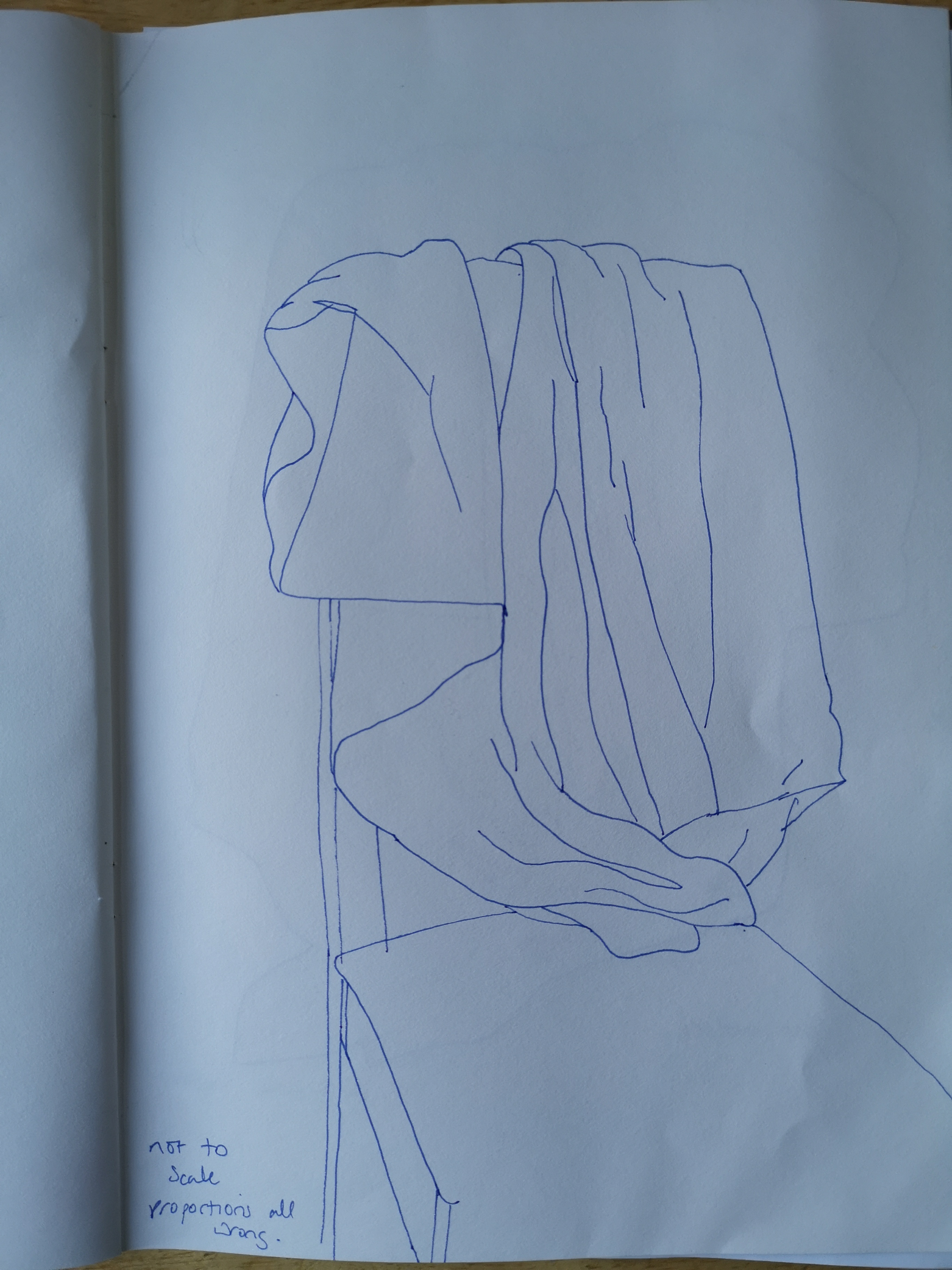
As well as other parts of my work, we discussed my assignment piece, although not my best work on the whole it was ok so no real changes advised as what I had accomplished may be lost. Instead my tutor encouraged me to use the opportunity to do 3 quick sketch responses to the subject, with the aim of loosening up and freeing my approach.
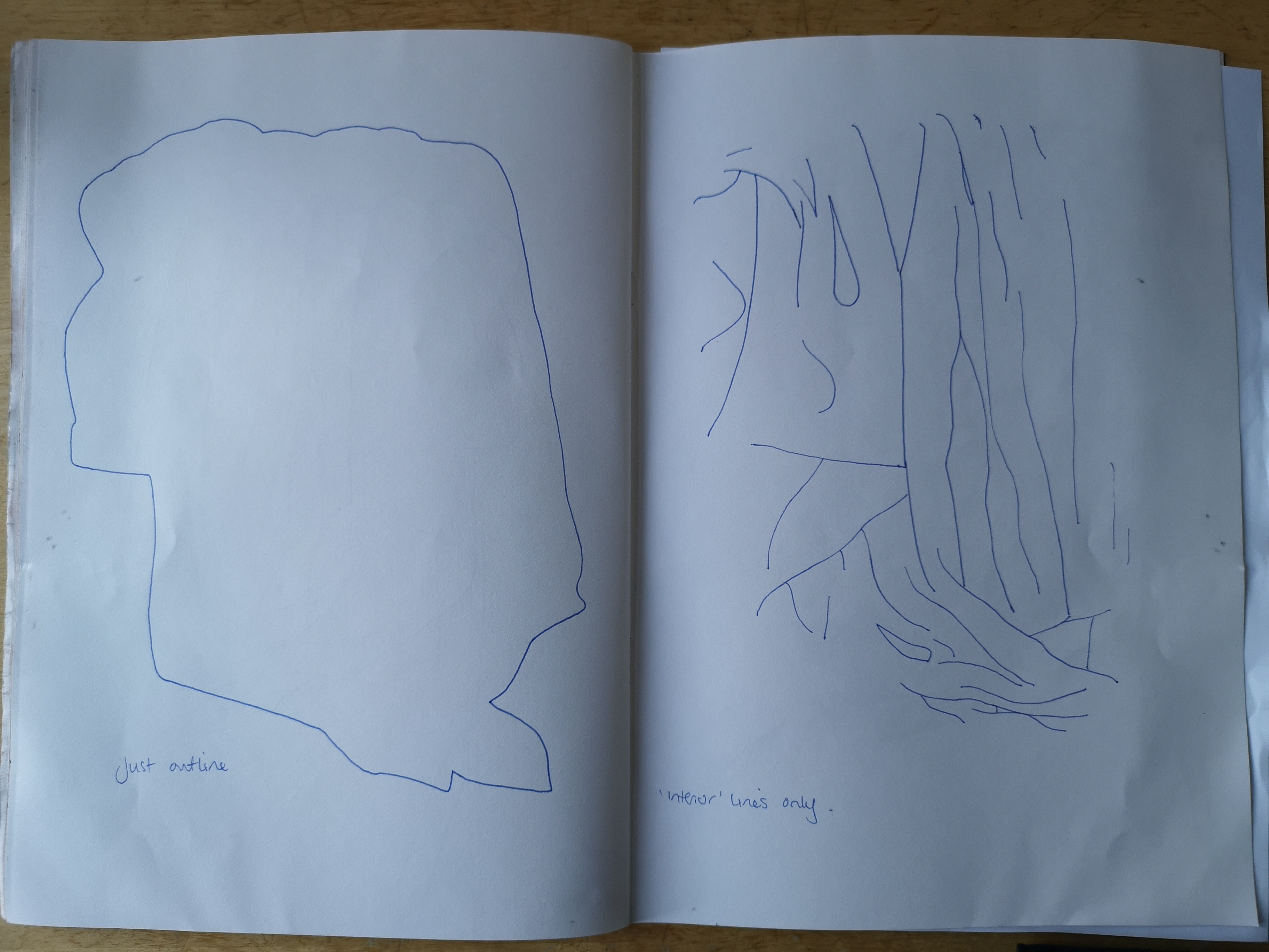
She advised that I do three 15 minute sketches of the same size and subject as my assignment:
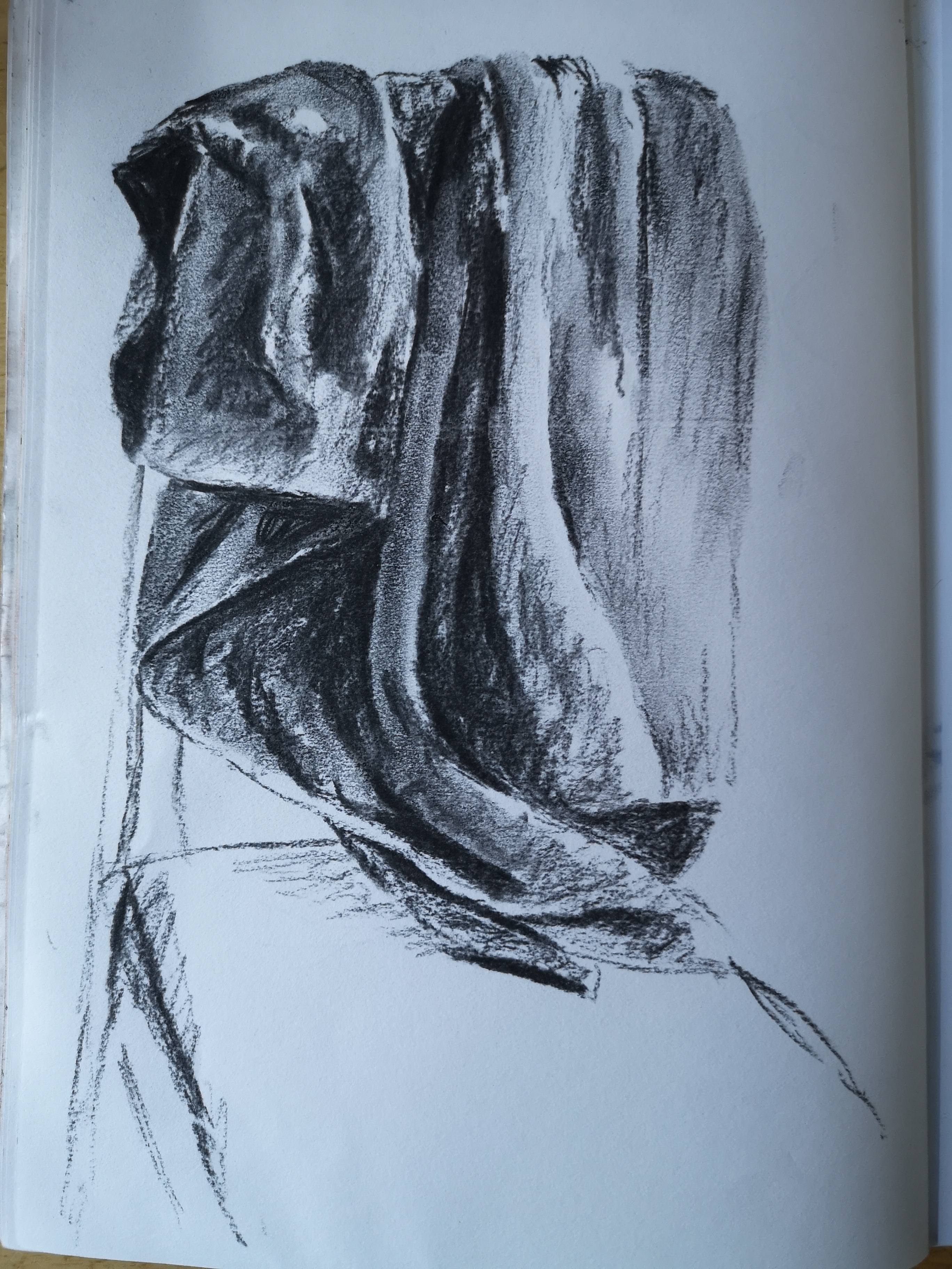
1 – live drawing, using very wet and large bold painterly strokes
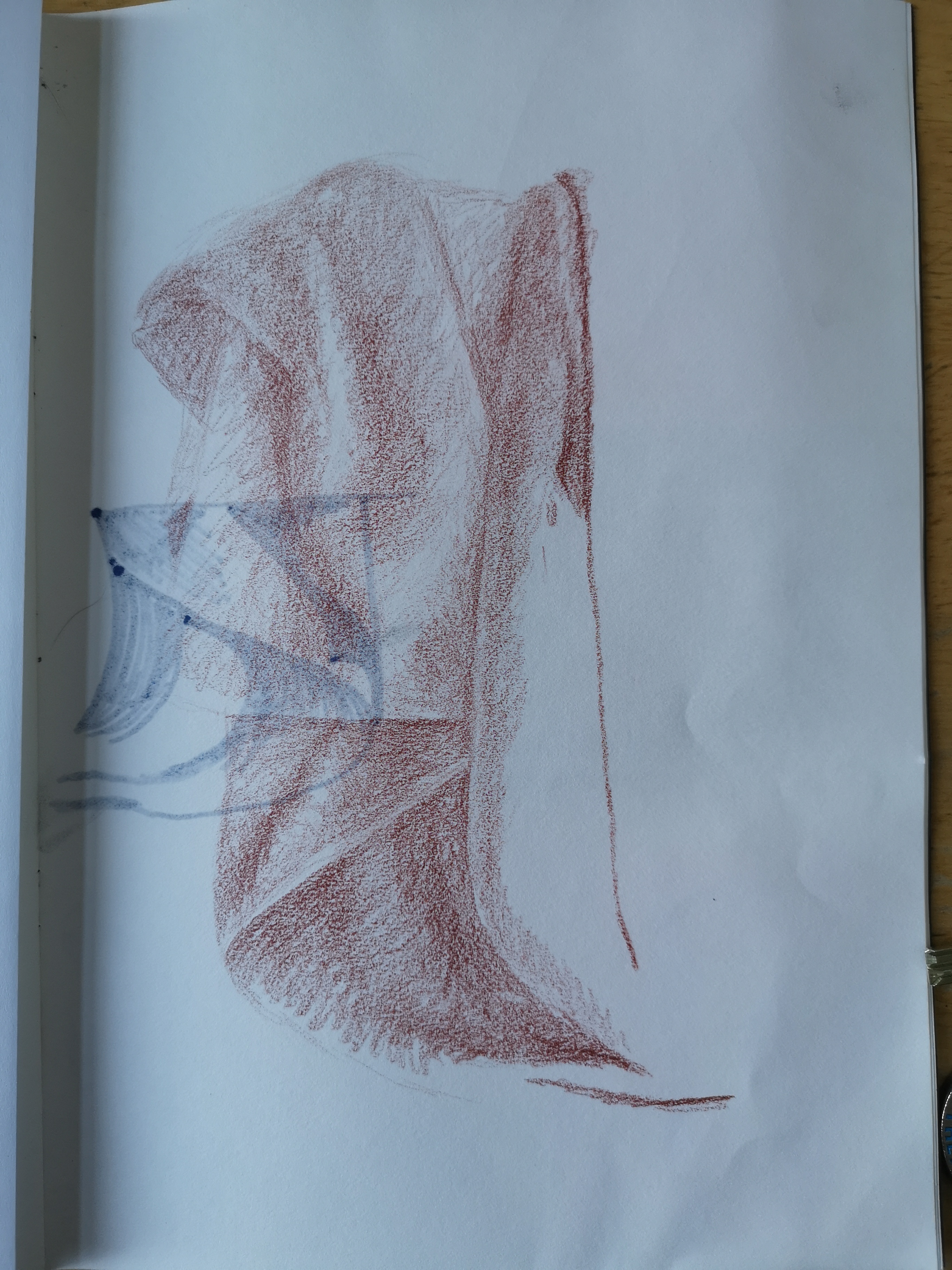
2 – live drawing using continuous line with a ball point pen
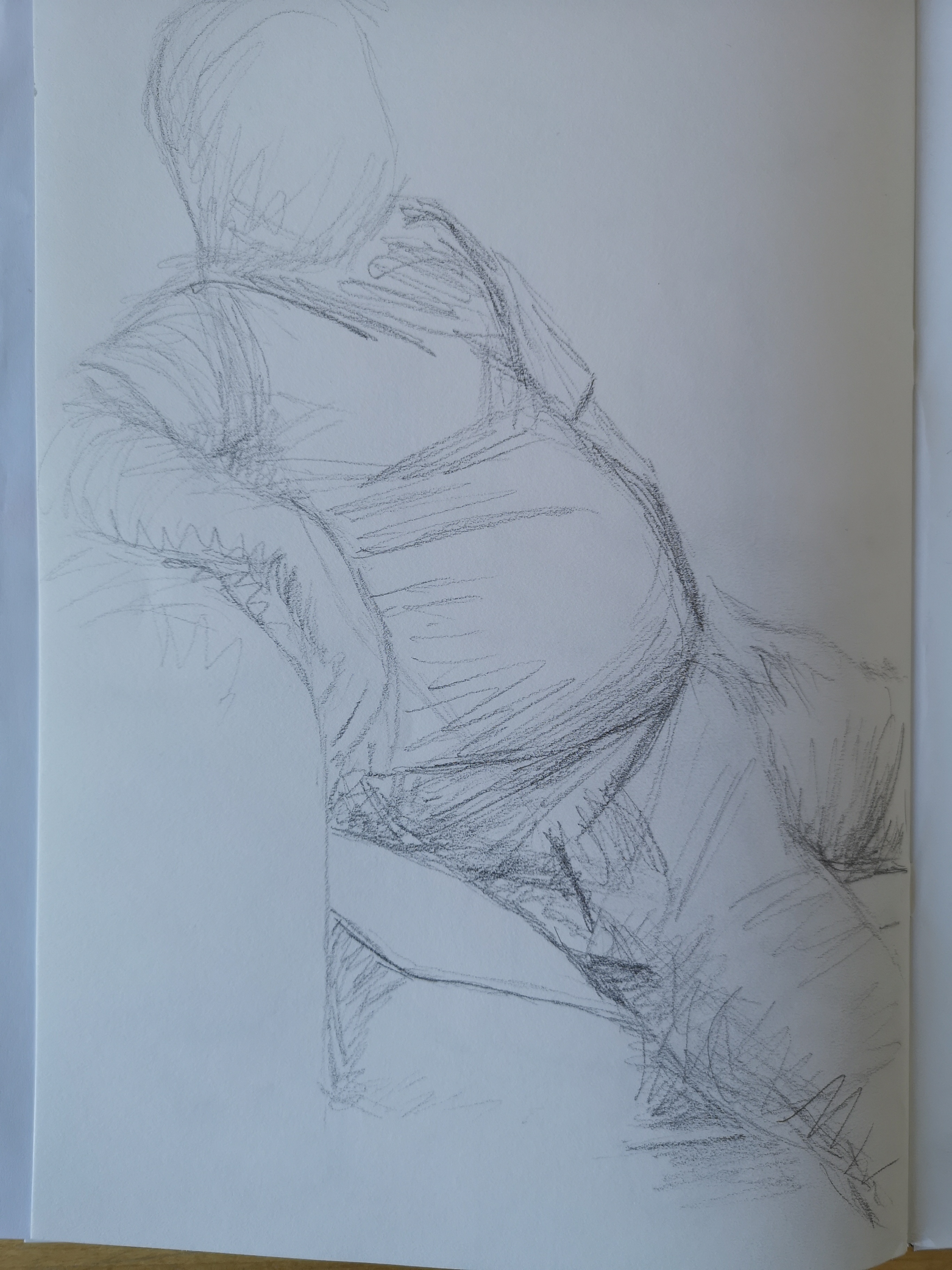
3 – to be completed from memory given that I have and intimate connection with the view
She suggested that i should not worry too much about the outcomes, they may have many flaws or errors, but that I may pick up something from each that I like which I can take forward for future practice.
The results are below.
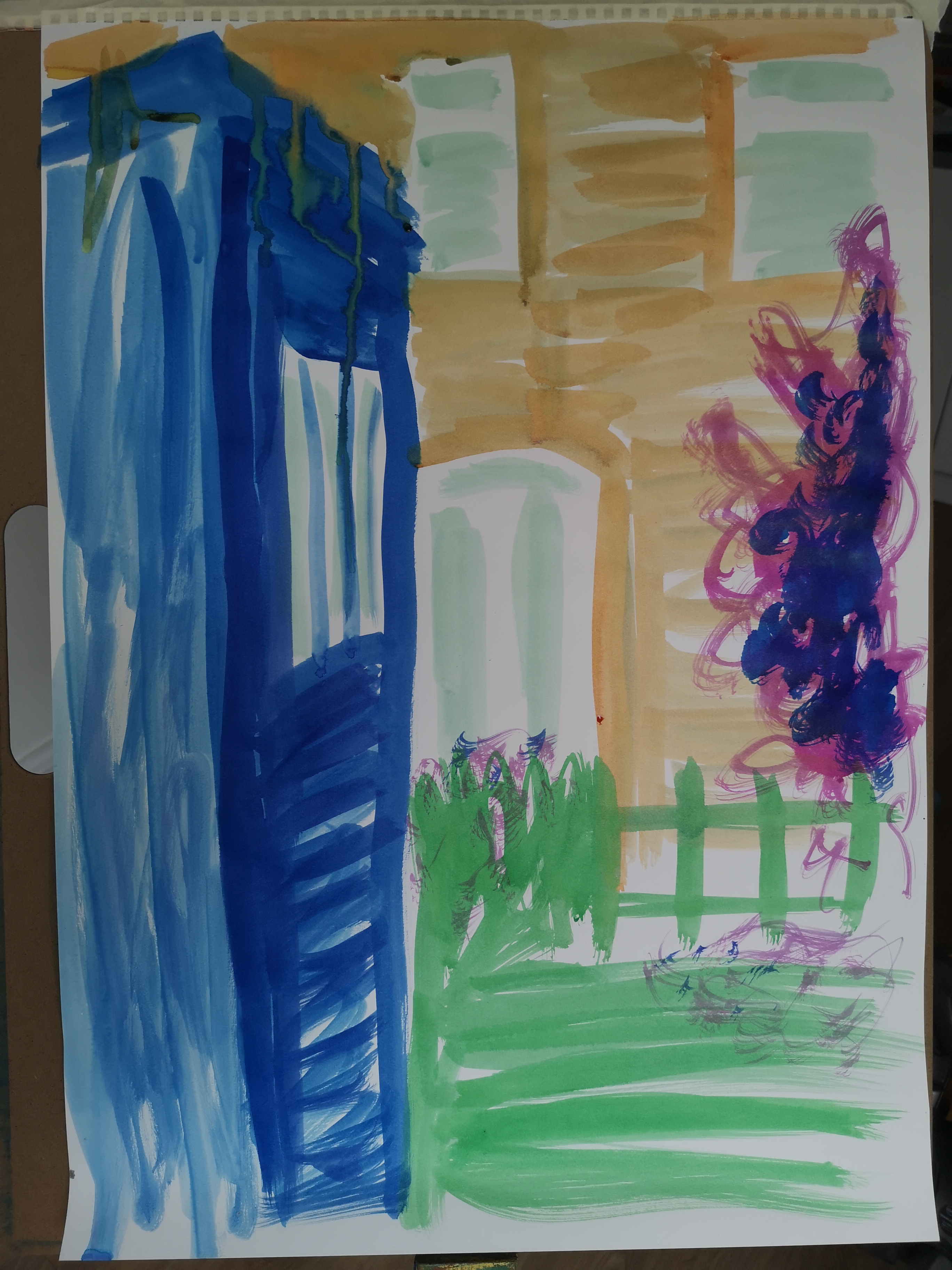
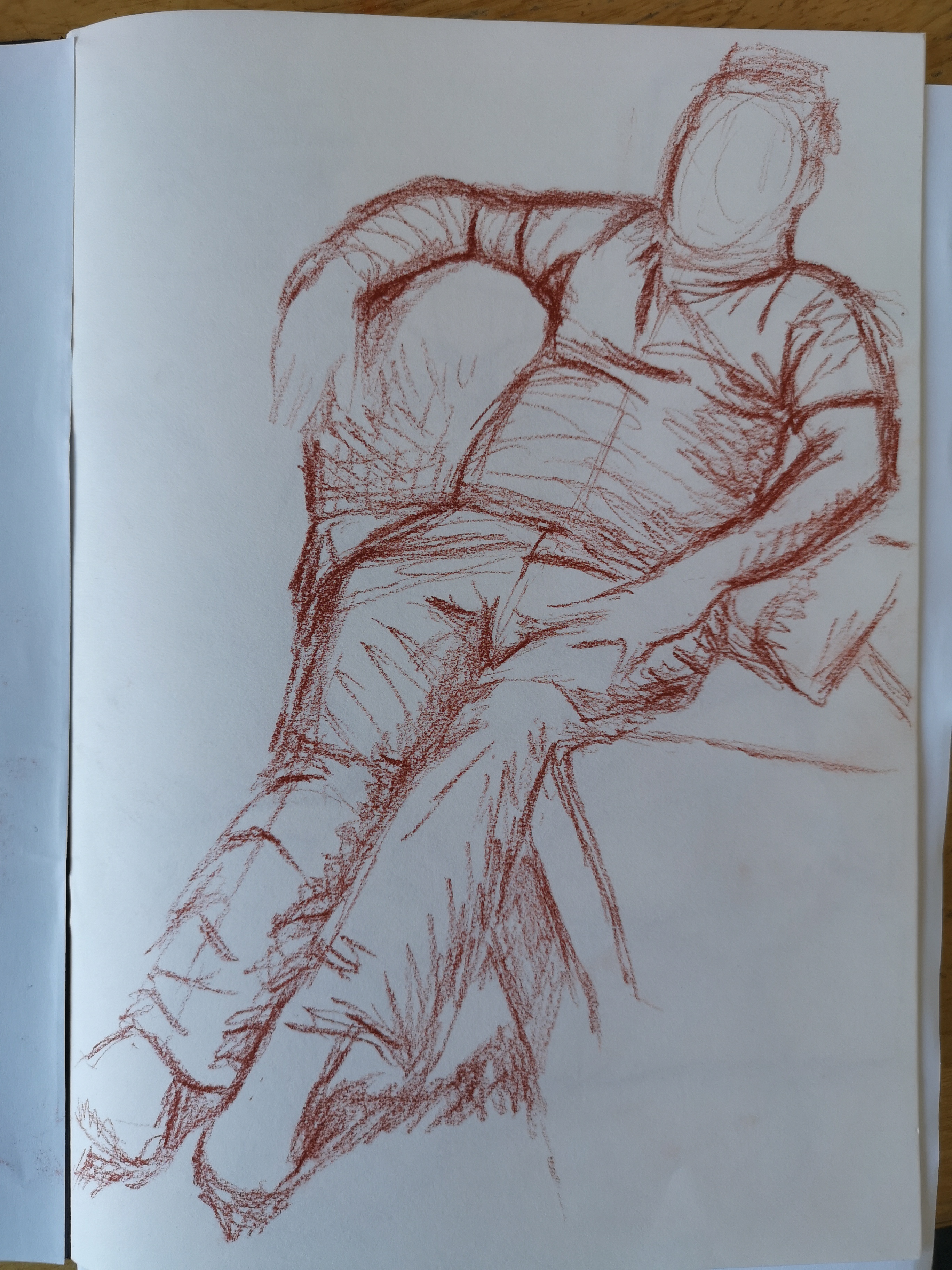
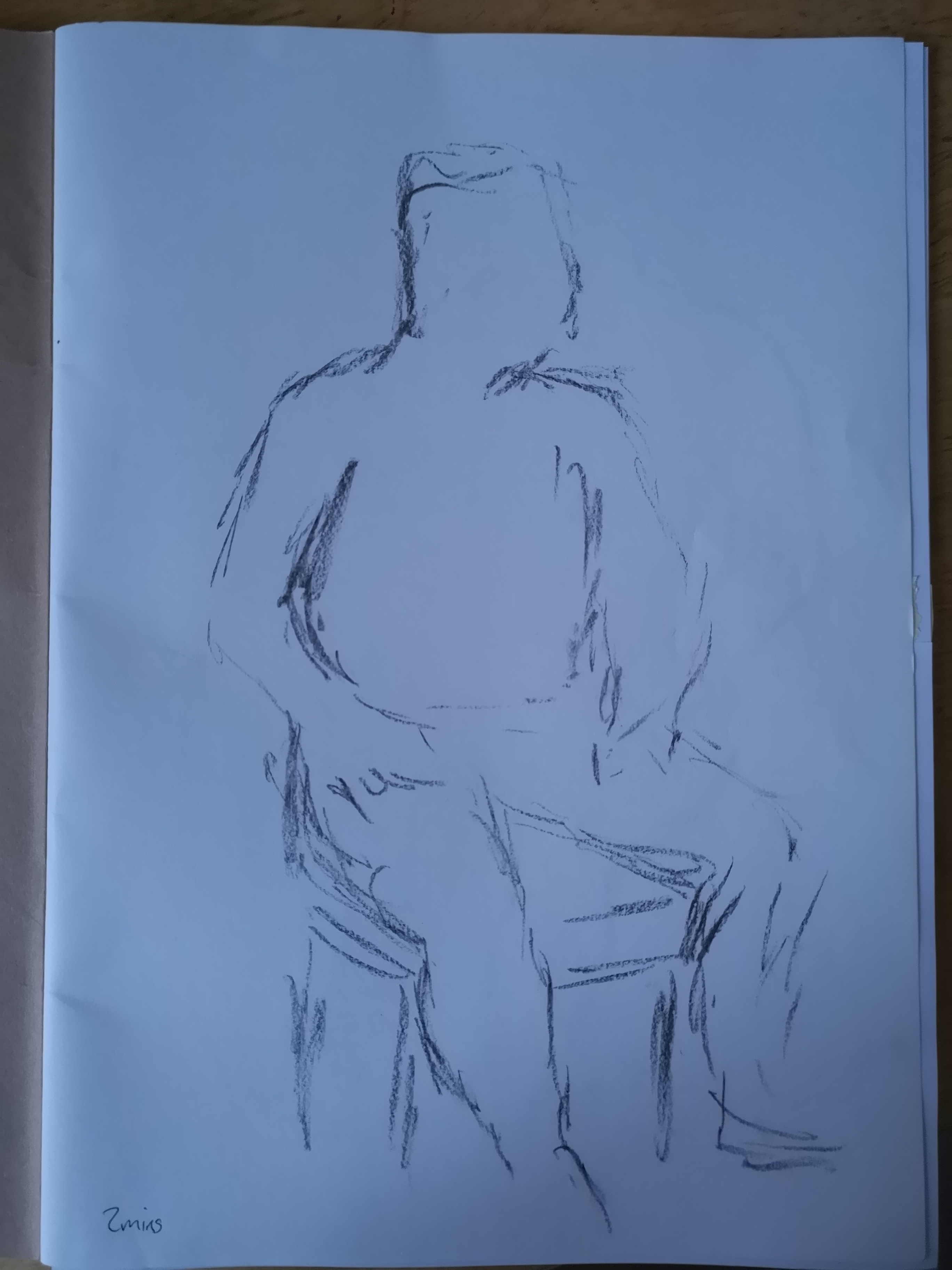
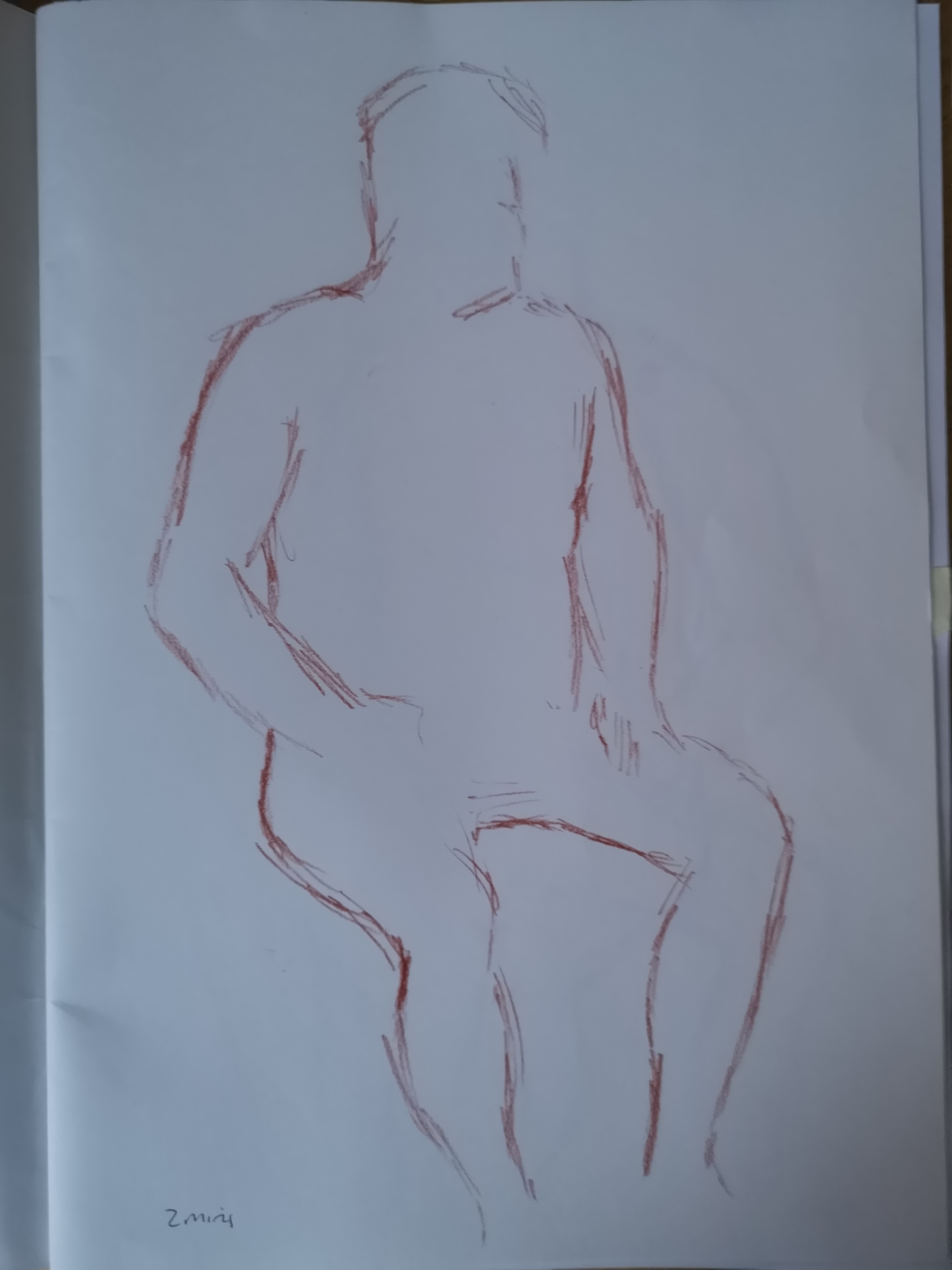
Ink on paper
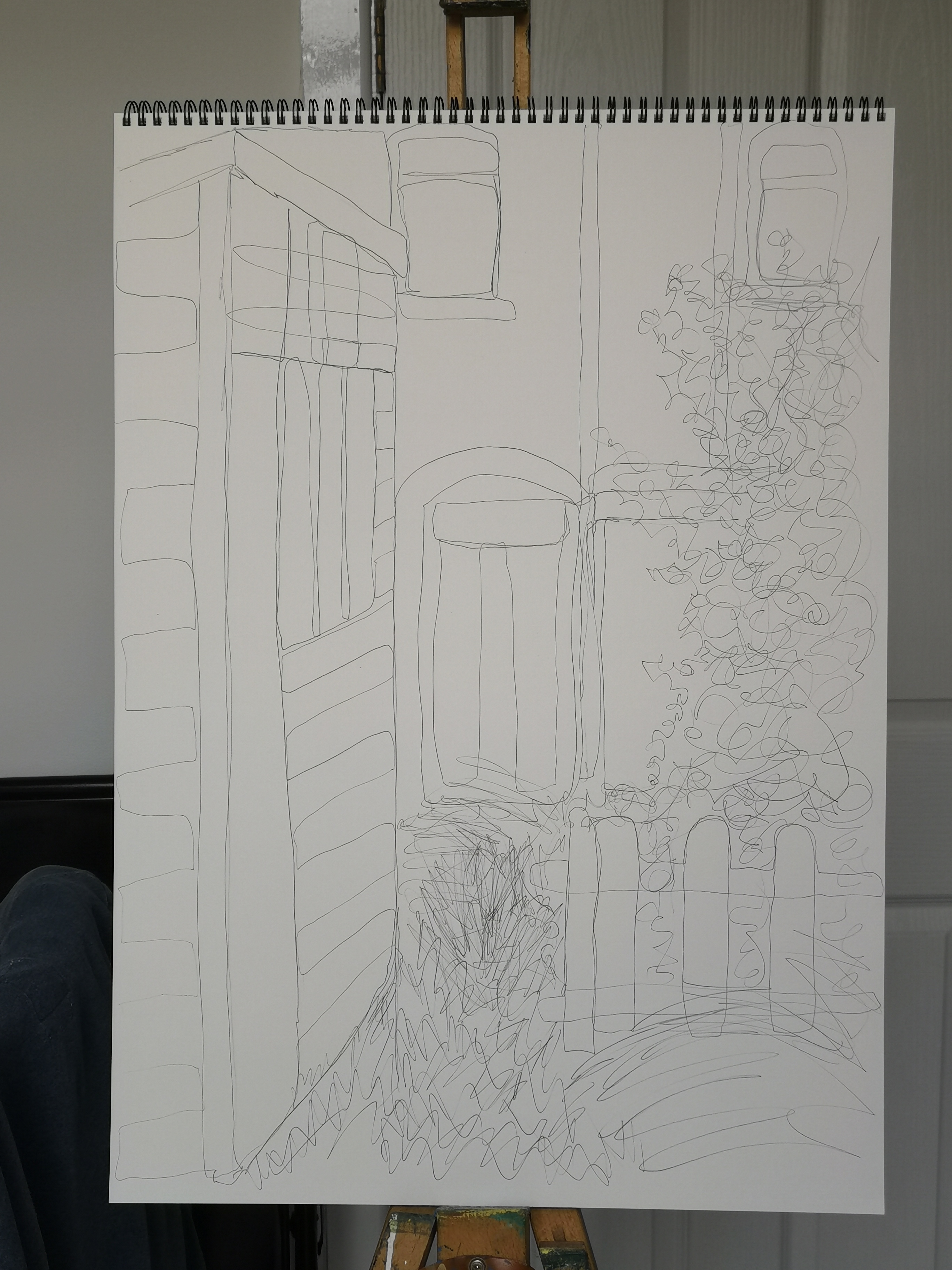
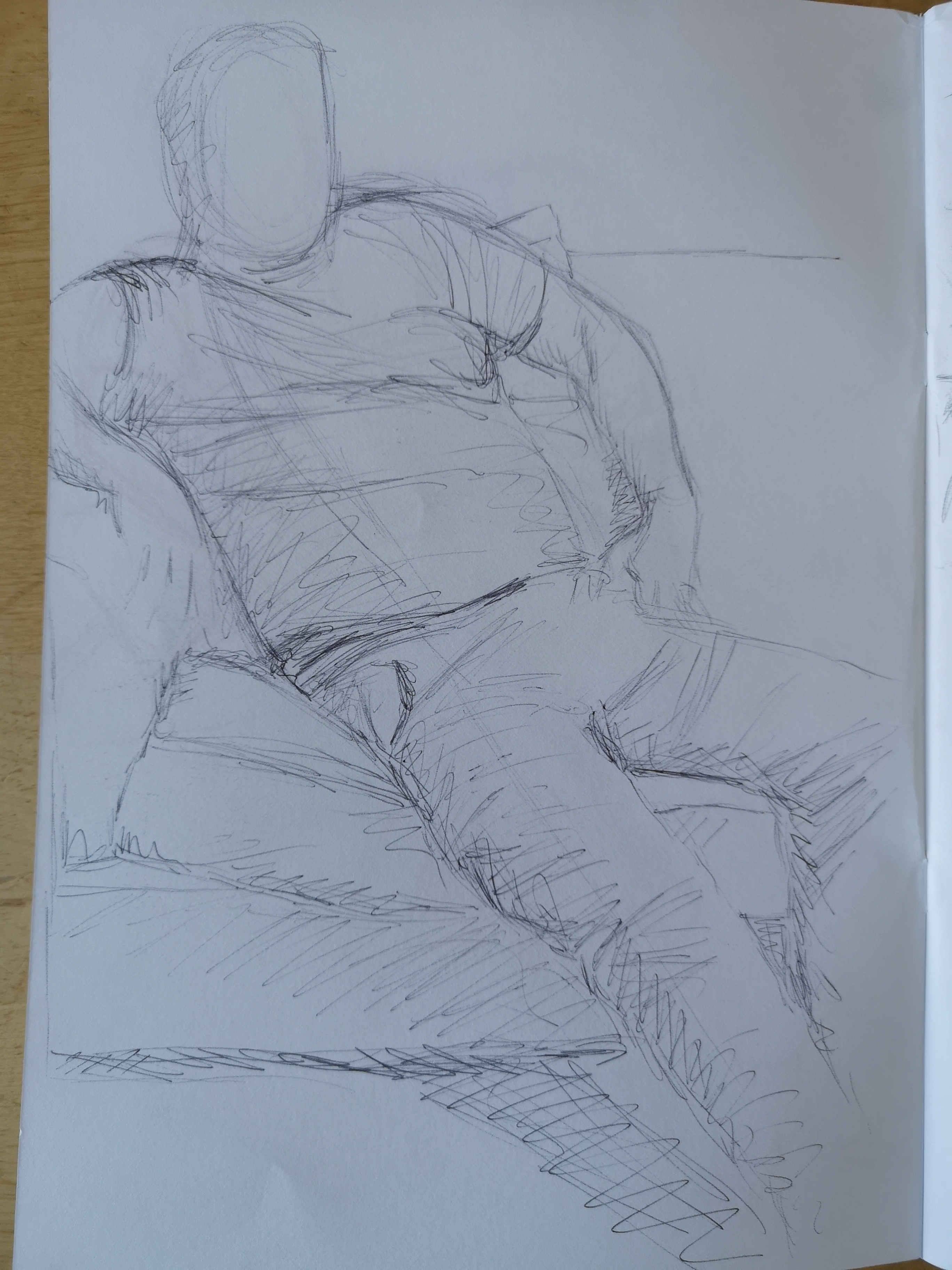
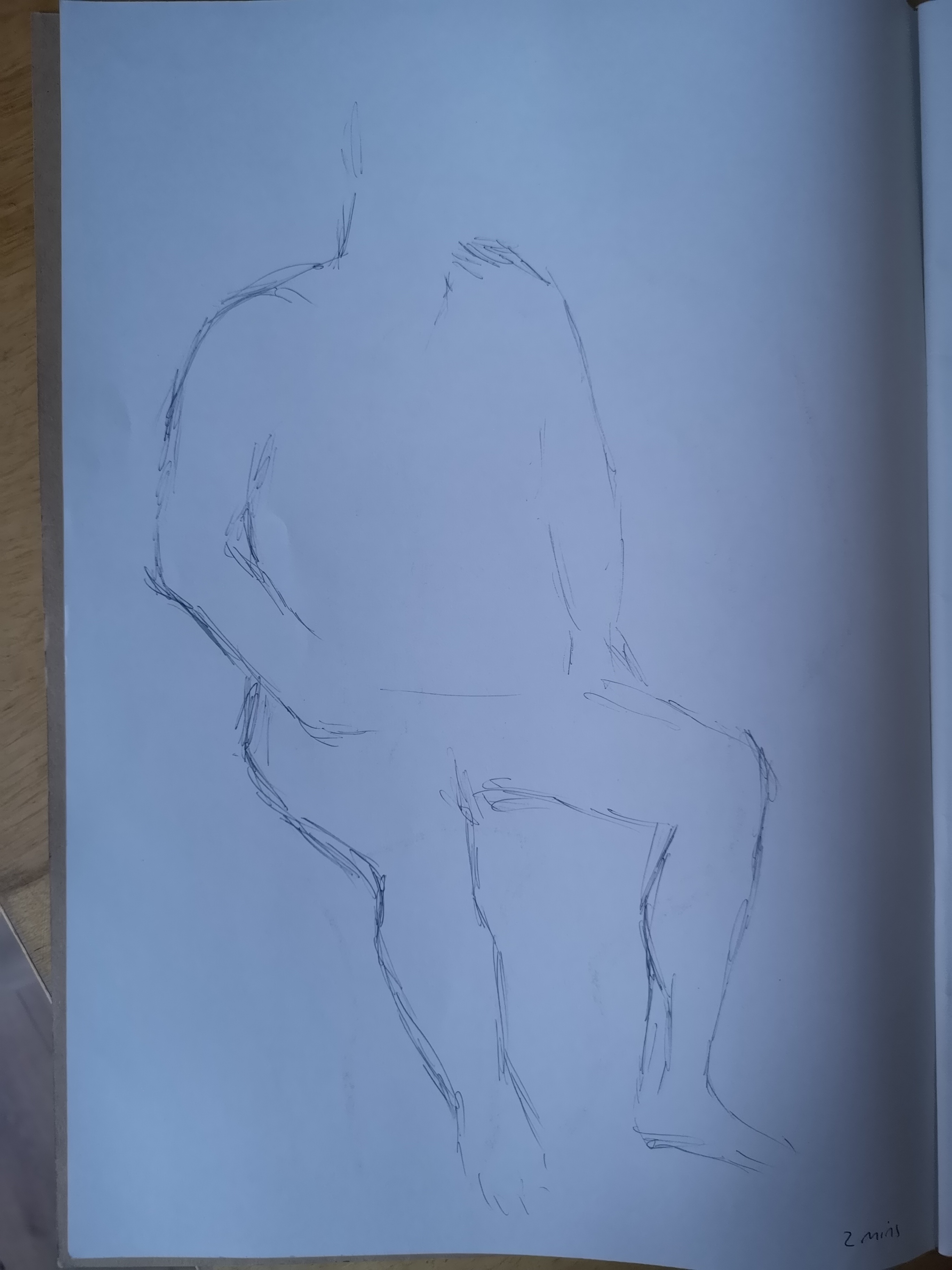
Ball point pen on paper
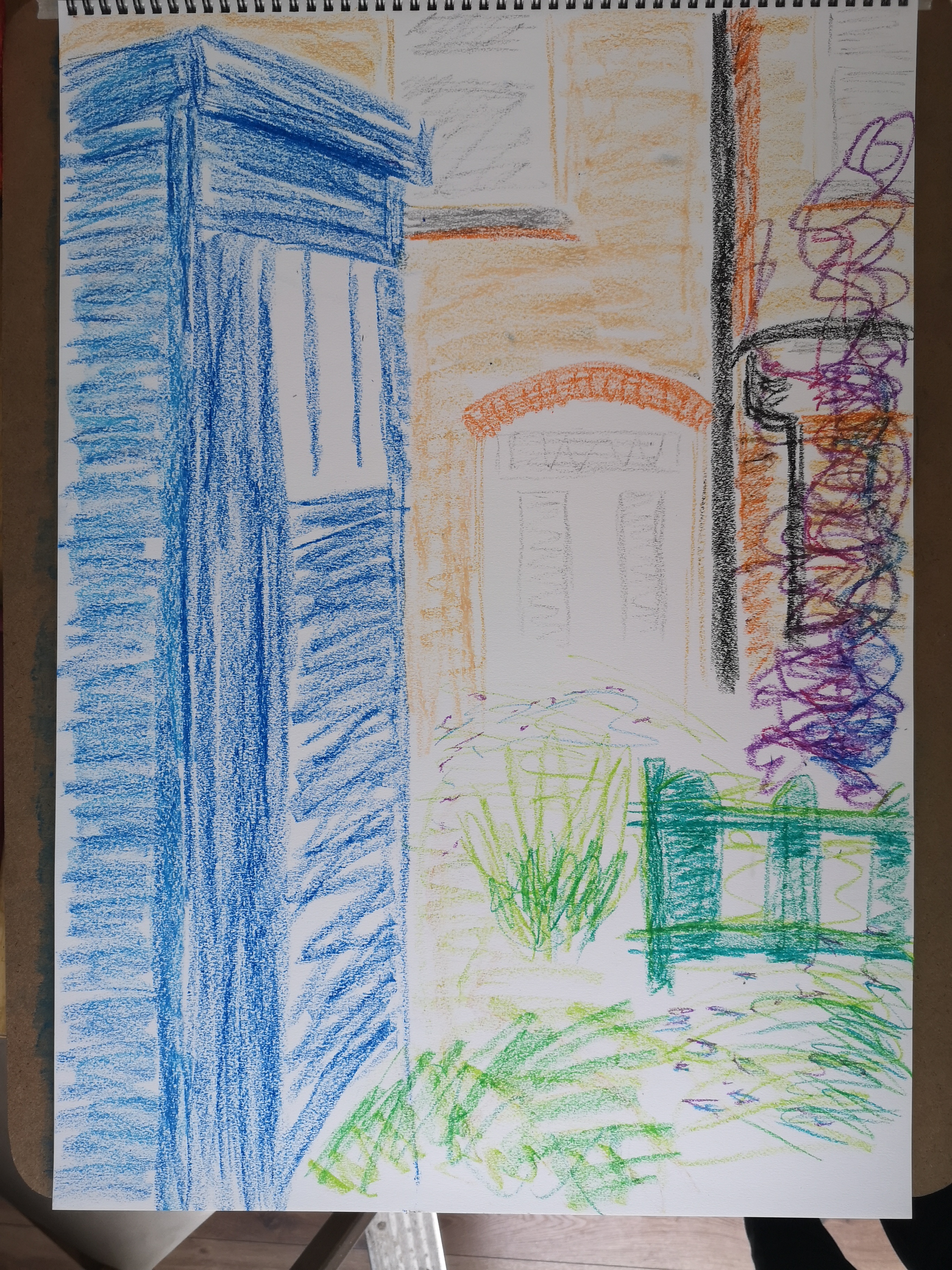
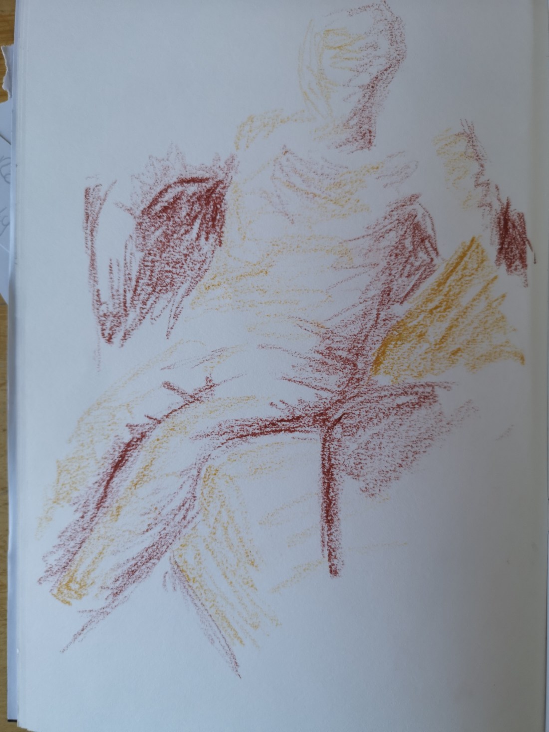
Oil pastel on paper.
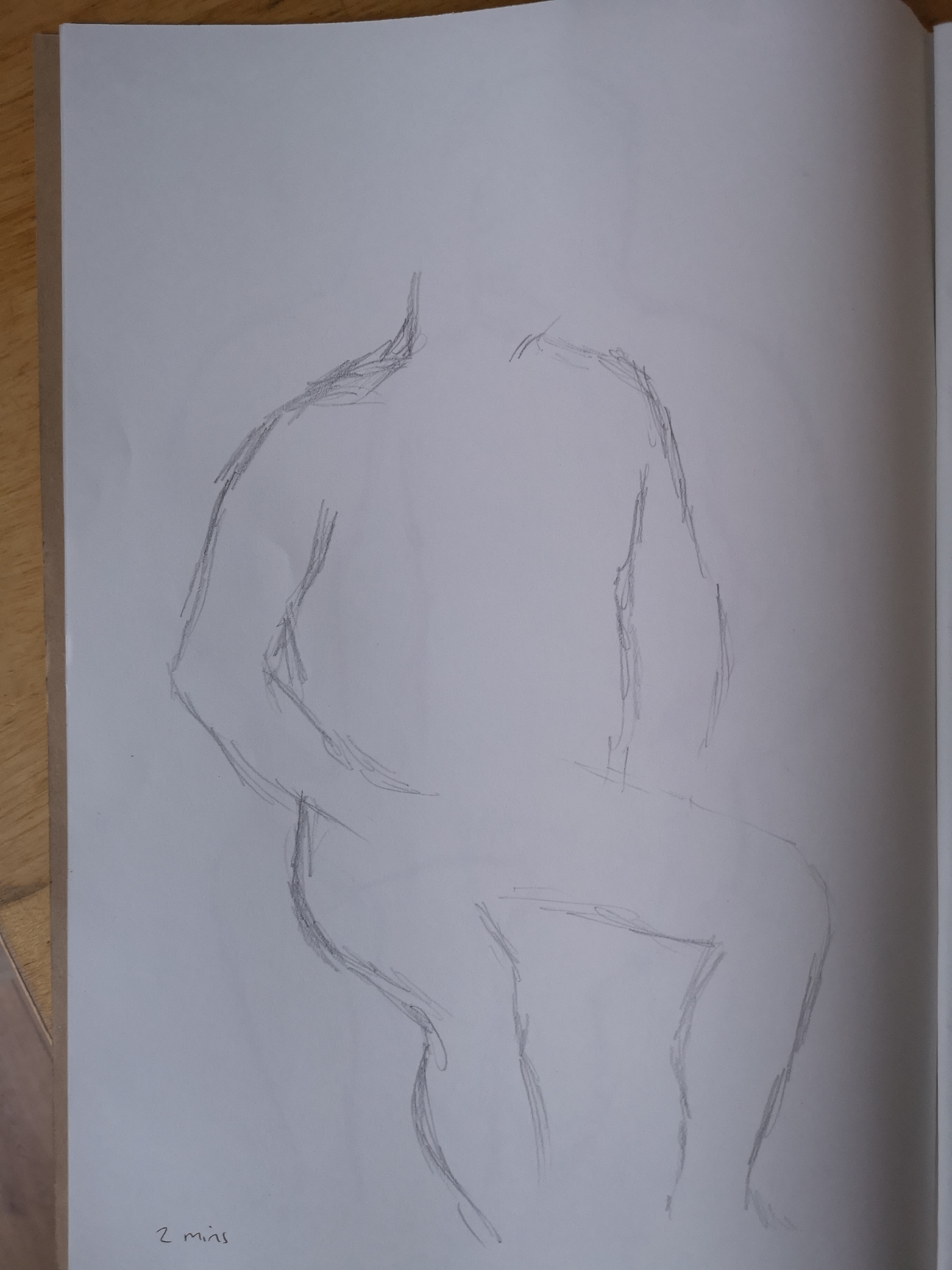
I worked much quicker than I anticipated, I did not realise that 15 minutes is actually quite a long time. However it was only after completing all three and reviewing them that I realised despite drawing the first 2 outside, they had all been drawn from memory. I had hardly raised my gaze from the paper!
In terms of outcome, I liked the first 2 best, not so much the oil pastel, but I’m not sure if this is just because of the texture that it gave. I really am pleased with the way I worked, I just got on and let myself go. It’s interesting that the marks are much more purposeful than I expected, the lines are bolder and sometimes straighter than they were with my assignment piece. With the ink I was very surprised as I am so anxious about how much ink I put on the brush and then onto paper, I always want to water down, but in the end I was more or less going direct from the bottle and realised that I could just go over again to emphasise the marks.
I found the continuous line drawing to be hardest as I was hesitant about working across the page, so I often had to retrace my line to get to another part of the picture. However, I like how the finished image looks, even though it is also quite wobbly looking.
I also noticed with all three that my main focus was on the structures and buildings, and that the shrubbery was almost an afterthought, I didn’t put anywhere near as much effort into this and in all three it occupies a much smaller space apart from the tree on the right. On reflection I think I was biased towards the tree because I always catch myself looking at it when I look out onto my garden. The colours within it always make me stop and look – it is quite green in its heart and then has a lovely deep purple colour extending out which is also tinged with deep red, auburn and burnt orange depending on the amount of light coming through. When the wind blows through the leaves they look like sequins as they flicker and all the colours are shown. I think I’ve always wanted to draw that tree but never before gave myself a reason to.
I really enjoyed the exercises, even if I did them a bit wrong, because they helped me to see what could be done without caring too much, which is something I need to do more of. I think it was a bit like the warm up exercises in part 1, a good way of getting the creative juices flowing – like doodling but a bit more structured. Its also helped to give me a few more techniques to consider for future projects.